This post has been republished via RSS; it originally appeared at: Workplace Analytics & MyAnalytics Blog articles.
The Workplace Analytics team is excited to announce our feature updates for October (see past blog articles here). In this update, you’ll discover the latest, including:
- Cost of low-quality meetings
- Manager impact Power BI template
- Chart interactivity improvements
Cost of low-quality meetings
As described in the August blog article, we recently added the ability to specify a per-user hourly wage in the organizational data file, which is used in the Cost of Low-Quality Meetings calculation in the Meetings overview exploration. But what happens when an employee doesn’t have an hourly rate specified, or when you don’t want to include that rate in a per-person format?
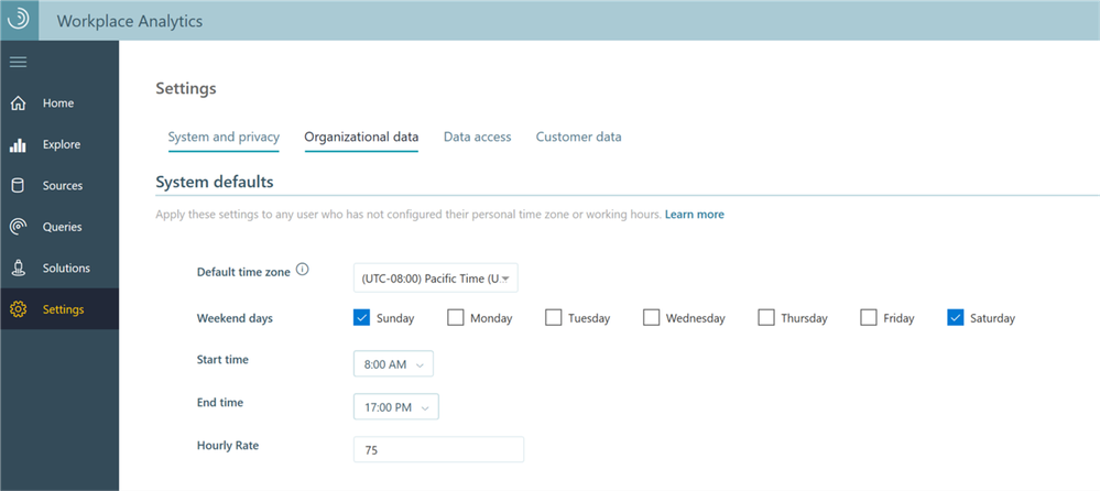
We’d like to announce a new global setting that allows you to change the default hourly rate used across the organization. By using this setting, you can update the hourly rate to reflect your own employee population to get a more accurate view of the cost of low-quality meetings.
To change this default, simply go to the Settings page and change the Hourly Rate setting. In the following illustration, this value is set to $75.00:
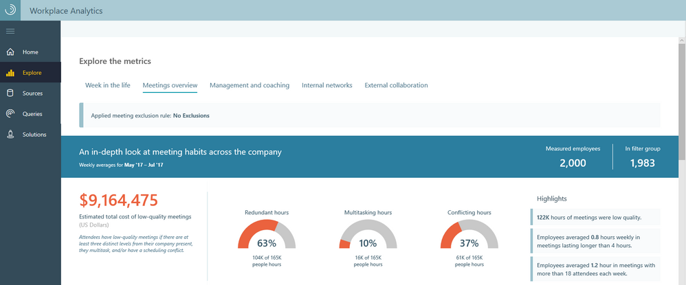
On the Meetings overview tab of the Workplace Analytics Explore page, you can see the total cost of low-quality meetings over a selected period of time, calculated by using the hourly rate that you set:
Manager impact Power BI template
In the September Workplace Analytics blog, we described a new Power BI template that let analysts visualize areas of collaboration overload in their organization. Such a template performs two tasks: it pre-populates a Workplace Analytics query and it selects the proper Power BI charts to display the results of that query.
This month, we are happy to announce the addition of a new Power BI template, Manager Impact. This template shows trends of manager behavior – how managers interact with their teams – within your organization.
Important: To see this info in the Trends overview table in Power BI, the Workplace Analytics admin must include the SupervisorIndicator column in the organizational data file that they upload. For the SupervisorIndicator attribute, indicate the manager status of each employee by using the values IC (individual contributor), Mngr (manager), or Mngr+ (manager of managers). If SupervisorIndicator is excluded, the query still runs and you obtain an OData link to its results, but after you open Power BI, the Trends overview table is blank.
The following section provides a brief description of how to use the Manager impact Power BI template. For more complete instructions, see Power BI templates.
Open the Queries page in Workplace Analytics, select the Manager impact query card, select a rule from the Meeting exclusions list, and select Run. Now, go to the Query > Results page. After the query finishes running, in the row of your query results, select the download icon:
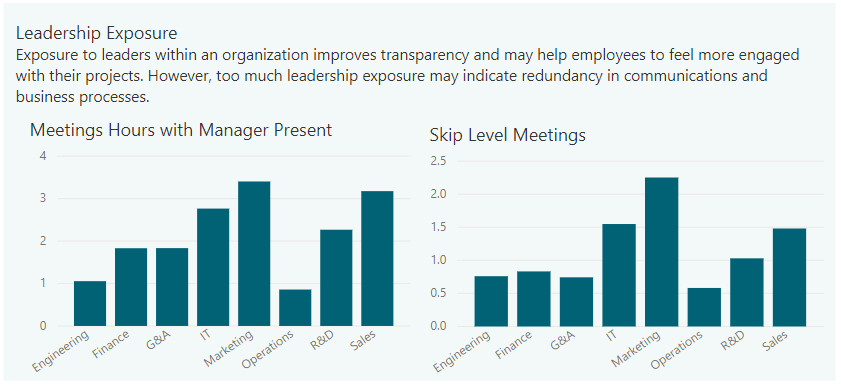
In the pop-up option box, select PBI template and then open the downloaded Power BI template query results file. The results file opens in Power BI. You are prompted to paste the OData link; paste it and then select Load. After the data loads, Power BI provides into manager trends within your organization. Here is an example of what the manager impact template provides:
Chart interactivity improvements
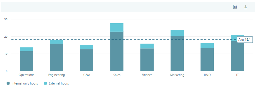
Charts in Workplace Analytics now contain a reference line that displays the average value of a specific metric for the filter group. This is an improvement over the former way that charts displayed this information, namely as a column (the first column) in the chart.
In the following illustration, the dashed line is the reference line:
At the beginning and end of the reference line you’ll find points on which you can hover to see the filter group averages for this metric.
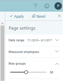
In the Page settings panel on the Explore page, you can use a slider to change the number of displayed groups. This setting applies to all bar charts and box plots in the Explore dashboards.
The following illustration shows this setting at its initial default value of 50 groups:
Please let us know if you have any feedback on the features described in this blog. Stay tuned for feature announcements coming next month!
