This post has been republished via RSS; it originally appeared at: New blog articles in Microsoft Tech Community.
Typical enterprise security operation teams often rely on dependable reporting visualisations to make critical security decisions. While Microsoft Defender ATP provides extensive visibility on the security posture of your organization through built-in dashboards, custom reporting can help you turn security data from multiple sources into insights to meet your analytical needs.
In this blog, we’ll guide you on:
- Gathering and using data available through the Microsoft Defender ATP APIs
- Creating meaningful metrics that will help you monitor specific custom KPIs and help CISOs make better informed decisions through the reporting capabilities built on top of Power BI
Why Power BI?
Power BI is a business analytics service that delivers insights to enable fast, informed decisions. It allows you to:
- Connect to hundreds of sources, prep data with ease, and create beautiful reports, all in minutes.
- Visually explore and analyze all data in one view.
- Collaborate on and share customized dashboards and interactive reports.
- Scale across your organization with built-in governance and security.
For more information, see Why Power BI.
The PowerBI Dashboard that we create will allow us to have a general overview of all onboarded machines, Microsoft Defender ATP sensor health status and location of the device. As a result, you can use this report to get a better understanding of the overall Microsoft Defender ATP health status of your environment.
Define the dataset and queries needed to create suitable Power BI visuals based on the needs of the consumer of the report.
Before you begin
Ensure that you fulfill the prerequisites described here.
Gather data through APIs
There are two ways to get data from the APIs and leverage them within the Power BI report:
- ODATA API queries – More information about this API is available here
- Advanced hunting API – More information about this API is available here
For this dashboard, we’ll use a combination of both API queries to create the dataset we need. For convenience, we’ll be using the Power BI-integrated authentication.
Let’s have a quick look into the queries being used.
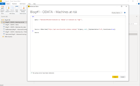
ODATA API query
This query gives us all the machines where the risk state is either medium or high.
Advanced hunting API
Another dataset we’re going to be using is created through an advanced hunting query. Advanced hunting queries are very powerful as they provide access to the data stored in your tenant across the different data entities.
Before you create your report, we recommend that you take time to optimize and tweak your query.
A non-optimized query can result in large data that can cause the query to run a little longer which can have an impact on the refresh time of your report. An example for a non-optimized query could be "MachineInfo | where EventTime >= ago(7d) as this will return a huge amount of data that you won´t need for your report.
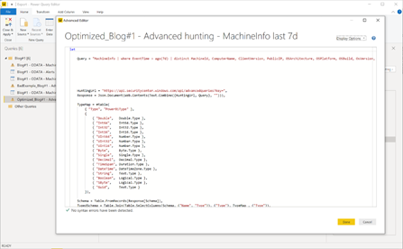
In the example below, we’re scoping the data through the query before it arrives in Power BI which will speed up the time at which data sets are refreshed.
Optimized Query:
"MachineInfo | where EventTime > ago(7d) | distinct MachineId, ComputerName, ClientVersion, PublicIP, OSArchitecture, OSPlatform, OSBuild, OsVersion, IsAzureADJoined, LoggedOnUsers, RegistryMachineTag, MachineGroup",
Take your time and go through the queries and data sources in the example we´ve provided in this blog to familiarize yourself with filter and query techniques.
Generated report based on queries
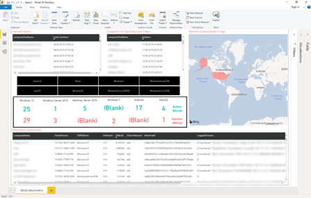
Now let’s have a look into the report – especially the visuals.
For a general computer overview, you might to want to have it plain and simple and not overloaded with other data visualizations. You might be able to a find computer by location.
Slicers are handy in enabling users of the report to quickly filter dashboard information. Users can quickly zone in on a specific set of information by applying the quick filters.
Cards provide the ability to see data related to machines
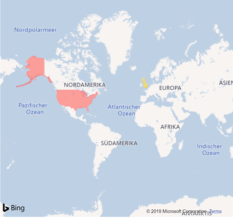
On top we also added a map where you’ll see a visual representation of the location of the computer.
In this specific report we’re leveraging machine tags which contain information about a computer’s location. This tag was set through information we got from the computer’s organisational unit in the active directory.
In one of the next blogs we will explain how to automatically get the location of a computer based on the external IP address.
Conclusion
In this blog post we guided you on how to gather data using two APIs to generate a report that provides a high-level overview of device related data.
We showed you how you can leverage Power BI capabilities to create visualizations and use some of the built-in functionalities to better narrow dashboard results.
We encourage you to start using this example Power BI dashboard to get device relevant data from your Microsoft Defender ATP instance.
We hope it provides an entry point for you to create customized reports and leverage the data that is available in Microsoft Defender ATP.
In the next post we’ll get into more advanced reports and show you how to connect different data sources and external services.
All the content that shared within this blog series will go into our newly created GitHub repository for reporting.
You´ll find the report from this blog here.
