This post has been republished via RSS; it originally appeared at: New blog articles in Microsoft Tech Community.
The Workplace Analytics team is excited to announce our feature updates for November 2019. (You can see past blog articles here). In this update, you’ll discover the latest features, including:
- Power BI – Workplace Analytics connector
- Redesigned Data sources page
- Solutions feature renamed “plans”
Power BI – Workplace Analytics connector
Workplace Analytics has introduced the Power BI-Workplace Analytics connector for the out-of-the-box metrics you see in the Explore dashboards. Analysts can now create their own visualizations on these metrics by bringing them directly into PowerBI.
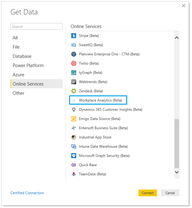
To use the Power BI-Workplace Analytics connector, first start Power BI desktop. Then, select Get Data, select Online Services, select Workplace Analytics, and finally select Connect.
After a connection to Workplace Analytics is established, select your current Workplace Analytics partition, choose the query type, and select OK. You’ll be asked to enter your Office 365 credentials, after which Power BI will display a list of metrics and attributes. You can choose from among these metrics and attributes to visualize data.
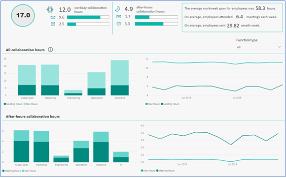
For example, you can generate a bar chart that shows an organization-wide analysis of collaboration hours or examines the meeting-hours trend for an entire organization:
Redesigned Data sources page
The Workplace Analytics Data Sources page has been redesigned. This redesign helps Workplace Analytics users at two different times:
- During onboarding, this page will make it easier for the analyst and admin to understand what data is available to use in analysis, and the quality of that data.
- As part of analysis, this page will make it easier for the analyst to diagnose data-quality-related issues that arise from unexpected query results.
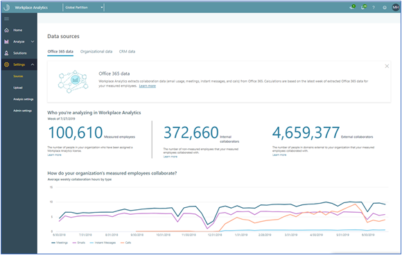
This new page has one tab with information about Office 365 data signals and another tab that shows the quality of the uploaded organizational data. Here is the new Office 365 data tab:
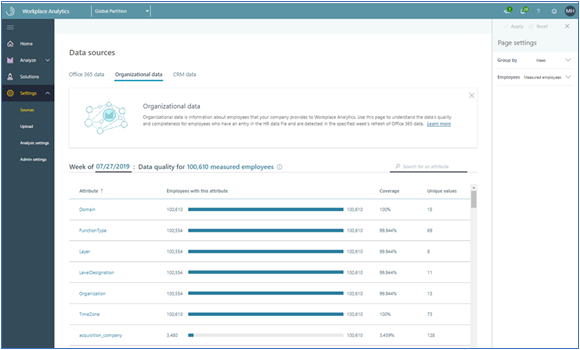
The Organizational data tab has enhanced interactivity with which you can ask more nuanced questions about the quality of your organizational data when you analyze different groups in your organization. For example, you can now examine the data along various dimensions, such as measured employees/internal collaborators, selected date ranges, and filters of organizational data.
The new Organizational data tab
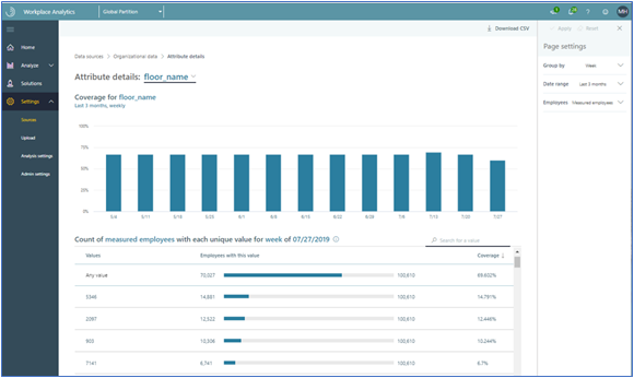
The new Organizational data attribute drill-down view
Solutions feature renamed “plans”
“Plans” is the new name for the “Solutions” feature of Workplace Analytics. The term “Solutions” did not properly convey the feature’s functionality and seemed vague, whereas the term “plan” more clearly portrays the improvement tool that analysts and PMs create. It also better reflects the experience of people who participate in a plan, whether it was launched in Workplace Analytics or in MyAnalytics.
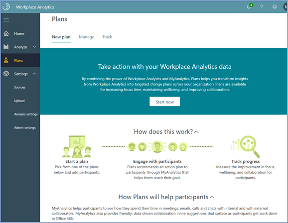
All the functionality of this feature remains the same under the new name. For example, to create a change plan, you first open the Plans page and then the New plan tab:
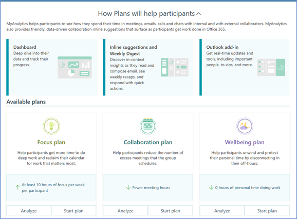
Next, select a plan and follow the steps that are described in the product documentation under Define the plan. This start with investigating (and then, optionally, selecting) a plan in the Available plans panel. The three choices are Focus plan, Collaboration plan, and Wellbeing plan:

