This post has been republished via RSS; it originally appeared at: Microsoft Developer Blogs - Feed.
Surface Duo introduces a whole new class of ultra-portable experiences running on dual screens. Today we are excited to announce our public preview of the SDK for Surface Duo. Xamarin developers can take advantage of the new SDK to enlighten existing apps and create innovative experiences that inspires creativity.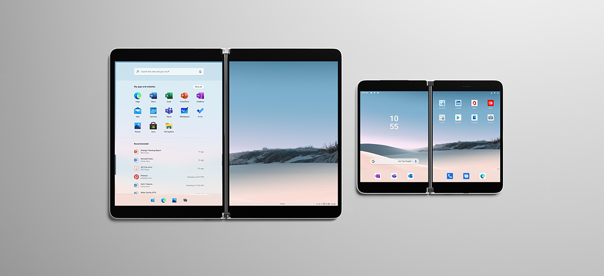
Get Creative with Dual Screen
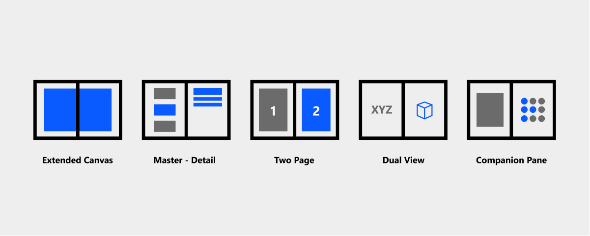
As you look at your current app screens and features, consider the following user experience patterns that might be best suited. By default, your app will run on the left or top screen depending on the orientation of the device. You then want to consider if your app should remain like that or if you could adopt one of these recommended patterns:- Extended Canvas
- Master-Detail
- Two Page
- Dual View
- Companion View
Get Started
Ready to take the Duo for a spin and start creating powerful new app experiences? Download the SDK for Surface Duo and Android emulator today, and then hop over to our array of Xamarin samples on GitHub. The most useful APIs to use today are provided from the ScreenHelper class which will return a Boolean indicating if the device is a Duo.protected override void OnCreate(Bundle savedInstanceState)
{
base.OnCreate(savedInstanceState);
SetContentView(Resource.Layout.activity_main);
screenHelper = new ScreenHelper();
isDuo = screenHelper.Initialize(this);
}
You can also access other helpful features such as rotation, isDualMode, and hinge angle. Check the samples for more info.
Take advantage of this today in Xamarin.Forms with a custom layout. This works in any version of Xamarin.Forms, no updates needed. For this initial launch we’ve created a custom layout dubbed the TwoPaneView that manages both screens, positions content, avoids the hinge area, and reacts to rotation. You can set the behavior of your layout with a simple enum:
public enum DuoSplitPaneBehavior
{
    ShowOnlyLeft,
    ShowOnlyRight,
    ShowBoth,
}
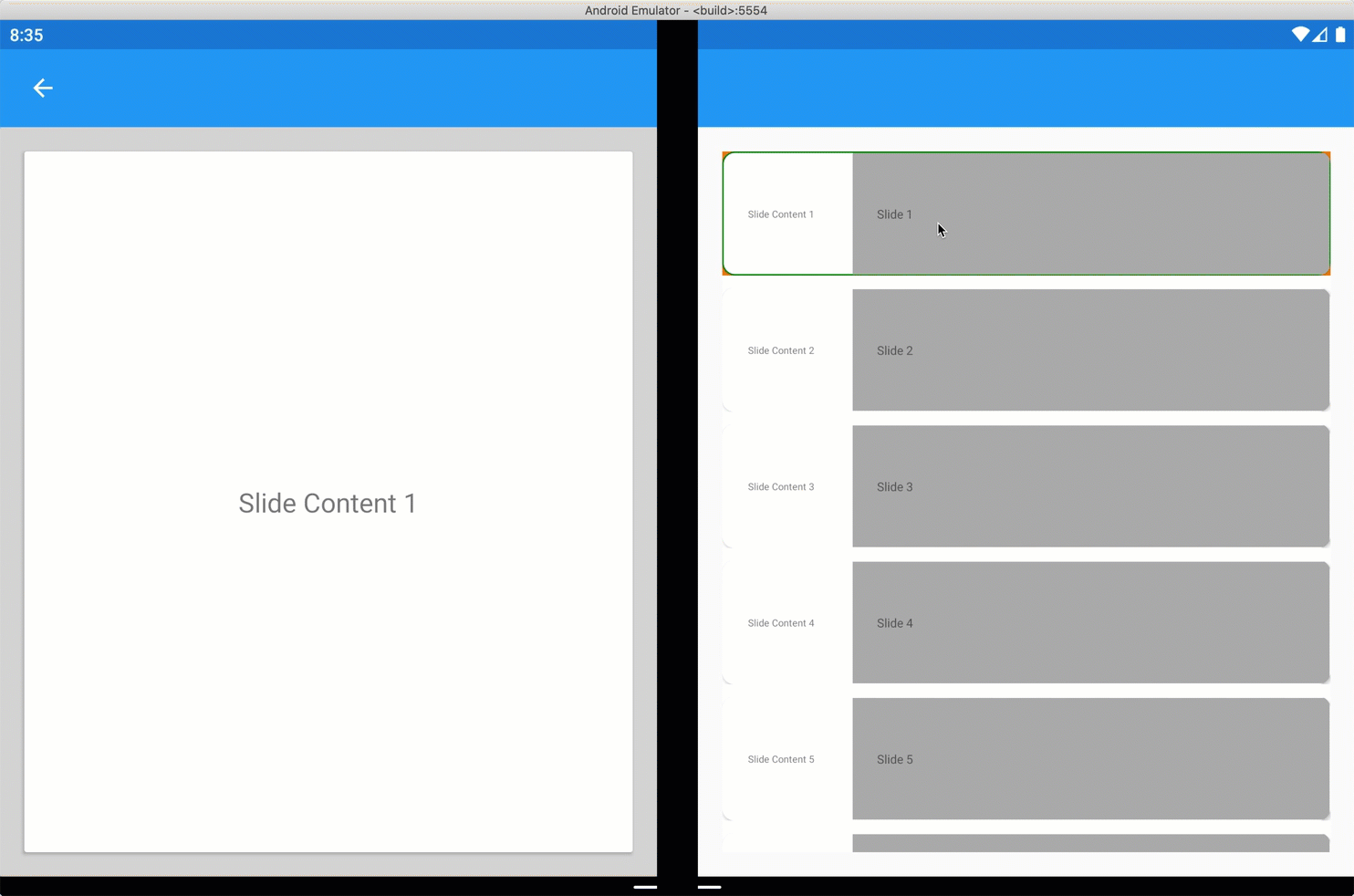
The following custom layout takes two children, one for each pane (or screen). This example shows the companion pane pattern using a TwoPaneView custom layout.
<ContentPage.Content>

    <local:TwoPaneView x:Name="twoPaneView">
        <CarouselView x:Name="cv" BackgroundColor="LightGray" PositionChanged="OnCarouselViewPositionChanged"
                      HeightRequest="{Binding Source={x:Reference mainPage}, Path=FormsWindow.Pane1.Height}">
            <CarouselView.ItemTemplate>
                <DataTemplate>
                    <Frame BackgroundColor="LightGray" Padding="0" Margin="0"
                           WidthRequest="{Binding Source={x:Reference mainPage}, Path=FormsWindow.Pane1.Width}"
                           HeightRequest="{Binding Source={x:Reference mainPage}, Path=FormsWindow.Pane1.Height}">
                        <Frame Margin="20" BackgroundColor="White">
                            <Label FontSize="Large" Text="{Binding ., StringFormat='Slide Content {0}'}" VerticalTextAlignment="Center" HorizontalTextAlignment="Center" HorizontalOptions="Center" VerticalOptions="Center"></Label>
                        </Frame>
                    </Frame>
                </DataTemplate>
            </CarouselView.ItemTemplate>
        </CarouselView>
        <CollectionView x:Name="indicators"
            SelectionChanged="OnIndicatorsSelectionChanged"
            SelectionMode="Single"
            Margin="20, 20, 20, 20"
            BackgroundColor="White"
            ItemsSource="{Binding Source={x:Reference cv}, Path=ItemsSource}">
            <CollectionView.Resources>
                <ResourceDictionary>
                    <Style TargetType="Frame">
                        <Setter Property="VisualStateManager.VisualStateGroups">
                            <VisualStateGroupList>
                                <VisualStateGroup x:Name="CommonStates">
                                    <VisualState x:Name="Normal" />
                                    <VisualState x:Name="Selected">
                                        <VisualState.Setters>
                                            <Setter Property="BorderColor" Value="Green" />
                                        </VisualState.Setters>
                                    </VisualState>
                                </VisualStateGroup>
                            </VisualStateGroupList>
                        </Setter>
                    </Style>
                </ResourceDictionary>
            </CollectionView.Resources>
            <CollectionView.ItemsLayout>
                <LinearItemsLayout Orientation="Vertical" ItemSpacing="10"></LinearItemsLayout>
            </CollectionView.ItemsLayout>
            <CollectionView.ItemTemplate>
                <DataTemplate>
                    <Frame CornerRadius="10" HeightRequest="100" BackgroundColor="White" Margin="0" Padding="1">
                        <StackLayout HorizontalOptions="Fill" VerticalOptions="Fill"  Orientation="Horizontal">
                            <Label FontSize="8" Padding="20,0,20,0" VerticalTextAlignment="Center" WidthRequest="100" Text="{Binding ., StringFormat='Slide Content {0}'}"></Label>
                            <Label FontSize="Micro" Padding="20,0,20,0" VerticalTextAlignment="Center" HorizontalOptions="FillAndExpand" BackgroundColor="DarkGray"  Grid.Column="1" Text="{Binding ., StringFormat='Slide {0}'}"></Label>
                        </StackLayout>
                    </Frame>
                </DataTemplate>
            </CollectionView.ItemTemplate>
        </CollectionView>
    </local:TwoPaneView>

</ContentPage.Content>