This post has been republished via RSS; it originally appeared at: Microsoft Developer Blogs - Feed.
Every new release of Xamarin.Forms contains dozens of improvements. Today, we are thrilled to share that Xamarin.Forms 4.5 is now available bringing you AndroidX, new capabilities for creating responsive UI, and controls "in the box" to speed your development. Let’s look at what is new in Xamarin.Forms 4.5 with several features to get excited about!One: AndroidX
On February 14th, we shared the stable release of the new AndroidX libraries from Google. This new set of libraries replace the Android Support libraries we have all become familiar with. Now in Xamarin.Forms 4.5, use AndroidX by default just like Xamarin.Essentials version 1.5. Delivering both cross-platform UI and platform services together. This requires no change to your code. If you notice any undesirable side-effects, please open an issue here. Be sure to update them both in your projects. Refer to our blog for guidance on migrating your existing apps.Two: VisualStateManager Target
Until now, VisualStateManager has focused directly on the controls to which it is specifically applied. Adding Target to setters provides flexibility to change properties on any control within the visual tree; not just the control the VisualStateManager is attached to. For example, in our XamarinTV sample app there is a video player. The Play button has two states for playing and pausing baked into the ImageButton control.
<BoxView x:Name="Screen" BackgroundColor="Black" Opacity="0.6"/>
<ImageButton x:Name="PlayPauseToggle"
        Source="{StaticResource PauseIcon}"
        Clicked="PlayPauseToggle_Clicked"
        BackgroundColor="Transparent"
        HorizontalOptions="Center"
        VerticalOptions="Center">
    <VisualStateManager.VisualStateGroups>
        <VisualStateGroup Name="PlaybackStates">
            <VisualState Name="paused">
                <VisualState.Setters>
                    <Setter Property="Source" Value="{StaticResource PlayIcon}"/>
                    <Setter TargetName="Screen" Property="BoxView.Opacity" Value="0.9"/>
                </VisualState.Setters>
            </VisualState>
            <VisualState Name="playing">
                <VisualState.Setters>
                    <Setter Property="Source" Value="{StaticResource PauseIcon}"/>
                    <Setter TargetName="Screen" Property="BoxView.Opacity" Value="0.6"/>
                </VisualState.Setters>
            </VisualState>
        </VisualStateGroup>
    </VisualStateManager.VisualStateGroups>
</ImageButton>
To trigger the change between states you write code to do this explicitly.
VisualStateManager.GoToState(PlayPauseToggle,
    (e.State == MediaElementState.Playing)
    ? "playing"
    : "paused");
Even with triggering the state change on the button, by using the TargetName to address the BoxView behind it, we can also change the opacity of that control. Check out our previous blog post on using this new feature, as well as the resources below.
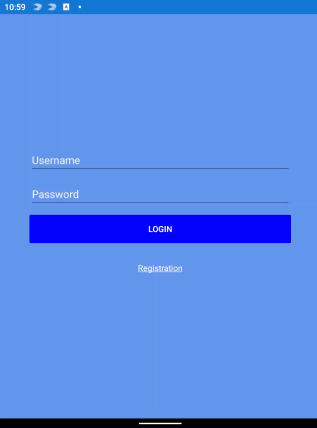
Three: Shell Modals
Whether you are using tabs or a fly-out menu, Shell is the easiest way to get started with your cross-platform mobile application. A favorite aspect of using Shell is the URI based navigation service that is omnipresent. Now, the ability to display modal pages uses that very same URI method. By using the new Shell.PresentationModel attached property, can describe your intention for any page you want to present as a modal.<ContentPage x:Class="RegistrationModal" Shell.PresentationMode="ModalAnimated">
// your content
</ContentPage>
Since this page is not part of your primary navigation, it has no route defined in AppShell.xaml. In order to navigate to that page, register a route for it that can then reference your GotoAsync call.
The following is equivalent to Navigation.PushModalAsync(new RegistrationModal()).
Routing.RegisterRoutes("registration", typeof(RegistrationModal));
Shell.Current.GoToAsync("//login/registration");
Four: PlatformSpecifics
Thanks to Xamarin.Android, Xamarin.iOS, and Windows, a major advantage to using Xamarin.Forms is easy access to native platform UI. When possible, we bring common concepts into alignment and provide a cross-platform API. When things don’t align, it sometimes makes more sense to provide something specific to the platform it applies to. In 4.5 we have a handful of those. Special thanks to Joe Manke and Andrei Misiukevich for their contributions!- iOS platform-specific: DatePicker UpdateMode
- iOS platform-specific: TimePicker UpdateMode
- iOS platform-specific: VisualElement first responder
- iOS platform-specific: TabbedPage translucent tab bar
- Windows platform-specific: Image location
Five: Features in Preview
While we are working through stabilizing new features and controls, it is extremely helpful to package them into stable releases. Then enabling you to opt-in by setting convenient feature flags. Such is the case for several new controls. Get a complete list of flags from our source code here. Please share your experiences by reporting any issues. Before proceeding, be sure to add the flags to your App.xaml.cs constructor.Xamarin.Forms.Device.SetFlags(new List<string>() {
"StateTriggers_Experimental",
"IndicatorView_Experimental",
"CarouselView_Experimental",
"MediaElement_Experimental"
});
CarouselView and IndicatorView
We are continuing to work through feedback on CarouselView and IndicatorView. As we do, the list gets shorter! Sure, we could keep things in preview or beta for a year, but your feedback has shown us that these controls are useful today. In addition to general improvements, we have changed the way you connect the controls together. To make this connection, you now reference the name of your IndicatorView from the CarouselView .<CarouselView IndicatorView=”MyIndicators”>…</CarouseView> <IndicatorView x:Name=”MyIndicators”/>The carousel also has implemented four visual states to make it easier to style. The following represent the visual state for:
- CurrentItem - currently displayed item.
- PreviousItem - previously displayed item.
- NextItem - the next item.
- DefaultItem - remainder of the items.
SwipeView
Reveal contextual content when swiping in specific directions by wrapping any control with a SwipeView. The community has been very inspired by this control and have been using it in many different ways! We are working hard to stabilize this control by implementing many requested improvements.StateTriggers
We have added state triggers in support of new dual-screen experiences, the new MediaElement, and generally to be more useful.- Adaptive Trigger (PREVIEW) - reacts to changes in the width and height of an application window.
- Compare Trigger (PREVIEW) - occurs when two values are compared.
- Device Trigger (PREVIEW) - occurs when running on the specified device.
- Orientation Trigger (PREVIEW) - occurs when the device orientation changes.
MediaElement
Brand new in this release is MediaElement, a base control for playback of audio and video. See this control featured in our XamarinTV sample app, which was featured during the Microsoft Surface Dual-Screen live event from Redmond. The control is extremely easy to use! Add the control to your layout, then set the source to any secure media URI.<MediaElement Source="http://sec.ch9.ms/ch9/5d93/a1eab4bf-3288-4faf-81c4-294402a85d93/XamarinShow_mid.mp4" />Let the native platform present the playback controls, or provide your own to achieve just the right desired user experience. This is a powerful control and we will be sharing more details in the future.