This post has been republished via RSS; it originally appeared at: New blog articles in Microsoft Tech Community.
Many people are being asked to work in new and different ways as they are now working remotely. This has been driving a renewed interest in understanding how people are using Microsoft 365. We hear that you want to learn if people are saving content to SharePoint and OneDrive, if more are using Microsoft Teams for chat and online meetings, and how email usage is trending. You also tell us that you want to get the most out of your Microsoft 365 by seeing if people taking full advantage of the services for which they are enabled.
The usage reports in the Microsoft 365 Admin Center can help answer these questions and many others. These reports cover Microsoft Teams, OneDrive, SharePoint, Exchange, Yammer, and many more solutions for 7, 30, 90, and 180 day periods. To learn more about all the available reports and the permissions you need to view them, click here.
While these reports can help, we know that that you need additional usage information in this time of change. To help, we are adding new data points to some of the reports and releasing a new report to better help you see Microsoft 365 app (formerly Office 365 ProPlus) usage. We are also adding a new card to the homepage to assist you in understanding the use of solutions that contribute to remote work.
Understanding usage trends in remote work scenarios
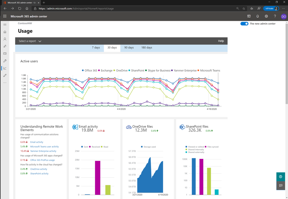
Out of all the feedback we have received over the past few weeks, the most requested information has been around understanding how people are working remotely. . This means that we can’t tell you if what they are doing is different because of where they are. However, the use of specific solutions and activities like using Teams to schedule . To help you understand these elements of remote work, a new card is available on the usage reports homepage. This card shows you the usage change in communication solutions, Microsoft 365 apps, and file activity in the cloud. The time frame you select at the top of the dashboard is used to compare the same number of days preceding it. For example, if you have chosen the seven day view on April 14th, it compares the activity of the past seven days (April 8 - April 14) with the seven days before that (April 1 - April 7) and show you the increase or decrease in usage.
What Microsoft 365 apps people are using
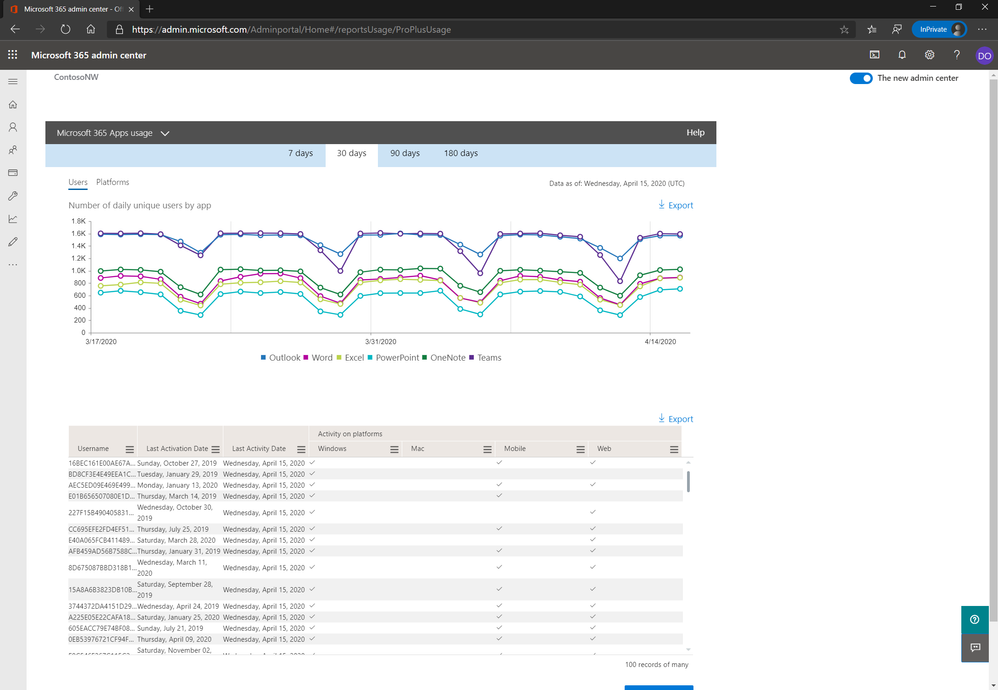
We have also heard that you want to better educate people on the benefits of Microsoft 365 apps that are not being used broadly and to make sure each user persona has the right apps for their job wherever they are working. This has been difficult as reports for apps like Outlook, Word, Excel, PowerPoint, and OneNote have focused on activations, not usage. Effective today, you can now see this with the new Microsoft 365 apps usage report. This report helps you better understand which apps people are using and on what platforms. The report has a line graph at the top with two pivots. The first pivot shows the number of daily users by app, and the second shows the number of users by platform. Under the graph, you see the user level details of what apps and the platforms they are being used on. To learn more, check out the documentation here.
Getting a better view of calendar activity
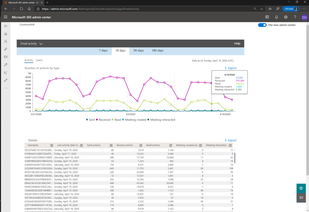
In the Exchange email activity report, you get a summary view of email traffic and user-level details of email activity. This is great to help understand if people are sending, receiving, and reading emails, but your feedback tells us that this is not showing the full picture of activity in Exchange. You want to see meetings and appointment usage data too. This is why we have added information on two new actions: Meeting Created and Meeting Interacted. The Meeting Created action measures meetings sent and appointments created. Meeting Interacted includes data on how people are accepting, declining, and marking meetings as tentative. These two additions give you a more holistic view of the activity within . To learn more, review the documentation here.
Understanding how usage is trending across Microsoft 365 services
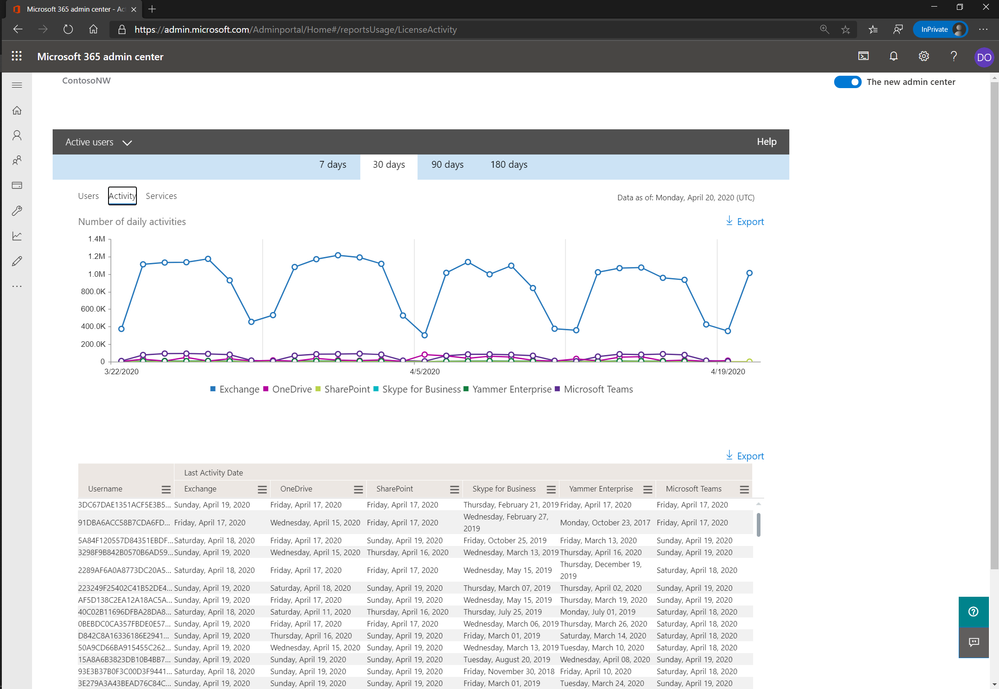
Moving beyond email and calendaring, we heard you wanted to see the total activity volume across Microsoft 365 services. As the line between home and work time is blurring, we understand your need to see if people are doing more. The Office 365 Active Users report shows the number of daily active users in Office 365 services like Teams, SharePoint, Exchange, and OneDrive. To make it easier for you to see both sets of data, the Office 365 Active Users report now includes the activity volume information. You can see this in a new pivot to the graph. Click “Activity” in the upper left of the chart to see this new graph. If you want to learn more about the report, click here.
Let us know what will help
Considering all the changes in how people are now working, we would like to hear from you on e hear that Teams and Exchange data is the most critical to have, and you need it faster. We are aiming to streamline our data processing so we can deliver reports for these solutions in under 24 hours. Organizations have also told us that they want to understand when peak usage of the services is happening, so we are looking into how we can deliver that data. If you like these ideas or want to share your thoughts on what you need, please let us know in the comments below.
