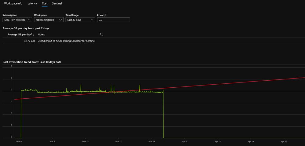
From the above screenshot you can see you can select your Subscription and Workspace(s). You also have the ability to provide a price (see the tool tip as you hover your mouse over the icon, above that field for details).
The first part of the report, shows a Workspace or many if you select <unset> in the workspace drop-down.
This report is using Azure resource Graph (ARG) data, so it retrieves data like the retention and licence used. You can also see (if known) who last set the licence and what licence scheme you’re on. If you have Sentinel assigned to the the workspace, you can probably adjust your retention from 30days to 90days for free, so I make a note of that. Please do check before you make changes.
Download and Install:
Please download the Workbook from my Github (v1.0) read the import instructions here readme
- v1.1 Added Events Per Second (eps) info
- Please look in the Github (above) for other versions
- …
- v1.4 Added Checks Tab for Daily, Weekly and Monthly suggested checking routines. Thanks to Rob Trent, the Workbook aligns to his and the community suggested checks, Daily, Weekly & Monthly https://secureinfra.blog/2020/03/19/suggested-daily-weekly-and-monthly-tasks-for-azure-sentinel/
Tab 1: Workspace Info
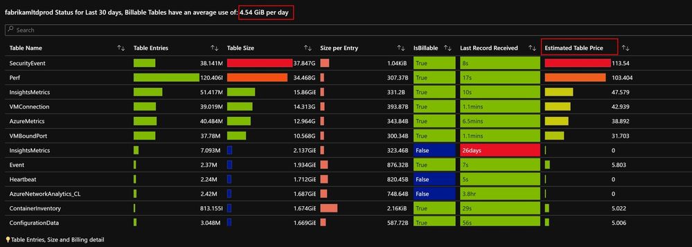
The report then shows all the Tables you have (and a daily average in the the chart title). the ‘Estimated Table Price’ will only have data if you put in value – in the [price] field.
Next I have included the Table Size and Table entries reports from another workbook. These are useful to see any pattern changes over the time period.
Tab 2: Latency
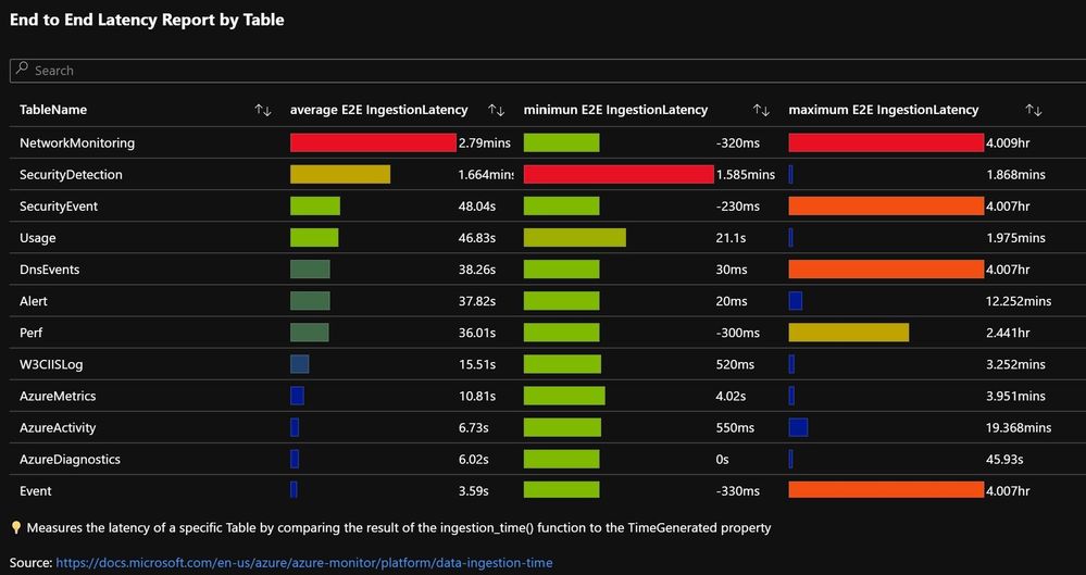
The latency report is similar to the info one in Tab1. Here I show the Average, Minimum and Maximum latency information for each Table. You can press the column heading to sort the results.
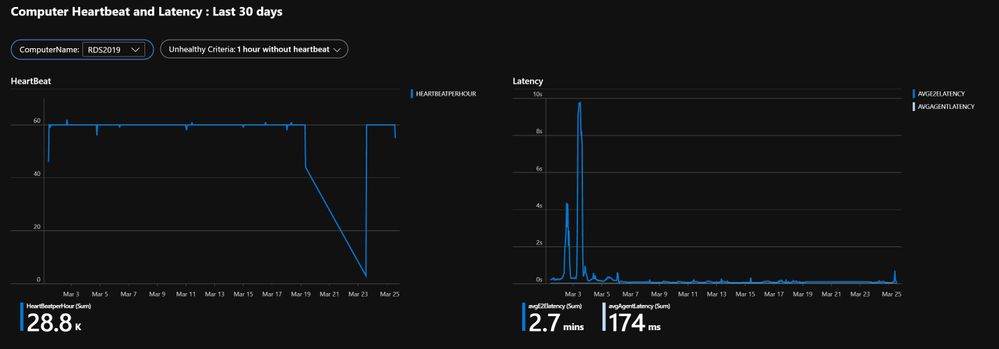
Next we show (please select a Computer from the list), this shows it’s Heartbeat data, this view is based on the default Agent Health workbook (see Azure Monitor Workbooks), but in the right-hand graph this shows the latency info, for both the Computer and the Agent (they can be different)
Tab 3: Costs
This tab, as the name suggests give you some other insights into Costs, the first graph is a capacity trend, projecting forward 30days to give you a hint as to the ingestion trajectory you are on.
Note: the longer time span you select the better the slope will be, 30days+ ideally, however its a slow query and longer time span will slow it down more!
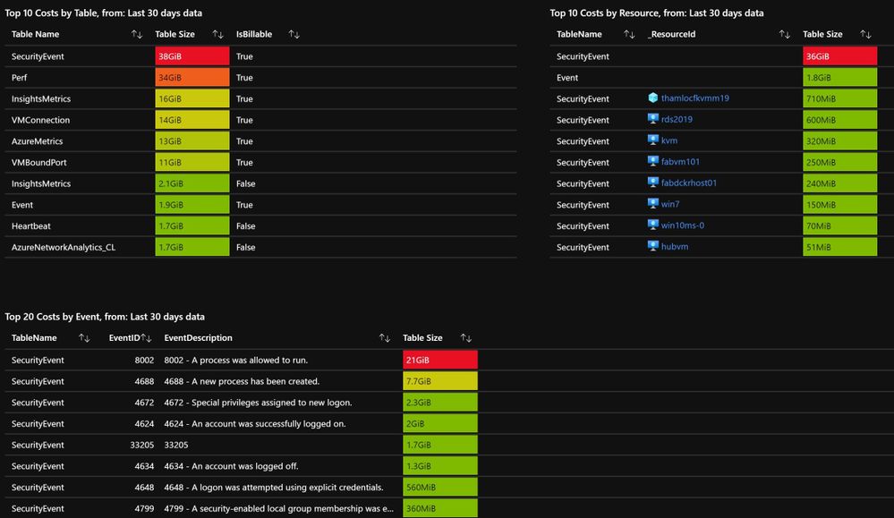
The next three graphs, breakdown Top 10 costs by Table and by Resource, as well as Top 20 cost per EventID. These can be very useful to spot a busy Computer or EventID that you may have.
Would a filter to select the Top 10, 20 or 30 be useful?
Tab 4: Sentinel
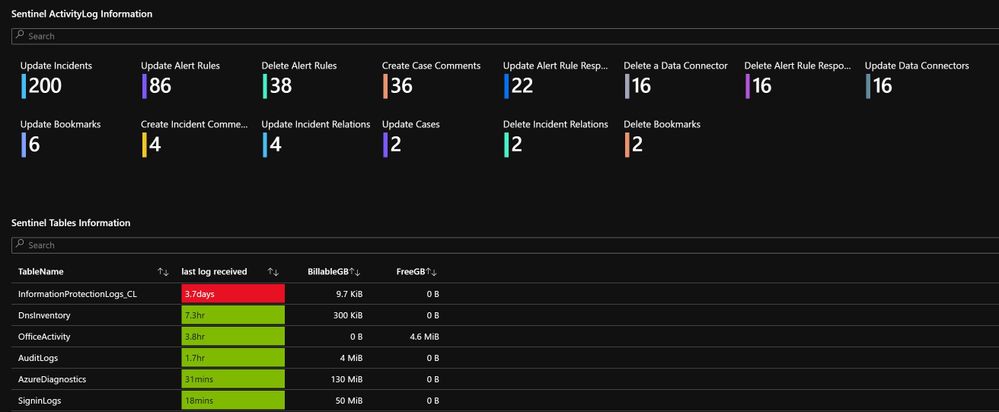
This tab, shows some details from Azure Activity logs as a tile view. The bottom graph just shows specific Tables that Sentinel uses in the Log Analytics workspace.
Summary:
This workbook has been many months in the making, and thanks to many people for testing and suggesting features.
