
This post has been republished via RSS; it originally appeared at: Microsoft Research.
Is FashionMNIST, a dataset of images of clothing items labeled by category, more similar to MNIST or to USPS, both of which are classification datasets of handwritten digits? This is a pretty hard question to answer, but the solution could have an impact on various aspects of machine learning. For example, it could change how practitioners augment a particular dataset to improve the transferring of models across domains or how they select a dataset to pretrain on, especially in scenarios where labeled data from the target domain of interest is scarce.
In our recent paper, “Geometric Dataset Distances via Optimal Transport,” we propose the Optimal Transport Dataset Distance, or the OTDD for short, an approach to defining and computing similarities, or distances, between classification datasets. The OTDD relies on optimal transport (OT), a flexible geometric method for comparing probability distributions, and can be used to compare any two datasets, regardless of whether their label sets are directly comparable. As a bonus, the OTDD returns a coupling of the two datasets being compared, which can be understood as a set of soft correspondences between individual items in the datasets. Correspondences can be used to answer questions such as the following: Given a data point in one dataset, what is its corresponding point in the other dataset? In this post, we show the distances and correspondences obtained with our method for five popular benchmark datasets and give an overview of how the OTDD is computed, what it has to do with shoveling dirt, and why it’s a promising tool for transfer learning.
Why is measuring distance between labeled datasets hard?
Comparing any two distinct classification datasets, like the datasets of clothing and handwritten digits mentioned above, poses at least three obvious challenges:
- They might have different cardinality, or number of points.
- They might have different native dimensionality (for example, MNIST digits are 28 × 28 pixels, while USPS digits are 16 × 16).
- Their labels might correspond to different concepts, as is the case with FashionMNIST and MNIST and USPS—fashion items versus digits.
Note the first two challenges are also applicable to unlabeled datasets, but the third challenge—which, as we’ll see below, is the most difficult—is specific to labeled datasets.
Intuitively, the number of examples should have little bearing on the distance between datasets (after all, whether MNIST has 70,000 points or 30,000, it’s still essentially MNIST). We can enforce this invariance to dataset size by thinking about datasets as probability distributions, from which finitely many samples are drawn, and comparing those instead. Similarly, the dimension of the input should not play a major role—if any—in the distance we seek. For example, the essence of MNIST is the same regardless of image size. Here, we’ll assume that images are up- or down-sampled as needed to make images in the two datasets being compared the same size (we discuss how to relax this in the paper).
The last of these challenges—dealing with datasets having disjoint label sets—is much harder to overcome. Indeed, how can we compare the category “shoe” from FashionMNIST to the “6” category in MNIST? And what if the number of categories is different in the two datasets? For example, what if we’re comparing MNIST, which has 10 categories, to ImageNet, which has 1,000? Our solution to this conundrum, in a nutshell, relies on representing each label by the collection of points with that label and, as is the case with enforcing invariance to dataset size, formally treating the collections as probability distributions. Thus, we can compare any two categories across different datasets by comparing their associated collections—understood, again, as probability distributions—in feature space, which also then allows us to extend the comparison across the entire datasets themselves.
The approach we’ve sketched so far banks on being able to compute distances between two different kinds of probability distributions, those corresponding to the labels and those corresponding to the entire datasets. In addition, ideally, we need to do this calculation in a computationally feasible way. Enter optimal transport, which provides the backbone of our approach.
Optimal transport: Comparing by ‘transporting’
Optimal transport traces its roots back to 18th-century France, where the mathematician Gaspard Monge was concerned with finding optimal ways to transport dirt and rubble from one location to another. Let’s consider an individual using a shovel to move dirt, a simplified version of the scenario Monge had in mind. By his formulation (below), each movement of the shovel between two piles of dirt carries a cost proportional to the distance traveled by the shovel multiplied by the mass of dirt carried. Then, the total cost of transporting dirt between the piles is the sum of the cost of these individual movements.
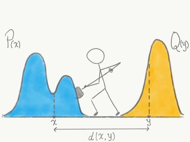
But what does dirt and shoveling have to do with statistics or machine learning? As it turns out, the intuitive framework devised by Monge provides an ideal formulation for comparing probability distributions. Let us think of probability density functions as the piles of dirt, where the “height” of the pile corresponds to the probability density at that point, and shoveling dirt between the piles as moving probability from one point to another, at a cost proportional to the distance between these two points. Optimal transport gives us a way to quantify the similarity between two probability density functions in terms of the lowest total cost incurred by completely shoveling one pile into the shape and location of the other.
Formally, the general optimal transport problem between two probability distributions \(\alpha \) and \(\beta\) over a space \(\mathcal{X}\) is defined as:
\(\min_{\pi \in \Pi(\alpha, \beta) } \int_{\mathcal{X} \times \mathcal{X}} d(x,x’)\text{d}\pi(x,x’)\)
Here \(\pi\) is a joint distribution (formally, a coupling) with marginals \(\alpha \) and \(\beta\). When the cost \(c(x,y)\) is taken to be the distance \(d(x,x’) = \| x – x’ \|^p\), the value of this problem is known as the p-Wasserstein distance, and it’s denoted by \(\text{W}_p\).
Distances between feature-label pairs
Using optimal transport to compare two probability distributions requires defining a distance between points sampled from those distributions. In our case, in which we’re comparing two datasets, each point \(z\) is a pair comprising a feature vector—an image for the datasets discussed here—and a label. So we need to be able to compute a distance between, let’s say, the pair (\(x\),“six”), where \(x\) is an image of a “6” from MNIST, and the pair (\(x’\),“shoe”), where \(x’\) is an image of a shoe from FashionMNIST. The first part is easy: We can compute distances between the images using various standard approaches. Defining a distance between their labels is, as we discussed earlier, much more complicated. But is it worth it? What happens if we ignore the label and just use the features to compute the distance? The visualization below shows what could go wrong. Ignoring the labels might lead us to believe two datasets are very similar when in fact, from a classification perspective, they’re quite different.
How important is it to use labels when comparing classification datasets? This interactive visualization shows it is indeed crucial when determining dataset similarity. Two datasets with similar shapes in feature space can be very different from a classification perspective if their labels (depicted in blue and green) are randomly flipped. Slide the scroll bars associated with each dataset left and right to rotate the point cloud datasets and to shuffle their labels; the coupling and OT and OTDD will respond to the change. Rotating the datasets has a similar effect on the distance obtained via normal OT and the OTDD, but shuffling the labels causes the value of the OTDD to increase much more than that of normal OT.
Since taking into account the labels of the points seems crucial, then how should we go about defining a distance between them? Earlier, we hinted at our proposed solution: We’ll represent labels as conditional probability distributions \(P_y = P(X|Y=y)\) and compute a distance between those. And here, too, optimal transport comes to our rescue—we can use it to compute these distances!
\(d(z,z’) = \left( d(x,x’)^2 + \text{W}_2(P_y,P_y’)^2 \right)^{\frac{1}{2}} \)
And in turn, thanks to optimal transport, we also have a distance between distributions over feature-label pairs—that is, datasets—which is our Optimal Transport Dataset Distance:
\(\text{OTDD}(\mathcal{D}_A, \mathcal{D}_B) = \min_{\pi \in \Pi(P_A, P_B ) } \int_{\mathcal{Z} \times \mathcal{Z}} d(z,z’)\text{d}\pi(z,z’) \)
A high-level visual summary of the OTDD is shown in the animation at the top of the post; its application in the case of five specific datasets is demonstrated in the visualization below, which provides some insight into our opening question: Is FashionMNIST more similar to MNIST or to USPS? The first pane of the visualization shows the distances between every choice of two datasets; lower numbers and lighter shades of blue represent more similarity. FashionMNIST is actually closer to USPS than to MNIST in terms of the OTDD. In the paper, we discuss in detail how to make the computation of the OTDD feasible and efficient, even for very large datasets.
The first pane shows the OTDD between five popular benchmark datasets; lower numbers and lighter shades of blue represent more similarity, while higher numbers and darker shades represent less. Select a dataset pair in the first pane to visualize the embeddings of those two datasets and the optimal transport coupling between them. Hovering over the embeddings shows the image represented by a given embedding point and its “best match” in the other datasets according to the OTDD.
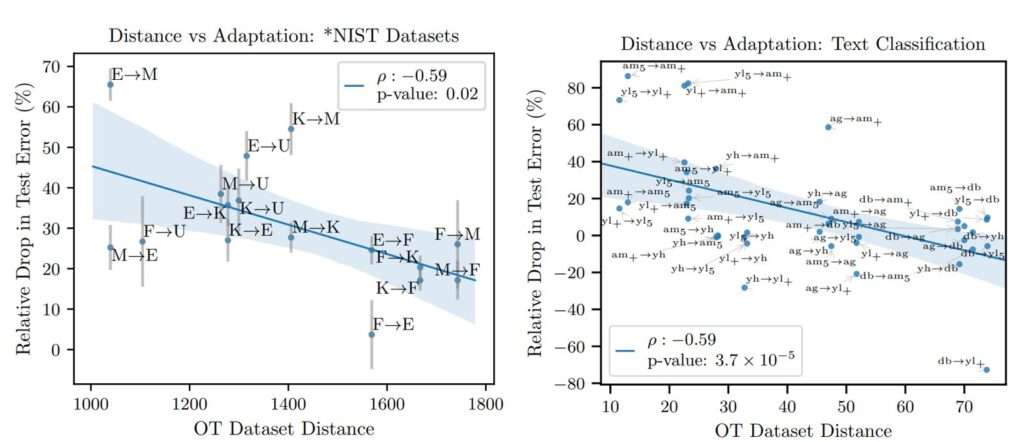
OTDD predicts pretraining transferability
One of the key observations in the paper is that the notion of distance we propose is highly predictive of transferability across datasets—that is, how successful training a model in one dataset and then fine-tuning it in a different dataset will be. We demonstrate this across various datasets and data types, such as image and text classification (below figures). This is remarkable because it suggests that our approach could be used to select which dataset to pretrain on by choosing the “closest” one, in terms of OTDD, to the target dataset of interest.
OTDD can tell you how to augment your dataset
Most state-of-the-art methods for image classification involve pretraining on a large-scale source dataset enhanced with some form of data augmentation, such as adding rotated or cropped versions of the images. Choosing the most beneficial transformation is hard and often involves expensive repeated training of large models. Another takeaway from the paper is our tool can inform this decision too, by estimating which transformations bring the source data closer, in the OTDD sense, to the target dataset of interest.
As an example, the visualization below shows how two components of the OTDD’s inner workings—label-to-label distances and optimal coupling—change as we modify MNIST through cropping and rotating while leaving USPS fixed.
How does transforming MNIST affect its similarity to USPS? Select a type of transformation to see how it modifies MNIST and the effect it has on the label-to-label distances and correspondences (coupling) computed by the OTDD to estimate its distance to USPS. For example, cropping the digits in MNIST leads to correspondences that are more coherent across corresponding digit classes, while rotating the digits has the opposite effect.
And how does the resulting distance relate to the quality of the augmentation in terms of its benefit to transfer learning? To test this, we generated multiple versions of MNIST using various types of transformations, computed the distance between them and USPS, and separately computed the increase in classification accuracy obtained by pretraining on any of the transformed MNIST datasets and fine-tuning and testing on USPS. The visualization below shows samples from the transformed datasets and demonstrates that, again, the OTDD is highly correlated with transferability.
How does transforming MNIST affect the transferability of a classifier trained on it and fine-tuned on USPS? Select a type of transformation to see how it affects the transferability (measured as accuracy improvement) and the OTDD between the transformed MNIST and USPS. The scatter plot shows the transformations that lead to the best transferability are precisely those that reduce the OTDD the most. The strong correlation between these two quantities suggests the OTDD could be used to predict transferability success.
In the paper, we present additional experiments with augmentations on ImageNet, for which we observe similarly encouraging results.
Moving forward with the OTDD
Throughout this post, we’ve seen how ideas originating from a need to efficiently transport dirt and rubble across different locations can be used to compare seemingly incomparable classification datasets, yielding a promising tool for guiding transfer learning and data augmentation. Besides these two tasks, we foresee significant potential benefits in its use within meta-learning to assess—and therefore leverage—task similarity in the learning process. We’re also interested in going beyond static comparison of datasets, as we’ve discussed here, and using the OTDD dynamically to sequentially modify one dataset, for example, to achieve a desired similarity to another relevant dataset of interest.
The post Measuring dataset similarity using optimal transport appeared first on Microsoft Research.