This post has been republished via RSS; it originally appeared at: Windows Blog.
I’m excited that you’re here to learn about what we’ve been doing to further improve Microsoft Edge and Bing! In my last post we announced our new sleeping tabs feature and I’m happy to share initial findings from our latest Beta build that a sleeping tab increases battery life by using 26% less CPU on average compared to a non-sleeping tab, and also reduces memory usage by 16% on average. This is great news for all you gamers and tab-hoarders out there! More exciting things are in the works for you later this year. Last month we also announced beautiful new themes for Microsoft Edge and I love to hear that Halo, Satin Stacks and Wandering Fields are the top fan favorites. This month we’re excited to start to apply our modern design principles to Microsoft Bing with new experiences that are visually immersive, and which help you find the information you are looking for faster. For those who already have Microsoft Edge installed, launch it and check it out. If you’re on a Mac or mobile device download it and let us know what you think! Without further ado, here’s what’s new in Microsoft Edge and Bing this month.Make the most of your time online
Move your tabs to the side with vertical tabs in Microsoft Edge I’ll admit it, I’m a tab hoarder. I like to have several tabs open at once to keep the right information at my fingertips. News sites, work reports, metrics dashboards, marketing plans – all of these help me stay on top of my life and work, but at some point I have so many open that it becomes hard to find the tab I need. To make tab management and organization easier, vertical tabs is now generally available this month. Now everyone can view and manage their tabs from a pane on the side with a single click. This allows you to clearly see the tab titles and controls, making it easier to find and switch between the tabs you need, regardless of how many you have open. Pair this with sleeping tabs and you get a browser built for more performance at lower power! To get started, click on the vertical tabs icon in the upper left corner of your browser frame. Read more about how our teams created vertical tabs and get a behind-the-scenes look into the user research and design that inspired features like vertical tabs and tracking prevention.
Get an easier way to view and manage your history in Microsoft Edge
I’ll admit it, I’m a tab hoarder. I like to have several tabs open at once to keep the right information at my fingertips. News sites, work reports, metrics dashboards, marketing plans – all of these help me stay on top of my life and work, but at some point I have so many open that it becomes hard to find the tab I need. To make tab management and organization easier, vertical tabs is now generally available this month. Now everyone can view and manage their tabs from a pane on the side with a single click. This allows you to clearly see the tab titles and controls, making it easier to find and switch between the tabs you need, regardless of how many you have open. Pair this with sleeping tabs and you get a browser built for more performance at lower power! To get started, click on the vertical tabs icon in the upper left corner of your browser frame. Read more about how our teams created vertical tabs and get a behind-the-scenes look into the user research and design that inspired features like vertical tabs and tracking prevention.
Get an easier way to view and manage your history in Microsoft Edge
 We’ve heard feedback that many of you are missing the Hub experience from our legacy version of Microsoft Edge. Hub allowed you to view and manage your favorites, history and more directly from a pane on the side. This month, we’re excited to bring a more efficient way for you to quickly access and manage your history without losing context of the page you’re on. Now when you go to history, it will open as a lightweight dropdown from the toolbar instead of opening the full page view in settings. This means that you can easily search, open and manage your history without navigating away. If you want it to stay open, you can pin it to the side. Go to “…” and select History or use the keyboard shortcut CTRL + H to try it out.
Find information fast with new modern Microsoft Bing experiences
At Microsoft Bing we're looking for ways to give you back time so you can focus on the things that really matter. We’re also looking for ways to move thoughtfully beyond a list of links, to a world of search results that seamlessly combine information with visually rich imagery in a single beautiful view. With that in mind, we’re excited to announce several new search experiences that quickly deliver information in a way that’s intuitive and engaging. The result is a visually rich format that allows you to quickly find what you are looking for without having to sift through large blocks of text. These new features are just the beginning as we look to evolve the search experience across all of Microsoft Bing! https://youtu.be/bOezBKQm6GQ Get inspired with intuitive, interactive Bing search results One of our goals is to deliver a search experience that moves beyond a static set of results. One way we’re doing so is by updating our search result pages so that they adapt to intuitively highlight the content you’re engaging with as you go.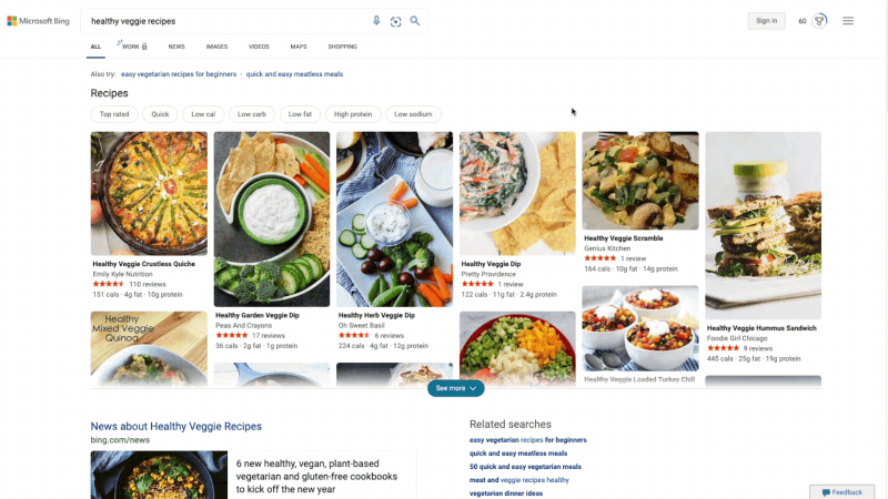 For instance, with more people cooking from home, we’ve heard many mention that they are overwhelmed by the sheer amount of recipe options online, and frustrated by recipes hidden below long introductions and ads. To help with that, we’ve released an updated recipes experience that extracts and aggregates the most relevant recipes content and presents it in a single view on the search results page.
This view shows recipe pictures along with high-level information like calories per serving and user reviews. If a recipe includes a how-to video, we’ll show that as part of the answer, and it will play if you hover over it. Seamlessly click from one recipe to the next and see them expand inline so you don't have to bounce from page to page. The expanded view shows more information such as: an ingredient list and possible substitutions for when you don’t have everything on hand, a drop-down menu for you to scale the recipe to a certain number of servings, and nutritional information. You can see this feature for yourself with queries like “fish tacos recipes” or “easy mac and cheese recipes” to see how it can help you quickly decide on a recipe and get right to cooking.
For instance, with more people cooking from home, we’ve heard many mention that they are overwhelmed by the sheer amount of recipe options online, and frustrated by recipes hidden below long introductions and ads. To help with that, we’ve released an updated recipes experience that extracts and aggregates the most relevant recipes content and presents it in a single view on the search results page.
This view shows recipe pictures along with high-level information like calories per serving and user reviews. If a recipe includes a how-to video, we’ll show that as part of the answer, and it will play if you hover over it. Seamlessly click from one recipe to the next and see them expand inline so you don't have to bounce from page to page. The expanded view shows more information such as: an ingredient list and possible substitutions for when you don’t have everything on hand, a drop-down menu for you to scale the recipe to a certain number of servings, and nutritional information. You can see this feature for yourself with queries like “fish tacos recipes” or “easy mac and cheese recipes” to see how it can help you quickly decide on a recipe and get right to cooking.
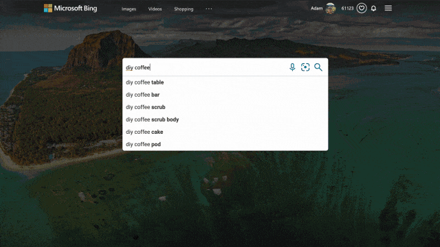 We applied similar principles to search results for those looking to catch up on home improvement or for creative projects to do with their kids. Search for things like “DIY coffee table” and “vegetable garden ideas,” and you’ll get a rich view of results that can serve as a starting point for your inspiration. From there you can click an idea that catches your eye to visit its home site for more details, save it for later, or find other similar suggestions or ideas!
While exploring these visual results, you might see something you like but that’s difficult to describe with words. That’s why we’ve also integrated visual search into the experience, so you can quickly search using an image. For example, in the “DIY coffee table” result, you may see wicker baskets that fit the table’s look and feel. With just a click, you’ll get image results of similar-looking items, and can directly click off to retailer sites to purchase a particular basket if you’re sold on it.
We applied similar principles to search results for those looking to catch up on home improvement or for creative projects to do with their kids. Search for things like “DIY coffee table” and “vegetable garden ideas,” and you’ll get a rich view of results that can serve as a starting point for your inspiration. From there you can click an idea that catches your eye to visit its home site for more details, save it for later, or find other similar suggestions or ideas!
While exploring these visual results, you might see something you like but that’s difficult to describe with words. That’s why we’ve also integrated visual search into the experience, so you can quickly search using an image. For example, in the “DIY coffee table” result, you may see wicker baskets that fit the table’s look and feel. With just a click, you’ll get image results of similar-looking items, and can directly click off to retailer sites to purchase a particular basket if you’re sold on it.
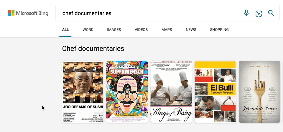 We’ve also made a few updates to our carousel experiences, with intuitive hover-over experiences that can help you, for example, quickly organize your book or movie lists. To see it in action, search for things like “chef documentaries” or “space books,” and you’ll get a rich carousel of answers that showcases just the results’ high-level information to avoid crowding the page. If you decide you want to learn more about a specific result, hover over it, and Microsoft Bing will then expand the result with more detailed information.
Quickly get informed with infographic-inspired experiences
Another part of our vision for modern search is to thoughtfully aggregate information for more detailed topics, and to design the page in such a way that you can quickly find what you’re looking for. Our goal is to provide both style AND substance.
We’ve also made a few updates to our carousel experiences, with intuitive hover-over experiences that can help you, for example, quickly organize your book or movie lists. To see it in action, search for things like “chef documentaries” or “space books,” and you’ll get a rich carousel of answers that showcases just the results’ high-level information to avoid crowding the page. If you decide you want to learn more about a specific result, hover over it, and Microsoft Bing will then expand the result with more detailed information.
Quickly get informed with infographic-inspired experiences
Another part of our vision for modern search is to thoughtfully aggregate information for more detailed topics, and to design the page in such a way that you can quickly find what you’re looking for. Our goal is to provide both style AND substance.
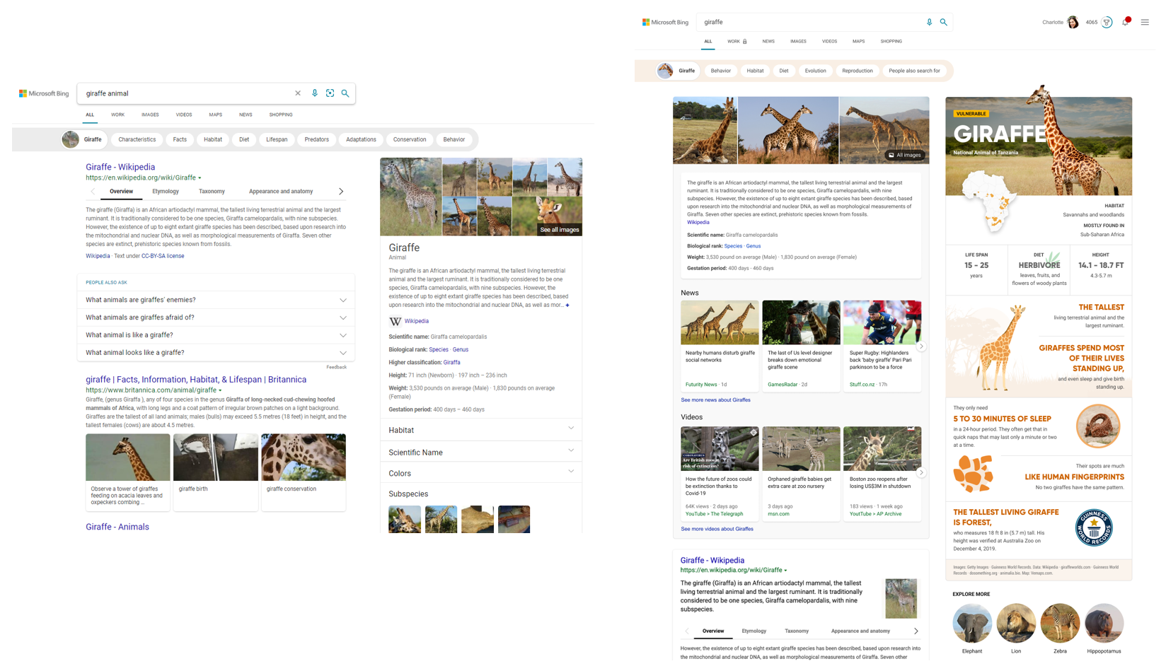 For example, you can search for broad topics like “Kenya” or “giraffes.” Results for these move beyond a dense summary of text results and blue links, and aggregate the top text and visual results into an infographic-inspired experience (you can see the updated experience alongside the previous experience above). Curiosity piqued? Click off to sites that contain more detail or explore other related topics.
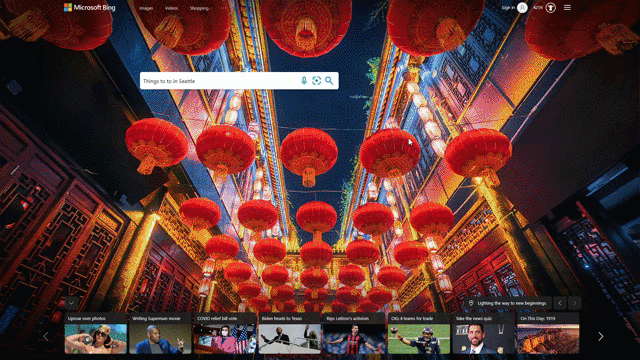 Another feature that showcases this design approach is our local answers, which can help if, for example, you’re trying to stay close to home and want to be a tourist in your own hometown. Search for things like “things to do in Seattle” or “Eiffel Tower,” and you’ll get aggregated information from a variety of sources. Instead of just a single carousel of images, or just a text summary of one aspect of what you’ve searched for, you will now see a comprehensive overview of the topic – inclusive of Bing Maps, top images, visitor reviews and more – so in a single view you can learn more about the area and focus on whatever is of interest to you. This experience is flighting and will be fully available in the U.S. in coming weeks.
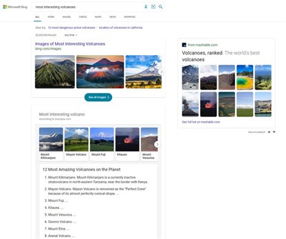 We’ve applied similar principles to more list-centric queries like “best rivers to visit” or “most interesting volcanoes.” Instead of getting just a text result, or information on a single answer, you get an explorable overview of relevant image-led content.
We hope you’re as excited about these new experiences as we are! Stay tuned in the coming months for more visually immersive experiences across the product. As always, you can provide feedback by clicking the feedback button on the lower right corner of the results page.
Startup boost makes your browser start up to 41% faster
We’ve applied similar principles to more list-centric queries like “best rivers to visit” or “most interesting volcanoes.” Instead of getting just a text result, or information on a single answer, you get an explorable overview of relevant image-led content.
We hope you’re as excited about these new experiences as we are! Stay tuned in the coming months for more visually immersive experiences across the product. As always, you can provide feedback by clicking the feedback button on the lower right corner of the results page.
Startup boost makes your browser start up to 41% faster
 When working and browsing online, speed matters. Startup boost maximizes your computer’s performance by significantly reducing the time it takes to open the browser after a device reboot or reopening the browser. This new feature rolling out this month powers faster browser launches after you reboot your device and when relaunching Microsoft Edge. Initial tests show startup times improve from 29% - 41% percent with this feature. Startup boost will be automatically enabled this month and you can access your browser settings menu to personalize Microsoft Edge even more.
Thanks again for your help making Microsoft Edge better than ever with your ongoing suggestions and feedback. We hope you love Microsoft Edge and we can’t wait to share what’s coming next!
When working and browsing online, speed matters. Startup boost maximizes your computer’s performance by significantly reducing the time it takes to open the browser after a device reboot or reopening the browser. This new feature rolling out this month powers faster browser launches after you reboot your device and when relaunching Microsoft Edge. Initial tests show startup times improve from 29% - 41% percent with this feature. Startup boost will be automatically enabled this month and you can access your browser settings menu to personalize Microsoft Edge even more.
Thanks again for your help making Microsoft Edge better than ever with your ongoing suggestions and feedback. We hope you love Microsoft Edge and we can’t wait to share what’s coming next!