This post has been republished via RSS; it originally appeared at: Workplace Analytics & MyAnalytics Blog articles.
The Microsoft Workplace Analytics team is excited to announce our feature updates for July (see past blog articles here). In this update, you'll learn about new feature releases, including:
- Meeting-organizer attributes available in query output
- Redesign of chart settings panel
Meeting-organizer attributes in query output
As described under “Filter by meeting-organizer attributes” in last month’s blog post, Workplace Analytics added the ability to filter on the meeting organizer’s attributes as you create meeting queries. Now, you’ll see these meeting-organizer attributes by default in meeting query results. Keep in mind that this data is de-identified—meeting-organizers cannot be individually identified.
When analysts study meeting content, they can perform offline analysis on aggregated data that includes meeting-organizer metrics. As part of the meeting query output, Workplace Analytics exports all available organizational (or HR) attributes that the customer has provided to Workplace Analytics during their organizational data upload process. In the output file, all exported organizer attributes have column names that are prefixed with “Organizer_”.
To see meeting-organizer attributes in query results:
1. Open the Queries page in Workplace Analytics.
2. Select Meeting. This opens the Meeting query page.
3. (Optional) In the Filters section, select Organizer. You can filter for meetings of interest based solely on organizer attributes.
4. Select Run.
5. After the query completes, view the query results.
6. In the query results, view results in column names that start with “Organizer_”.
Redesign of chart-settings panel
The chart-settings panel in the Explore page of Workplace Analytics has been redesigned to make it easier to use. Now, you can select specific dates in the date-range section and view flexible date ranges and weekly data in all of the trend charts. Formerly, you could see only a weekly average for each month.
To use the chart settings panel:
1. Open the Explore page in Workplace Analytics.
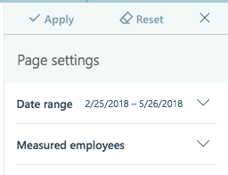
2. On the right side of the page, see the Page settings section:
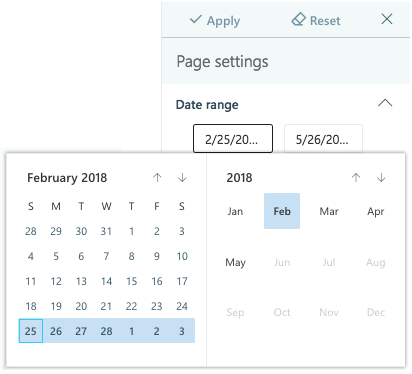
3. To set a date range, select the down arrow next to Date range:
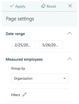
4. To set grouping and/or filtering options for employees, select the down arrow next to Measured employees:
Please let us know if you have any feedback on the features described in this blog. Stay tuned for feature announcements coming next month!
Learn more about Workplace Analytics on our product page and read about our work with customers at insights.office.com. Get personal insights with MyAnalytics.


