This post has been republished via RSS; it originally appeared at: Excel Blog articles.
For the last seventeen years, I have been fortunate to travel to live Excel seminars around the country. About 35 times each year, I would show up in a city and accountants or auditors would show up to earn continuing education credits by learning some new Excel tips. The people who attended the seminars lived every hour of every day in Excel. These people spent 40 hours a week in Excel – and those were the weeks they were on vacation.
There are multiple ways to accomplish everything in Excel. But sometimes, the quickest way is not the most obvious way. I just retired from the seminar circuit, but I present here four of the most painful customer stories. Each of these are from real people who ran into a wall in Excel and then went to extraordinary lengths for a workaround. In each case, there is an easier, but perhaps not so obvious way to solve the problem.
Typing 5000 Names versus Flash Fill
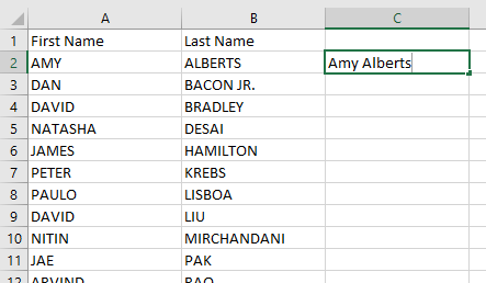
My first story pre-dates my seminars. I worked in a company with a few hundred employees. I was in the accounting department when I received a call from an intern in the marketing department. He was sent an Excel workbook that contained first name in column A, last name in column B, and other data to the right. He was supposed to combined the first name and last name into a single column. The new column was to be formatted in proper case instead of the upper case used in the original columns. The intern’s solution was to start in cell C2 and start typing. The task certainly would have taken all day.
 |
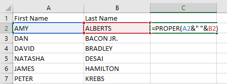
If you are an Excel ninja, you might be comfortable with =PROPER(A2&” “&B2). The PROPER function handles converting the text from upper case to proper case. The Ampersands are used as concatenation operators. This is the formula that I provided back in 1997.
 |
Today, thanks to new functions added during February 2017, you could use the simpler =PROPER(TEXTJOIN(“ “,,A2:B2)). But let’s face it, for an intern who is completely new to Excel, it seems unlikely that either of those formulas are going to be obvious.
 |
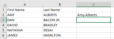
Thanks to a new Flash Fill feature introduced in Excel 2013, the task becomes simple. With AMY in A2, ALBERTS in B2, you simply type Amy Alberts in C2. Move the cell pointer to the blank C3.
 |
From the Data tab, choose Flash Fill or press Ctrl+e.
 |
The Flash Fill feature will analyze what you typed, attempt to figure out the rule, and apply that rule to all of the data in the data set.
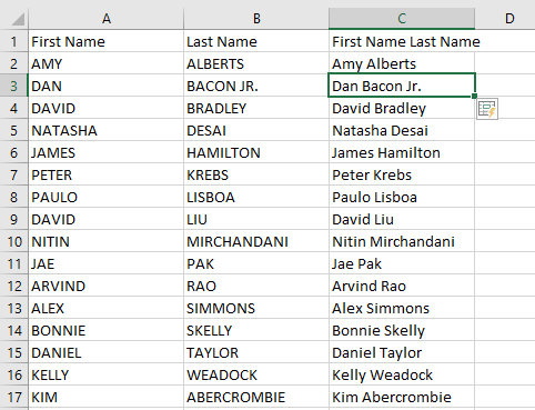 |
While Flash Fill already potentially saves hours of typing, the Excel team did a great job of making Flash Fill discoverable. If someone types Amy Alberts and the starts typing the D from Dan Bacon Jr., Excel will show that it can easily fill in the results as shown in grey below. Simply press Enter and the task is done.
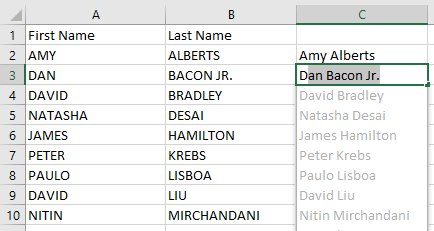 If you type the first name in column C and then start to type the second name, Flash Fill will grey in the results. If you type the first name in column C and then start to type the second name, Flash Fill will grey in the results. |
Why Do Filters and Subtotals Behave Differently?
As an Excel user, it might feel like Filters and Subtotals are essentially from the same class of tools in Excel. Both can be used for Data Analysis. But they behave differently when you are trying to copy the results to a new worksheet.
The data set for this example has hundreds of rows with six columns: Invoice Number, Date, Customer, Quantity, Product, and Revenue.
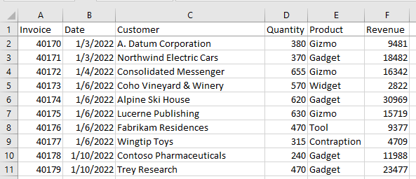 Six columns of data. Six columns of data. |
Turn on the Filter drop-downs. Filter the dataset to Product = Gizmo. As shown below, you can see rows 1, 2, 4, 7, 12, and so on. Excel has hidden rows 3, 5, 6, 8, 9, 10, 11, and so on. Select the data. Copy. The flashing selection marquee is drawn only around the visible rows. Paste to another sheet and only the visible cells are pasted. This works great. It is intuitive.
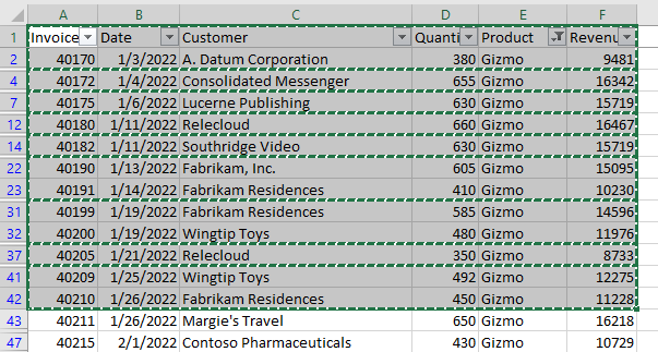 Filter to Gizmo and copy. Filter to Gizmo and copy. |
However, instead of filtering, add some Subtotals. Sort the data by Customer. On the Data tab in Excel, choose Subtotal. In the Subtotal dialog, subtotal by Customer, using the Sum function to add subtotals to Quantity and Revenue.
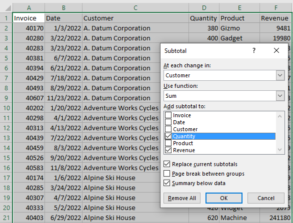 Add subtotals by customer. Add subtotals by customer. |
Excel inserts a subtotal row after each customer. They also add three Group and Outline buttons to the left of column A. These buttons are labeled 1, 2, and 3.
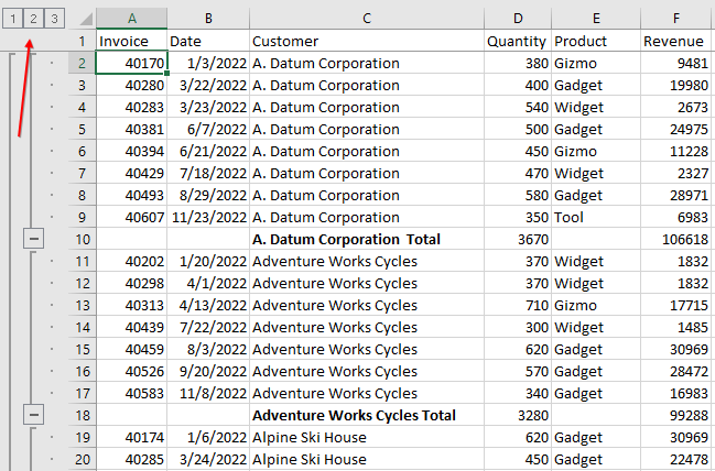 After adding subtotals, click the number 2 group and outline button. After adding subtotals, click the number 2 group and outline button. |
When you click the #2 Group and Outline button, the customer details are hidden and you get one line per customer. It is a beautiful summary of your data. Many people in my seminars know how to get this far.
But then there is a problem. Say that you want to copy those customer totals to a new worksheet. When you select the data and Copy, a single selection marquee is drawn around the whole dataset. That means you’ve selected both the visible and hidden rows as well.
 Collapse to show only the customer subtotals. A copy includes the hidden rows as well. Collapse to show only the customer subtotals. A copy includes the hidden rows as well. |
When you paste to a new worksheet, you will get the customer detail rows and the totals, with no way to easily remove the detail rows. Often, people will resort to slowly deleting the detail rows at this point.
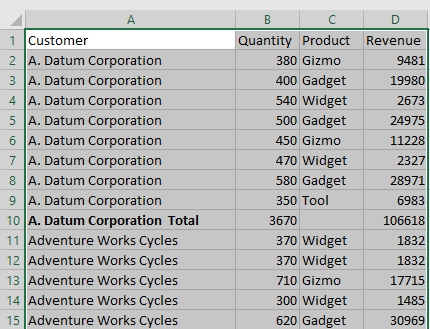 After pasting, there is no way to isolate the subtotal rows. After pasting, there is no way to isolate the subtotal rows. |
But there is an easier way. Select the data. Before copying, press Alt and Semi-colon. This obscure keyboard shortcut selects the visible cells. Now when you copy, you will get individual selection marquees around each row.
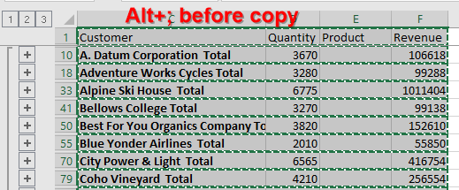 Use Alt+; before copying to select visible cells. Use Alt+; before copying to select visible cells. |
Paste to a new worksheet. Excel automatically converts the formulas in the subtotal rows to values. Delete the mostly blank Product column and you will have a summary report.
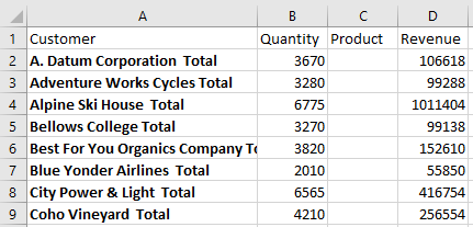 Paste just the subtotal rows. Paste just the subtotal rows. |
How to Get Rid of the Gaps Between Columns in a Column Chart
This is a problem that has been around for decades. By default, a column chart has fairly narrow columns and big gaps between the columns. Some managers want a histogram chart. What is the difference between a column chart and a histogram? You need to make the columns wider and the gaps narrower.
Excel ninjas know that you can right-click one column, Format Series, and find the setting for Gap Width. Drag that slider to the left and you can create a histogram.
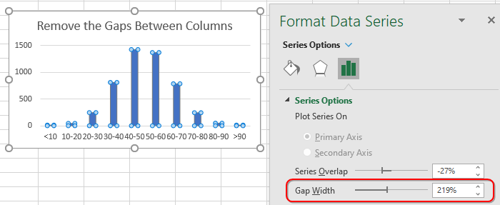 To make the columns wider, make the Gap Width smaller. To make the columns wider, make the Gap Width smaller. |
But the Excel team tried to make this simpler in 2016. Unfortunately, they tried to solve two problems at once. The new Histogram chart automatically makes the columns wider and the gaps invisible. That was a great goal. But the Excel team realized that summarizing thousands of data points into a neat summary using the FREQUENCY array formula was intimidating. They designed the histogram chart to automatically summarize the data points into bins.
A new Statistical Charts drop-down appeared on the Insert tab for Office 365 subscribers in late 2016. It offered Histogram, Pareto, and Box and Whisker.
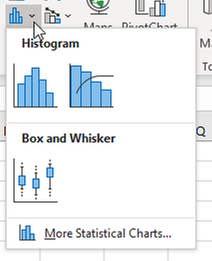 The new statistical charts include Histogram, Pareto, and Box and Whisker. The new statistical charts include Histogram, Pareto, and Box and Whisker. |
In the figure below, you have 5000 values in column A. Without summarizing them, select A1, choose Histogram, and you get this chart in just a few clicks.
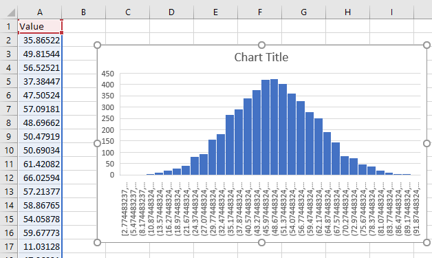 Excel automatically summarizes 5000 points to a histogram. Excel automatically summarizes 5000 points to a histogram. |
The problem is that the bin sizes are wacky. As humans, we think in tens or hundreds. The new Histogram chart has created bins such as 24.37448324 to 27.07448324. This really isn’t going to work. The person creating the chart is going to be forced to right-click the axis and choose Format Axis.
The settings for Bin Width, Number of Bins, Overflow Bin and Underflow bin are confusing. You can’t specify both the Bin Width and Number of Bins. The chart does not snap into place until you specify the correct Overflow Bin and Underflow Bin. After gnashing my teeth with these settings, I am ready to go back to the good old days of simply dragging the Gap Width slider all the way to the left.
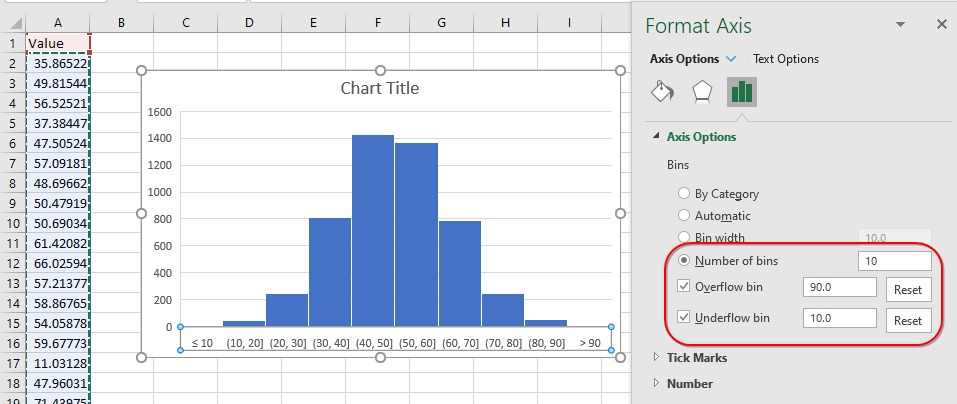 Adjust the settings in the Format pane. Adjust the settings in the Format pane. |
The Excel ninja is comfortable summarizing the 5000 data points using a FREQUENCY formula. They would like to create a histogram from D1:E11 as shown below.
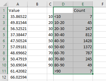 A FREQUENCY function produces the results in column E. A FREQUENCY function produces the results in column E. |
Select the data. Insert a Histogram. Even though the data is already summarized, the Histogram chart is going through the steps of summarizing my already summarized data. This is not what I want at all.
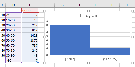 You don't want Excel further summarizing the data that is already summarized. You don't want Excel further summarizing the data that is already summarized. |
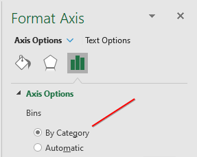
To correct the issue, right-click on the [7-917] label and choose Format Axis. In the Format Axis task pane, change from Automatic to By Category.
 |
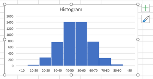
Success: Excel draws a column chart with no gaps and uses the bins you defined.
 |
To finish the chart, click the Plus icon (added in Excel 2013) and choose Data Labels.
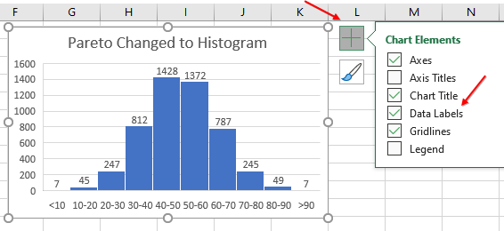 Add data labels using the Plus icon. Add data labels using the Plus icon. |
Include Filtered Items In Totals Has Been Greyed Out Since January 2007
PivotTables are an awesome tool in Excel. Excel pros often use them every day. Below is a pivot table summarizing revenue by customer.
If you study this data set, there are some large customers and a lot of small customers. Your manager wants a report of just the large customers. Before creating this report, notice that the largest customer in this dataset is Wingtip Toys. Their $2.9 million in revenue is roughly 20% of the $14 Million total.
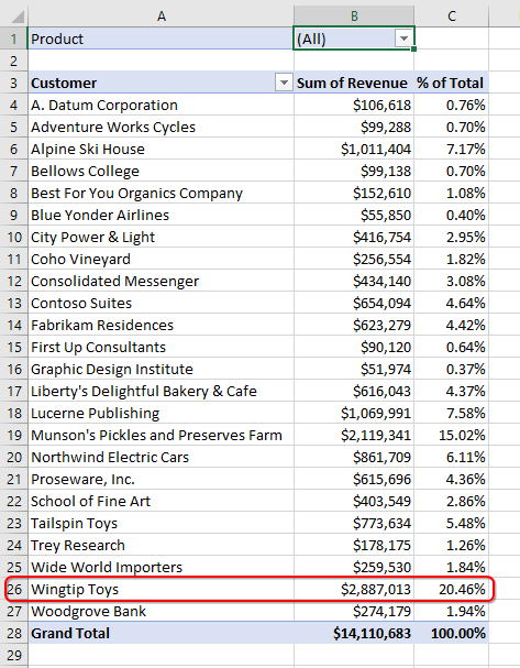 A pivot table showing revenue by customer. A pivot table showing revenue by customer. |
Open the drop-down in A3. Choose Value Filters, Top 10.
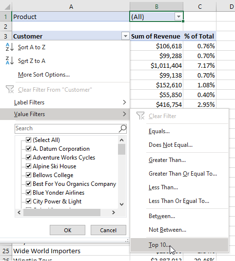 Use the Top 10 filter. Use the Top 10 filter. |
In the Top 10 Filter (Customer) dialog, you can choose Top or Bottom and any number. Select Top 5 Items by Sum of Revenue.
 Filter to Top 5. Filter to Top 5. |
The long report is now small enough to fit in a tile on a dashboard. But your manager has a problem. The new report says that Wingtip Toys is 36% of your revenue. That doesn’t pass the reasonableness test. Your manager knows that Wingtip is about a fifth of the revenue, not more than a third of the revenue.
The problem here is the Grand Total is not all customers – it is only the total of the five customers. I’ve met many people here who hide this Grand Total and then build a second pivot table showing just the grand total of all customers. But this doesn’t help the Percentage of Total column.
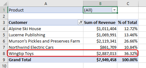 After using Top 10 filter, the percentages of total seem wrong. After using Top 10 filter, the percentages of total seem wrong. |
There is almost a solution. Go to the Pivot Table Format tab in the Ribbon. The left-most icon is called Subtotals. Open that drop-down menu. The fourth item, Include Filtered Items in Totals would solve this problem. But here is where the “almost” comes in. That feature is greyed out. It has been greyed out since January 20, 2007. For thirteen years, I’ve been coming to the office, updating Excel, and checking to see if this feature is suddenly available. Come on Microsoft, hook this up and I won’t have to be creating two pivot tables just to get the totals to be right.
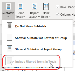 The "Include Filtered Items in Totals" has been greyed out since January 20, 2007. The "Include Filtered Items in Totals" has been greyed out since January 20, 2007. |
There is a solution. It is the least intuitive solution in this article. Delete your pivot table. Create a new pivot table. Check the box for “Add This Data To the Data Model”.
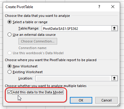 Add This Data To The Data Model. Add This Data To The Data Model. |
With that one change, the Include Filtered Items In Totals is no longer greyed out. Look at the Grand Total row in the screenshot below. It has an asterisk and shows the total of everyone. The percentages in column C are correct again.
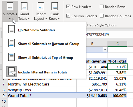 Include Filtered Items in Totals is available if you use the Data Model. Include Filtered Items in Totals is available if you use the Data Model. |
In each of these cases, Excel offers a fast way to solve the problem. Many people will never discover the fast methods and will instead resort to time-consuming workarounds. For every story in this article, there are dozen more examples of people who have hit a wall in Excel and can’t find a fast way to solve their problem. If you find yourself saying "I wonder if there is an easier way to solve this problem in Excel?" there likely is a faster method. Create a post in the Excel Community to see if anyone has already found an easier solution.
Bill Jelen is the host of MrExcel.com and the author of 61 books about Excel. His book, MrExcel LX – The Holy Grail of Excel Tips details solutions to many of the pain points discussed in his seminar.
