This post has been republished via RSS; it originally appeared at: New blog articles in Microsoft Tech Community.
The most important part of data analysis for a solution is a thorough understanding of the data you’re working with. Once you’ve verified what the source of the data actually means and that you can trust it, you need to do some simple visualizations and calculations to evaluate the datasets. This is a bit different than a Business Intelligence process, where you try and homogenize the data as much as possible at the source, and then transform whatever you can on the way to the storage: Extract, Transform and Load (ETL). In Data Science, you bring the data in first, then work with it as "raw" as you can, transforming only at Feature Engineering stage: Extract, Load and Transform (ELT).
I find that using even basic descriptions of datasets are is very useful. These types of statistics are also often called “Exploratory", since it’s a method of just looking at what you have. And at the end of this article, you’ll see how deceptive these “simple” things can really be.
Let's begin by exploring the simplest concept in Statistics: a field known as Descriptive Statistics - which is the process of describing the data by running formulas over it.
Population or Sample?
First, is this all of the possible data or just a part of it? The formulas you’ll use to describe the data and eventually make predictions with it depends on that answer. Statistics put data into two types:
- Population – All of the data about a thing
- Sample – Some of the data about a thing
For many things, you can have all of the data there is. For instance, let’s say you have a group of people in a room. If you want to know information about just those people, this is the entire group you need – everyone is right there in the room. That’s a population.
But in some cases you can’t get all of the data. Suppose you want to figure out what “most” people are like. Or maybe just part of what they are like – such as their age. You can’t measure everyone on the planet – it just isn’t practical. Not only that, the data changes as you measure it. By the time you measure the age of someone and move on to the next billion people, the first person is older.
But It turns out you can make a lot of guesses about the population - all of the people - from a smaller group of them - some of the people. (And it turns out you can only fool some of the people all of the time, but that's another topic)
There are, however, two problems with using just a subset of data to make assumptions about all of it. The first is that you need a fairly large group of people to make the guess (if in fact people are different. Sometimes they aren’t. More on that later).
The second problem is that the group (sample) you select needs to resemble, at least on some level, all of the people (the population). We’ll deal with those problems in another article. For now, think about a sample that closely resembles the population, and one that is large enough to matter.
NOTE: In another article I’ll explain ways that you can test the sample to see how much you can trust it to represent the population. And we’ll deal with that size issue. It turns out size does matter.
Count and Spread
The simplest thing you can do with data is to count it. How may do you have?
The second simplest thing you can do is measure the spread of the data – although even this starts becoming interesting and bit more complex to calculate.
For instance, in measuring age, you might have 25 people in the room: the youngest person might be 5, and the oldest 70. It’s actually important to know these numbers – they help you when you start talking about the sample representing the population, or in the case where you have the whole population, what some of these numbers might mean.
Another example – let’s say you want to describe the people in a college class. It’s not odd to have 25 people in the class. It may be odd to have a five year old and seventy year old in that class! Something might not make sense there, so you would need to look at your data more closely before you base anything on it. It is possible to have a spread like that in a class, but it isn't very common.
This is another simple evaluation you can do, just looking at the data to see if it makes sense. The technical term for this example is "outliers", and there's a formula to help you find those as well. More on that in a bit.
Mean, Median, Mode
With those basic numbers out of the way, the next thing to do is to see how the data “centers” itself. There are three basic statistics you can use to look at that, and then you’ll take a look at why those are problematic.
Let’s get some numbers for the ages of folks in your room:
23, 18, 16, 18, 25, 23, 22, 22, 21, 5, 70, 21, 19, 21, 22, 24, 24, 23, 19, 18, 19, 20, 20, 20, 23
One of the first formulas to learn is the “Average” or “Mean”. There’s one for the population, and one for the sample (yes, it matters):
Sample Mean: x = ( Σ xi ) / n
Population Mean: μ = ( Σ Xi ) / N
Wow – that looks complicated, but it really isn’t. Statistics uses a lot of symbols, and they just need a little teasing out to understand. Anytime you come across a new symbol just realize that's a placeholder for a longer formula underneath. For the Population Mean, here are what the symbols, uhm, mean:
- The μ symbol is simply a placeholder for the whole formula to the right. It will be used in other formulas as you move through statistics, so a “simple” formula for a statistical calculation can explode into several lines after you decompress it. Remember, the fact that it’s a population matters – don’t let that mix you up later.
- Next, you have the Σ symbol. That’s just a sum, or addition.
- The large X (meaning it’s a population variable) stands for each number (like 23, 18, and so on). A small x would mean a sample.
- The I symbol just means “keep going with the X’s till you run out”.
- The N symbol (capitalized, watch that) means the count of items.
So, that whole thing boils down to “Add up everything and divide it by the number of things” (seems like they could just say that next time). And in your case, it looks like this:
556/25 = 22.24
So that’s your Average, or Mean. You could say “the average age in this college class is around 22” and you’d be right.
But there are a couple of other measurements that are handy to look at when you first get a set of data. These are simpler formulas.
If you line up all the numbers from smallest to largest, you can take the middle one and find out where it lies:
5, 16, 18, 18, 18, 19, 19, 19, 20, 20, 20, 21, 21, 21, 22, 22, 22, 23, 23, 23, 23, 24, 24, 25, 70
In this case, the middle value is 21 – still pretty close to the average. This measure is called the Median. If you have an even set of numbers, add the two middle ones and divide by 2.
The next handy measurement is the number that occurs most often – this is called the Mode. In your data set, this is 23 – once again, pretty close to the average.
Basic Visualizations
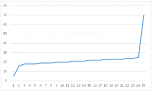
In that last example, you know a lot about your data. But you often need to look at data graphically to understand it a little better. Since you’re looking at how the data is averaging, a good set of visualizations to use are line charts and scatter plots. A line chart simply takes the data and draws a line from each data point going across (x-axis) and how far up from the bottom it goes (y-axis). Your chart, ordered from youngest to oldest in the room, looks like this:
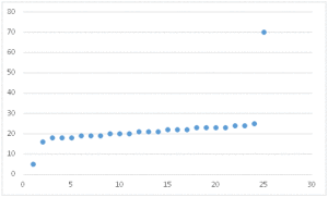
So far that works for what we want to show. Most people lie in the 20-25 year old range. Let’s do a scatter plot of that as well – it’s the same concept, it’s just that the points aren’t connected:
This shows you the same thing, however – take a look at that! You can clearly see there are two data points that are outside the biggest group. These are called outliers, and you can read more about those here. As an interesting note, the scatter plot is often used with und-ordered data, to show the groupings it may have.
And Now, For Something Completely Different
These are great ways to look at data, but they aren’t to be trusted, at least not all by themselves….
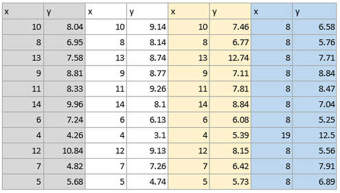
Take a look at these numbers:
Calculating the Mean and Median for each set of data (each x and y pair) gives this:
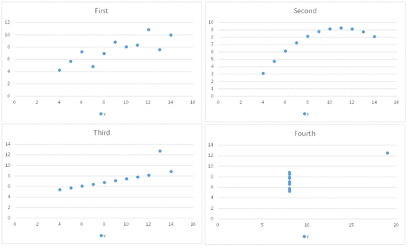
Looks almost the same for all of them, yes? So they are essentially the same? Actually, no. Here are their scatter plots:
Pretty different after all! This is a series of numbers called Anscombe’s quartet, and it shows that you can’t always judge a class by its numbers. And that graphs are important.
In a future article I'll show you how to work with these concepts in R, Python, SQL and even Excel, and show you how interesting "simple" evaluations can be.


