This post has been republished via RSS; it originally appeared at: Excel Blog articles.
Financial modelling isn’t always about complex depreciation schedules, financial statement analyses, scenario managers and long, complex formulae. Sometimes, a picture can tell a thousand-word story. With this borne in mind, I decided to take a look at a useful chart you may require from time to time:
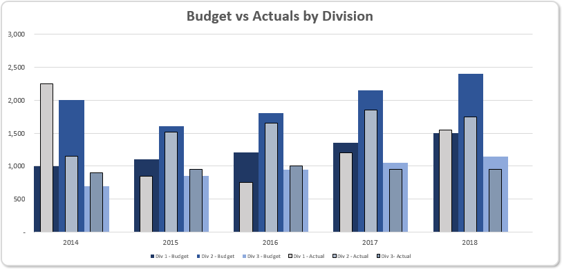
Here, I have created a single chart in Excel that will display the target amounts and have the actual amounts flow through like a bullet chart for each time period. The problem is, Bullet charts – never mind “multiple” ones still don’t exist in Excel.
So let’s create one.
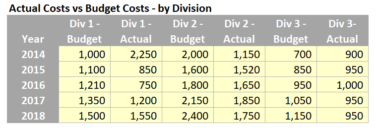
The first step is to format our data properly in a way that we can plot it on a chart in Excel. I will be using the following dataset in the current format:
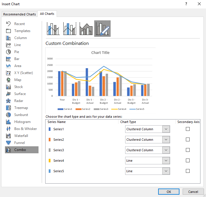
With the data in hand, we can create the chart. As part of this solution we will be using Clustered Columns chart in Excel, by highlighting the table and clicking on Insert -> Clustered Column (from the Charts group of the Insert tab of the Ribbon):
Interestingly, it will typically default to Combo (even on this command) and you may need to toggle all of the chart types to be “Clustered Columns”. If that glitch doesn’t happen for you, that’s great, you have missed a step!
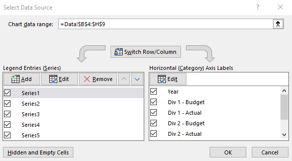
Then right-click on the chart and choose ‘Select Data…’ in the ‘Select Data Source’ dialog box, where we can switch the row / column data.
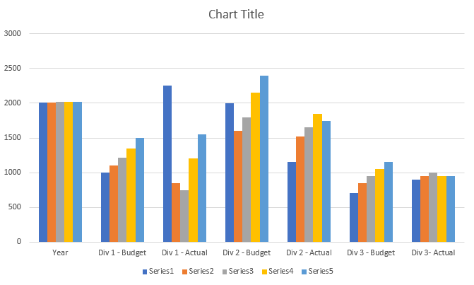
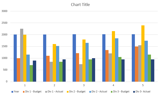
The chart should look something like this now:
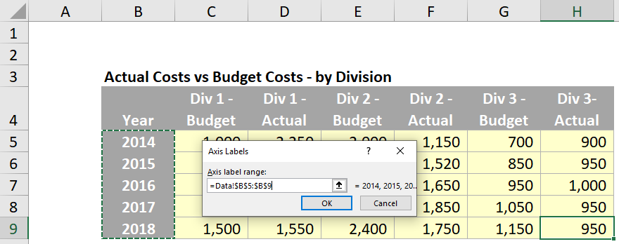
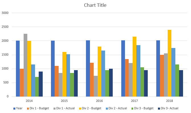
Notice that the x-axis is labelled as 1, 2, 3, 4 and 5 when we want it to be 2014, 2015, 2016 and so on… Therefore, return to the ‘Select Data Source’ dialog and edit the horizontal ‘Axis Labels’:
Great; now we have our years in order.
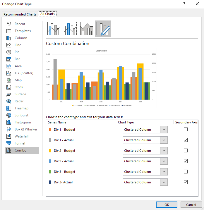
The next step is to organise the columns into primary and secondary axes. Click on the chart, then click on the Design tab on the Ribbon, and then the ‘Change Chart Type’ option. This brings up the ‘Change Chart Type’ dialog, where we can assign different data series onto a secondary axis. In this case we will assign all of the Actual series to the secondary axis (this is because the secondary axis is displayed on top):
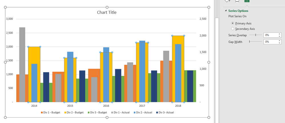
Remove the Year series from the chart. Then, we change adjust the format of the data series to make it appear like a bullet chart. We do this by changing the Series Overlap and Gap Width values in the Format Data Series panel. We adjust the ‘Gap Width’ of the budgeted series to 0%.
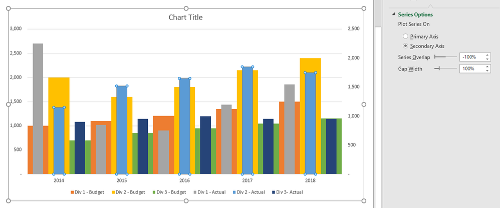
To format the primary axis data series, we set the ‘Series Overlap’ to -100% and ‘Gap Width’ to 100% (of course you can vary these settings to create a slightly different chart):
Our chart is starting to come together, at this point we have two things to deal with:
- The axes have different maximum amounts – this will cause confusion as our budget amounts are being compared to our actual amounts that are on different axes
- We do not have clear spacing between the years. This may make it difficult for end users to read the chart.
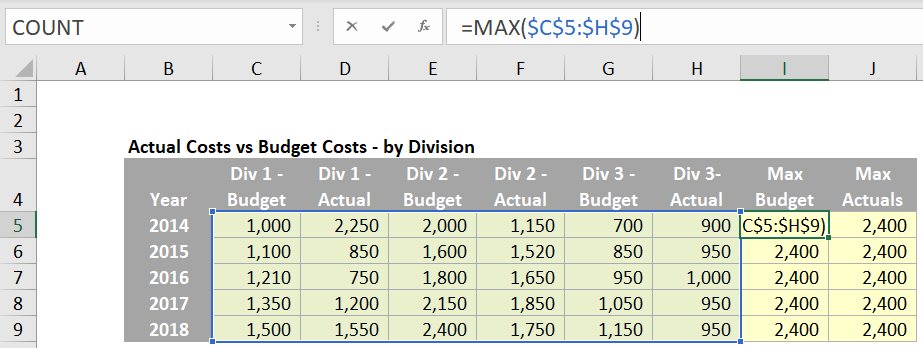
To deal with these two issues we can include new data series that will ‘control’ the maximum amount in the axis. We do this by using the MAX formula to retrieve the maximum amount from our data:
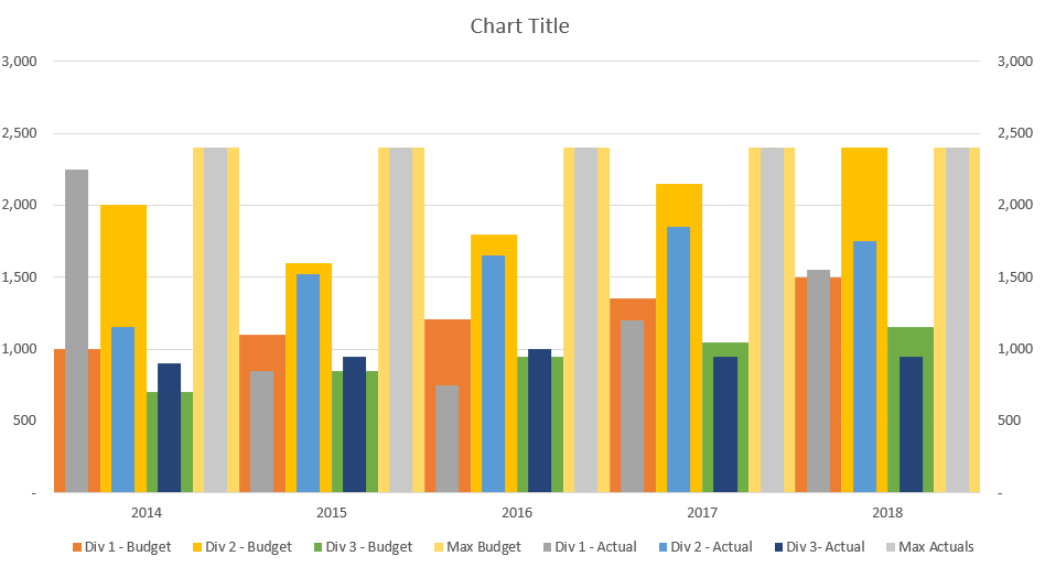
This will insert a new data series into the chart that will always have the maximum value from the dataset:
The two axes are now set to the same maximum amounts.
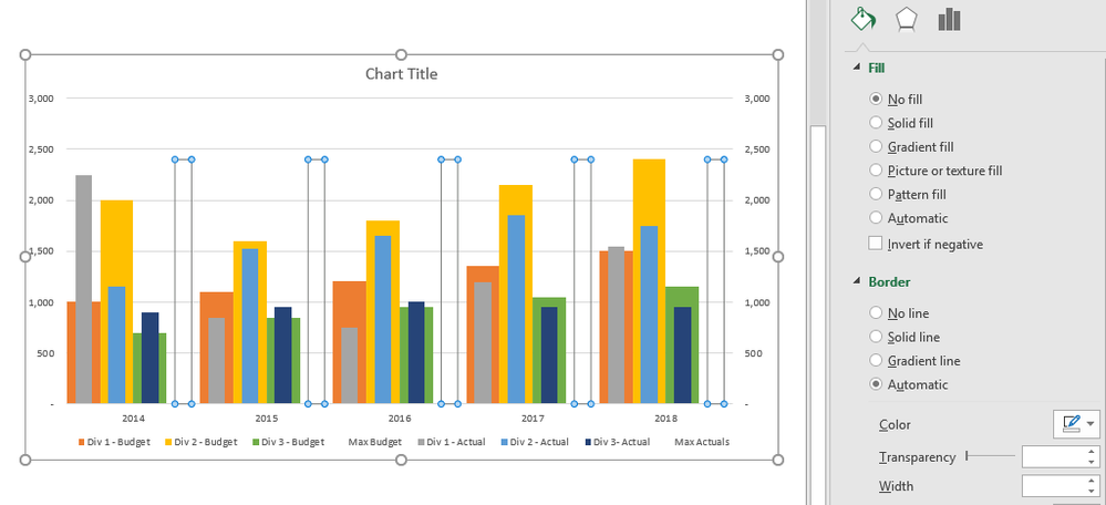
Format the two new data series with ‘No fill’, which essentially renders them invisible:
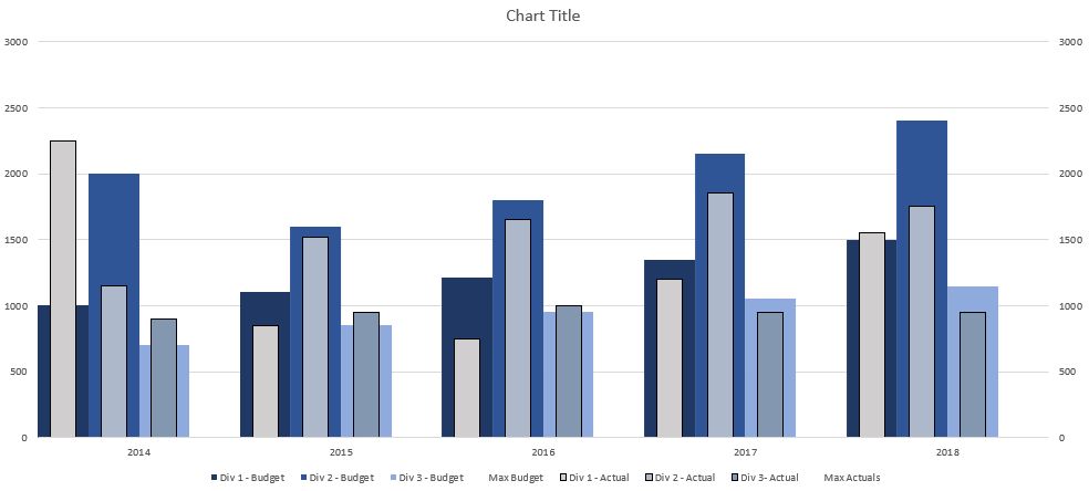
Two birds one bar… wait, was it stone? That would conclude it for our chart, if we did not care for colour. We should apply a different colour palette:
Of course, you do not have to pick these exact colours, but we’ve tried to pick a pallet that looks somewhat desirable. The final adjustments to the chart are:
- Delete the ‘Max Budget’ and ‘Max Actuals’ series from the legend
- Hide the secondary axis
- Add spaces to the end of the years data, e.g. use “2014 “ instead of “2014”, so that the years appear to centre in their respective groupings
- Give the chart a name.
There we have it: a versatile Multiple Bullet chart.
@Liam Bastick is an Excel MVP, originally from the UK, but now based in Australia. He heads the global consulting / training firm SumProduct (sumproduct.com). You can contact him at liam.bastick@sumproduct.com.


