This post has been republished via RSS; it originally appeared at: Microsoft Developer Blogs.
Xamarin.Forms 4.7 introduces drawing controls for Shapes and Paths. These are powerful new cross-platform controls that use the familiar control syntax from UWP and WPF. As well as use the native graphics libraries on each target platform. SkiaSharp and NGraphics have long been the "Go-To" solutions for rendering drawn UI to support advanced designs. They also continue to be excellent choices based on your individual needs. Now Shapes and Paths bring the power of drawing closer to you by shipping "in-the-box".
Shapes
There are many built-in controls available in the new API including ellipse, line, polygon, polyline, and rectangle. Each of these shapes support common styling properties. Such as aspect, fill, and a variety of stroke options. Here are two examples where these shapes help quickly implement a design.
Enable the Flag - Shapes are an experimental preview. First add the flag to your
App.xaml.csat the top of the constructor:Device.SetFlags(new string[]{ "Shapes_Experimental" });.
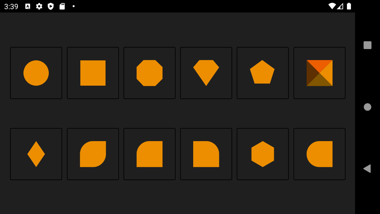
Custom Step Indicator
When design requires the use of primitive shapes, using these graphics are a huge time-saver. Consider this custom progress indicator design that shows circles separated by dashes:

<StackLayout Orientation="Horizontal" HorizontalOptions="Center" >
    <StackLayout.Resources>
        <Style TargetType="Ellipse">
            <Setter Property="Fill" Value="#33222222"/>
            <Setter Property="WidthRequest" Value="20"/>
            <Setter Property="HeightRequest" Value="20"/>
            <Setter Property="VerticalOptions" Value="Center"/>
        </Style>
        <Style TargetType="Line">
            <Setter Property="Stroke" Value="#33222222"/>
            <Setter Property="X2" Value="40"/>
            <Setter Property="VerticalOptions" Value="Center"/>
        </Style>
    </StackLayout.Resources>

    <Ellipse Fill="#FF9900" />
    <Line />
    <Ellipse />
    <Line />
    <Ellipse />
</StackLayout>
Take this even further and use a VisualStateManager to customize the behavior!
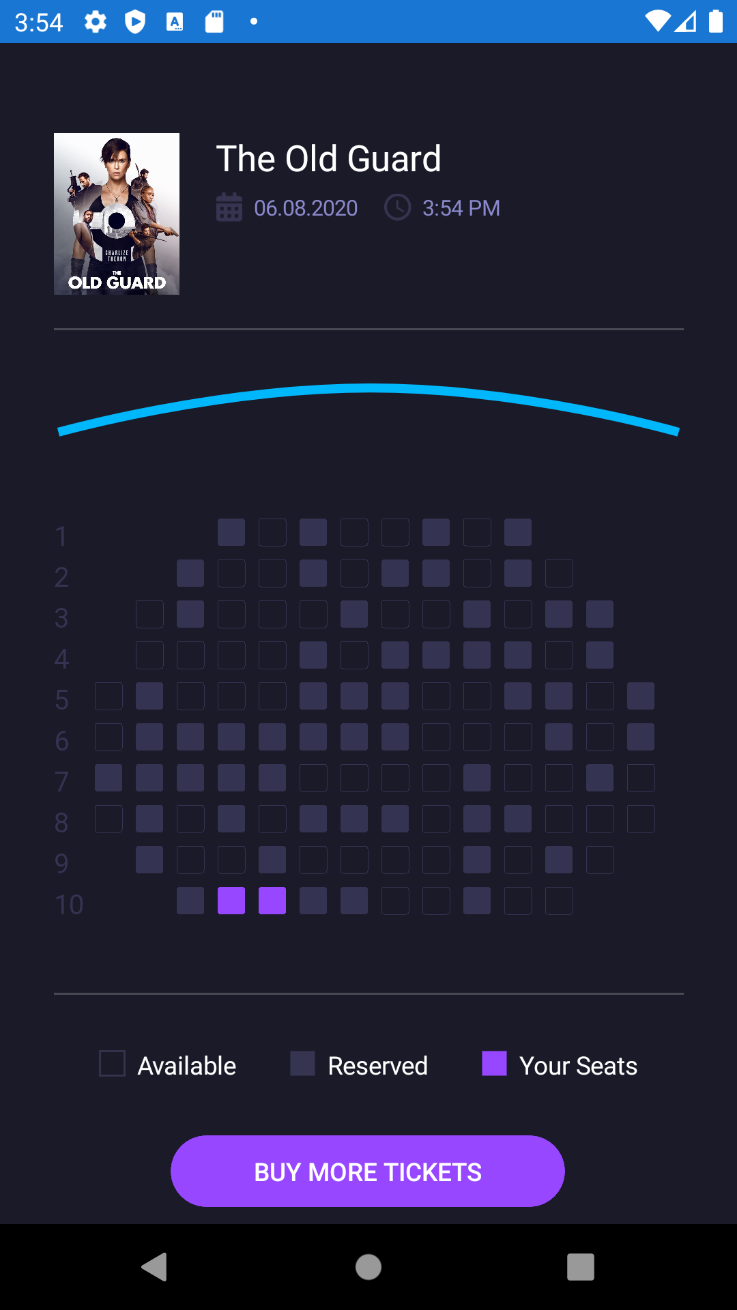
Circle Image
One of the most powerful uses of shapes is the ability to clip other controls. This is also called "masking". In this example, a square profile image can become a circle by applying an EllipseGeometry to the Image.Clip property.

<Grid ColumnDefinitions="*,279,*"
          RowDefinitions="*,160,350,*">

    <!-- Profile Circle Image -->
    <Ellipse
        Grid.Row="1"
        Grid.Column="1"
        HorizontalOptions="Center"
        VerticalOptions="Center"
        WidthRequest="168"
        HeightRequest="168"
        Stroke="#FFFF9900"
        StrokeThickness="4"
        Fill="White"/>
    <Image
        Grid.Row="1"
        Grid.Column="1"
        HorizontalOptions="Center"
        VerticalOptions="Center"
        WidthRequest="150"
        HeightRequest="150"
        Source="https://devblogs.microsoft.com/xamarin/wp-content/uploads/sites/44/2019/03/Screen-Shot-2017-01-03-at-3.35.53-PM-150x150.png">
        <Image.Clip>
            <EllipseGeometry
                Center="75,75"
                RadiusX="75"
                RadiusY="75"/>
        </Image.Clip>
    </Image>

    <!-- Login Form -->
</Grid>
The above code does more than just clip the image. It uses another Ellipse to create a border effect around the photo by setting a white fill and an orange stroke.
Paths
Use Paths for irregular shapes and even custom designs. If you have been using SVG images, then you are already using paths. Open any SVG in a text editor and see a Path node in the XML with a data string to copy directly into your Xamarin.Forms XAML. That is how the shape in the login view pictured above was created.
<Path
    HorizontalOptions="Fill"
    VerticalOptions="Fill"
    Fill="{AppThemeBinding Dark=#333333, Light=#FFFFFF}"
    Data="M251,0 C266.463973,-2.84068575e-15 279,12.536027 279,28 L279,276 C279,291.463973 266.463973,304 251,304 L214.607,304 L214.629319,304.009394 L202.570739,304.356889 C196.091582,304.5436 190.154631,308.020457 186.821897,313.579883 L186.821897,313.579883 L183.402481,319.283905 C177.100406,337.175023 160.04792,350 140,350 C119.890172,350 102.794306,337.095694 96.5412691,319.115947 L96.5273695,319.126964 L92.8752676,313.28194 C89.5084023,307.893423 83.6708508,304.544546 77.3197008,304.358047 L65.133,304 L28,304 C12.536027,304 1.8937905e-15,291.463973 0,276 L0,28 C-1.8937905e-15,12.536027 12.536027,2.84068575e-15 28,0 L251,0 Z"
    />
Notice in the above code, the Fill color is set using an AppThemeBinding so it will respond to dark and light themes.
Community Ignited
It has been a pleasure watching the Xamarin.Forms community rapidly generate so many good looking design challenges using the new Shapes and Paths controls. Here are a few that might inspire you:

|
|

|
| Source | Source | Source |

|
|

|
| Source | Source | Video |
And the list goes on! Here are some others to explore:
- https://twitter.com/XamarinGuy/status/1276821768737484801
- https://twitter.com/jsuarezruiz/status/1274745705362608129
- https://twitter.com/jsuarezruiz/status/1279822752703283200
- https://www.youtube.com/watch?v=lpfWJcQ07FI
When working with shapes, it is useful to have good design tools from the start. Javier Suarez Ruiz blogged about the software that he uses for this.
In Closing
This is just the tip of the iceberg for what you can achieve with Shapes and Paths! Learn when to use Shapes and when to use Frame and BoxView by comparing some key differences:
| BoxView | Frame | Rectangle | |
| Border Color |

|
|
|
| Border Width |
|
|
|
| Clip |

|
|
|
| Contain Content |
|
|
|
| Corner Radius |
|
|
|
| Shadow |
|
|
|
What are you creating using Shapes and Paths? Join this discussion on GitHub and let us know!
Below are some additional resources in addition to the samples shown above.