This post has been republished via RSS; it originally appeared at: Azure Data Explorer Blog articles.
Graphs are a powerful way to model and analyse complex relationships between entities, such as cybersecurity incidents, network traffic, social networks, and more. Kusto, the query and analytics engine of Azure Data Explorer, Microsoft Fabric Real-Time Analytics and many more recently introduced a new feature that enables users to contextualize their data using graphs. In this blog post, we will show you how to use graph semantics to create and explore graph data in Kusto, and how to visualize it using Plotly, a popular library for interactive data visualization in Python.
Graph semantics are a set of operators that allow users to work with graph data in Kusto, without the need to use a separate graph database or framework.
To learn how to use graph semantics in Kusto, please have a look at our documentation.
How to visualize graph data using Plotly and Python?
Plotly is a popular library for creating interactive data visualizations in Python, which supports several types of charts. Graph visualizations are a type of visualization that shows the nodes and edges of a graph, and allows users to interact with them, such as zooming, panning, hovering, and clicking. Plotly is referring to them as network graphs and they are based on a combination of scatter charts and the networkx library, which is a Python package for creating and manipulating graph data structures.
To visualize graph data in Kusto using Plotly and Python, users need to follow the following steps:
- Enable Python on their Kusto cluster, by following the instructions.
- Define a stored function that uses the evaluate python operator to execute a Python script that uses the Plotly and networkx libraries to create a Plotly visualization object from the input tables. An example of such a function is provided in this gist
- Call the stored function with the edge table and the node table as parameters, and optionally specify the layout algorithm for the network graph. The function will return a JSON representation of the Plotly figure.
- Render the JSON object in the ADX dashboard, by using the render operator and specifying the Plotly format. The dashboard will display the interactive network graph and allow users to explore it.
An example of graph visualization in the cybersecurity domain
To illustrate how to use graph semantics and Plotly visualization in Kusto, let us use an example of graph data in the cybersecurity domain. Suppose we have a table called “cyberSecurityEvents”, that has information about cybersecurity incidents that occurred in a network, such as the source and destination IP addresses, the event type, the timestamp, and the severity. A sample of this table is shown below:
We can use the make-graph operator to create a graph based on a tabular expression of an adjacency list (edges). Once we have our graph, we can call the graph-to-table operator to validate if the graph was created successfully. The columns of “sourceId”, “targetId” and “nodeId” are important to create our graph visualization in the next step.
Result “E”:
|
sourceId |
targetId |
source |
destination |
eventType |
timestamp |
severity |
|
4753861782967421034 |
-8227505276406843952 |
10.0.0.2 |
10.0.0.3 |
malware |
2020-12-01 10:00:00.0000000 |
high |
|
4753861782967421034 |
-354337055333087454 |
10.0.0.2 |
10.0.0.4 |
bruteForce |
2020-12-01 10:05:00.0000000 |
medium |
|
4753861782967421034 |
-6799805752225072945 |
10.0.0.2 |
10.0.0.6 |
phishing |
2020-12-01 10:10:00.0000000 |
low |
|
4753861782967421034 |
-1183213656716702608 |
10.0.0.2 |
10.0.0.8 |
ransomware |
2020-12-01 10:15:00.0000000 |
high |
|
4753861782967421034 |
-5643934523958740586 |
10.0.0.2 |
10.0.0.10 |
dos |
2020-12-01 10:20:00.0000000 |
medium |
|
-354337055333087454 |
-1183213656716702608 |
10.0.0.4 |
10.0.0.8 |
dos |
2020-12-01 10:25:00.0000000 |
high |
|
-354337055333087454 |
-1183213656716702608 |
10.0.0.4 |
10.0.0.9 |
ransomware |
2020-12-01 10:30:00.0000000 |
high |
|
-1183213656716702608 |
5555878072287917823 |
10.0.0.8 |
10.0.0.69 |
dos |
2020-12-01 10:35:00.0000000 |
high |
|
-1183213656716702608 |
-7486455444057893805 |
10.0.0.8 |
10.0.0.23 |
bruteForce |
2020-12-01 10:40:00.0000000 |
high |
|
-7486455444057893805 |
1338086924021571346 |
10.0.0.23 |
10.0.0.42 |
phishing |
2020-12-01 10:45:00.0000000 |
high |
Result “N”:
|
nodeId |
|
4753861782967421034 |
|
-8227505276406843952 |
|
-354337055333087454 |
|
-6799805752225072945 |
|
-1183213656716702608 |
|
-5643934523958740586 |
|
5555878072287917823 |
|
-7486455444057893805 |
|
1338086924021571346 |
|
4753861782967421034 |
Now that we have the edge table “E” and the node table “N”, we can use the stored function “VisualizeGraphPlotly” (gist) to create a Plotly visualization. The function takes two mandatory parameters: the edge table and node table. Additionally, you can provide the following parameters:
- Layout algorithm ('spring_layout', 'circular_layout', 'random_layout', 'shell_layout', or 'kamada_kawai_layout', more), .
- Color scale ('YlGnBu’, ’Hot’, ’Earth’, more)
- Title of the diagram
The function will use the networkx library to create a graph object from the tables, and then use the Plotly library to create a network graph visualization from the graph object. The function will also add styling and annotations to the graph object, such as colours, sizes, hover texts.
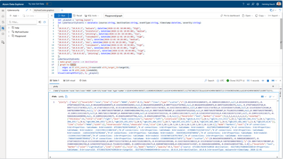
The final statement (without the datatable object):
Once you execute it, you will get back a single JSON object which will serve as an input for the Plotly visualization.
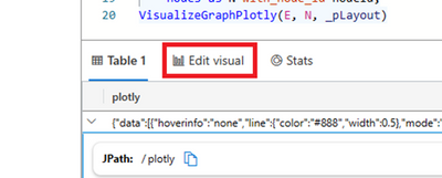
To visualize the graph, you need to click on “Edit visual”.
Now you need to select the visual type “Plotly”.
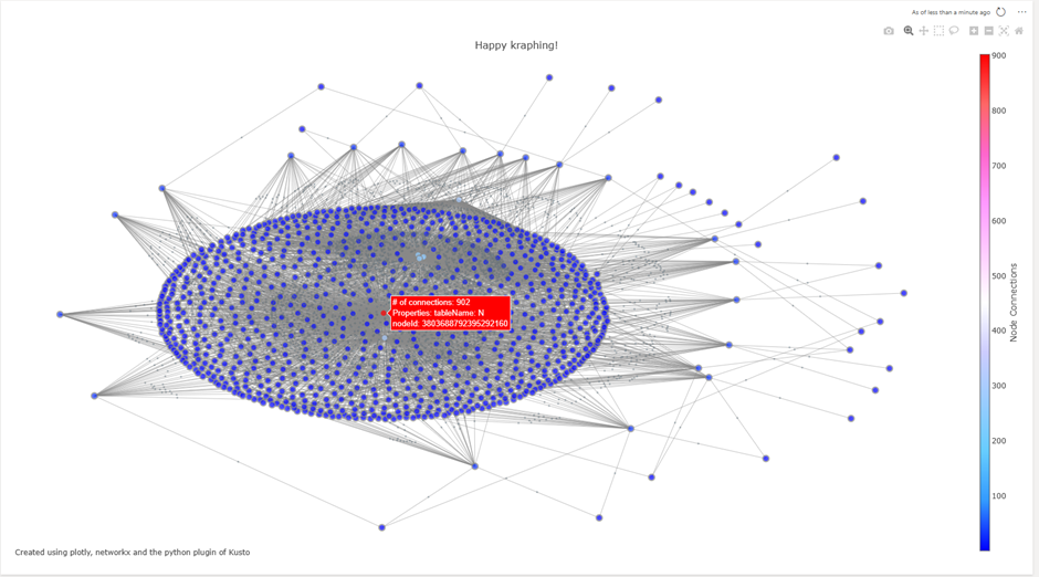
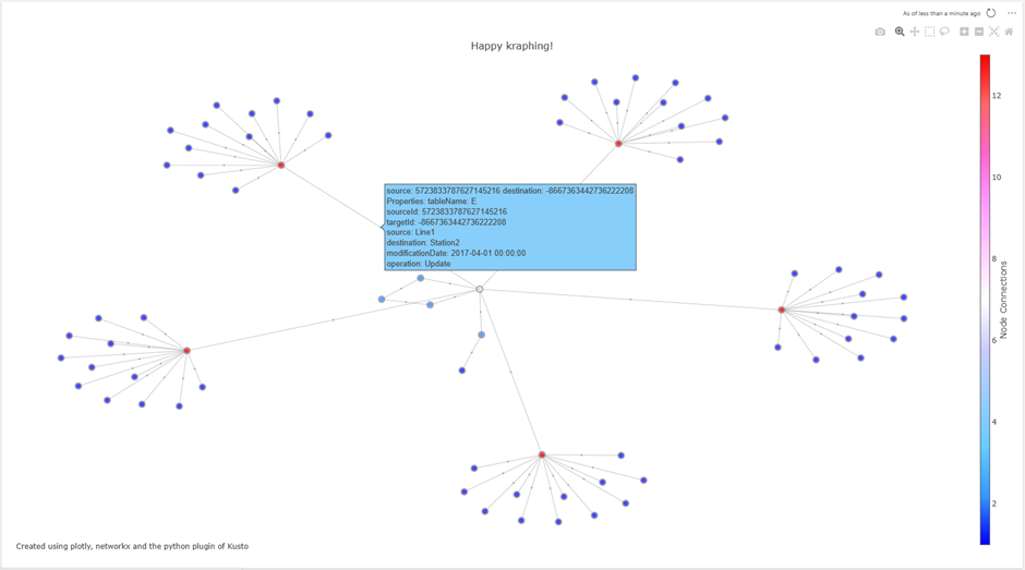
The result is a graph visualization using Plotly. You can hover over nodes and edges to get additional information. Now, this visualization can be easily added to an existing or new dashboard.
Summary
This blog post demonstrates how to use graph semantics in Kusto to create and explore graph data, and how to visualize it using Plotly and Python. It provides an example of graph data in the cybersecurity domain and shows how to use a stored function that uses the evaluate python operator to create a Plotly figure from a graph in Kusto. It also explains how to render the figure in the ADX dashboard using the render operator and the Plotly format.
Please provide feedback.
Other examples based on other data sets:


