This post has been republished via RSS; it originally appeared at: New blog articles in Microsoft Tech Community.
This article will continue discussion on practical time series analysis applications in security with another use case focusing on visualizing the anomalies and how to interpret results of time series decomposition in Azure Sentinel. Please refer to previous introductory article Looking for unknown anomalies – what is normal ? for high level overview on time series analysis and step by step guide on how to compile queries to detect unknown anomalies.
Scenario: Time series anomaly of Palo Alto Logs to detect data exfiltration
Data exfiltration is common tactic used by an adversary after compromising system for movement of sensitive data outside the company network.
You can read more about various techniques of it on MITRE ATT&CK Tactic TA0010 here.
For this detection scenario, we are focusing on outbound data transfer size attribute generally logged by network sensor logs such as Firewalls, IDS/IPS etc specifically focused for internal networks to outside public networks. The network device logs are voluminous in nature and in a vast and dynamic environment identifying common patterns and deviation from normal baseline can become challenging. Time Series analysis will help us in identifying seasonal trends, baseline patterns from the data. These techniques can help in detecting anomalies which are deviations from normal baseline patterns with considering seasonal trends.
The original query in github TimeSeriesAnomaly-MultiVendor_DataExfiltration applies for multiple network vendors from the
CommonSecurityLogtable, however for the scope of this article I am limiting it to traffic logs of single vendor Palo Alto. As detailed in earlier blog, detection query has various section starting with preparation of time series data by transforming it into vector of multi-value array which are then used with time series analysis functions such asseries_decomposeandseries_decompose_anomaliesto detect anomalies.
Preparing Time Series Data
Query:
The query filters for Traffic logs for vendor Palo Alto Networks. The PrivateIP regex pattern is used to categorize the destination IP into Private and Public and later only filter the events with Public IP addresses as destination. For this table, SentBytes field in the schema captures the outbound data transfer size in Bytes. Make-series operator used to prepare timeseriesdata to use with time series analysis functions to visualize and find the anomalies.
let starttime = 30d;
let endtime = 1d;
let timeframe = 1h;
let PrivateIPregex = @'^127\.|^10\.|^172\.1[6-9]\.|^172\.2[0-9]\.|^172\.3[0-1]\.|^192\.168\.';
let TimeSeriesData = CommonSecurityLog
| where TimeGenerated between (startofday(ago(starttime))..startofday(ago(endtime)))
| where DeviceVendor =="Palo Alto Networks" and Activity  == "TRAFFIC"
| where isnotempty(DestinationIP) and isnotempty(SourceIP)
| extend DestinationIpType = iff(DestinationIP matches regex PrivateIPregex,"private" ,"public" )
| where DestinationIpType =="public"
| project TimeGenerated, SentBytes,DeviceVendor
| make-series TotalBytesSent=sum(SentBytes) on TimeGenerated from startofday(ago(starttime)) to startofday(ago(endtime)) step timeframe by DeviceVendor;
TimeSeriesData
Results:
Below result indicates outbound data transfer in bytes towards Public IP addresses. TimeGenerated and TotalBytesSent columns are vector of multi-value array resulting from make-series operator.
Visualizing Time Series Decomposition
Query:
Below query will use TimeSeriesData as input and visualize its decomposition into baseline, seasonal, trend and residual components.
TimeSeriesData
| extend (baseline,seasonal,trend,residual) = series_decompose(TotalBytesSent)
| render timechart with (title="Palo Alto Time Series decomposition")
Results:
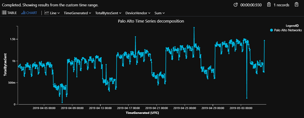
Below figure displays the time chart decomposition of hourly outbound data transfer size observed in the 30 days.
Default view is filtered to show the actual data transfer, but you can filter it to display one or multi views (baseline, seasonal , trend, residual) of the decomposition from the chart.
Menu options for TotalBytesSent to visualize charts.
Menu options for DeviceVendor to select split or Don’t split time series.
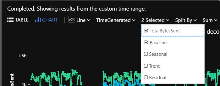
if you click on DeviceVendor and select Don’t Split as shown in above screenshot, you will get check box to multi select charts.
Below Menu options after selecting Don’t Split. (Multi select vs radio buttons).
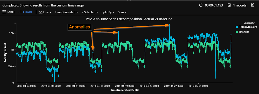
Below chart displays TotalBytesSent (Actual) vs Baseline pattern overlaying each other. As you could notice visually, we have some spikes and dips in actual data as compared to baseline pattern. However, for this particular use case, we are interested only in spikes for outbound data transfer which are highlighted with arrows and marked as anomalies. First anomaly specifically is within seasonal dip patterns which is far from baseline pattern hence flagged with score above 3.
Visualizing Time Series Decomposition Anomalies
Query:
Next part of the query will use series_decompose_anomalies function to visualize the anomalies.
TimeSeriesData
| extend (anomalies, score, baseline) = series_decompose_anomalies(TotalBytesSent,3, -1, 'linefit')
| render timechart with (title="Palo Alto Time Series anomalies")
Results:
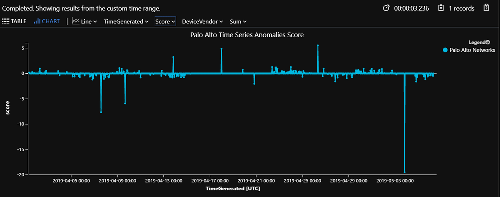
Below chart shows timechart filtered to score attribute calculated against hourly trend of outbound data transfer after comparing with baseline pattern. The chart shows both positive as well as negative anomalies, but we are only interested in flagging positive anomalies for this use case which are shown above 0 line and anything above score 3 is flagged as anomalies.
Filtering specific positive anomalies
Tabular version of the anomalies can be retrieved with below query. Note, since network data sources can have large data size ranges, we are keeping 3 as custom score threshold. You can adjust it based on your environments and false positive acceptance criteria.
let TimeSeriesAlerts = TimeSeriesData
| extend (anomalies, score, baseline) = series_decompose_anomalies(TotalBytesSent,3, -1, 'linefit')
| mv-expand TotalBytesSent to typeof(double), TimeGenerated to typeof(datetime), anomalies to typeof(double),score to typeof(double), baseline to typeof(long)
| where anomalies > 0
| project TimeGenerated, TotalBytesSent, baseline,score,anomalies, deviceVendor;
TimeSeriesAlerts
Results:
Below results indicates anomalies which are greater than score threshold 3. You can also notice, even though first record has low number , it is still far from the baseline count observed in seasonal dip pattern.
Investigating the anomalies
To investigate the anomalies, we need to query respective time hour ,review all the events and identify cause of the spike as compared to baseline. Since this data was generated for demonstration, I will just list the investigation query and not display any results. The result of this query will be dataset with traffic details grouped by source to destination along with unique list of ports and services for it. The results are also sorted by score and TotalBytesSent so the higher results bubble up towards top.
Query:
TimeSeriesAlerts
| join (
CommonSecurityLog
| where isnotempty(DestinationIP) and isnotempty(SourceIP)
| where TimeGenerated between (startofday(ago(starttime))..startofday(ago(endtime)))
| summarize HourlyCount=count(), ListOfDestPorts=make_set(DestinationPort), TotalBytesSent=sum(SentBytes),TotalBytesReceived=sum(ReceivedBytes) by SourceIP, DestinationIP,DeviceVendor, TimeGenerated=bin(TimeGenerated,1h)
) on DeviceVendor,TimeGenerated | sort by score desc,TotalBytesSent desc
Conclusion:
In this article, we looked into another example analyzing hourly trend of outbound data transfer towards Public IP addresses. By analyzing trend of outbound data transfer over 30 days, we detected seasonality and trend in the data which helped to identify three positive anomalies on 13th Apr 17:00 UTC ,17th Apr 21:00 UTC and 26th Apr 05:00 UTC. The first anomaly is specifically detected in the seasonal dip associated with weekend. With the traditional static threshold-based approaches, we could have missed flagging this anomaly.
Remember, the deviation from the baseline count alone are not necessarily an indication of malicious activity but gathering more context around the timestamp of anomaly and identifying the cause of the spike along with the gathering more details around behavior of traffic and destination addresses will help analyst to categorize it as malicious or non-malicious which is what investigate query results will provide. The charting function in Sentinel gives various options to visualize the data and analyst can interpret the anomalies visually. As detailed in previous article, the score threshold value provided in time series function can be tweaked to effectively flag outliers which are actionable in your environments.
Feel free to submit pull requests on other time series analysis based queries on Azure Sentinel Github Repo. Happy Hunting.
References:
- Looking for unknown anomalies - what is normal? Time Series analysis & its applications in Security
- MITRE ATT&CK Tactic TA0010 – Exfiltration.
https://attack.mitre.org/tactics/TA0010/
- KQL operators syntax and example usage documentation.
- make-series: https://docs.microsoft.com/en-us/azure/kusto/query/make-seriesoperator
- series_decompose() : https://docs.microsoft.com/en-us/azure/kusto/query/series-decomposefunction
- series_decompose_anomalies(): https://docs.microsoft.com/en-us/azure/kusto/query/series-decompose-anomaliesfunction
- mv-expand: https://docs.microsoft.com/en-us/azure/kusto/query/mvexpandoperator
- render : https://docs.microsoft.com/en-us/azure/kusto/query/renderoperator


