
This post has been republished via RSS; it originally appeared at: New blog articles in Microsoft Tech Community.
In Adaptive Cards there are multiple ways to show and hide content depending on other content or conditions, or even user interaction. But despite that most of them is available since the version 1.2 (so quite early) it requires a bit of knowledge how to actually implement them.
There are 3 major ways for showing and hiding content in Adaptive Cards:
- Action.ShowCard
- Action.ToggleVisibility
- Condition defined under "Only show when" property
Let's go now through each of them.
Action.ShowCard
To use it first you need to add "ActionSet" element to the designer canvas and then select Action.ShowCard from the list of available options:

Once that is done, define button's properties inside "Element properties" window, such as its title and id.
Hint! To display the other card, that will be shown after clicking on the added button, double click it! It will trigger the hidden card to appear, so you can easily author its contents.
Next double-click the button, to display the hidden card and author its contents:

Next, switch to "Preview mode" to see how the card is being shown and hidden after clicking the button:

Important! If you add "Action.Submit" to the hidden card it will send data from all fields present from that card and "up" - so from all parents of that hidden card. The "Action.Submit" button on a top-most card will only send data from that top card.
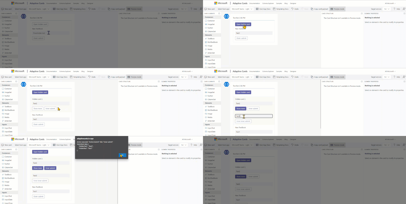
Data from cards is always submitted from parent to child cards.
Action.ToggleVisibility
To use it first you need to add "ActionSet" element to the designer canvas and then select Action.ToggleVisibility from the list of available options:
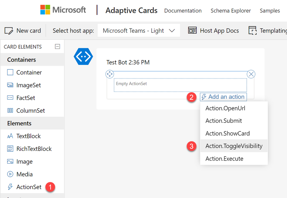
Next, the same as with ShowCard scenario, define properties of the added button.
Important! Unlike with ShowCard, the ToggleVisibility requires you to do some work directly within the generated JSON payload of the card. There is no UI to configure it any other way.
Now add elements to the card that you want to show and hide after clicking the button. Then define their properties:
- Id - it is absolutely required to define unique ids of the added elements. Ids are used to target elements and toggle their visibility.
- Initially visible - define whether elements should be visible as the card is rendered, or hidden. Toggle will then either show them, or hide them. When you unclick the checkbox, element will be overlayed with a greyed pattern.

Now navigate to JSON payload and find ToggleVisibility button's definition. Add there the following code:
"targetElements": [ "colon delimited list of elements' Ids to toggle" ]

Important! The only "downside" of that approach is in case you add an always visible submit button, then it will always send data from all fields even when they are hidden.
Last step is to test it. Switch to "Preview" mode and examine behavior of your card:

Only show when
This approach uses "Adaptive Cards Templating Language". To be able to use it, first you need to define Data that will be bind with the card. And once you have the data, then you are able to create a condition that determines when an element should be visible:

You can use different types of comparisons, to both integer, dates, boolean or string data types.
Important! Unlike "Toggle", showing and hiding elements based on conditions is actually happening when a card is being rendered. As of today, Data that card is using is only static, so it cannot be changed after the card is displayed. This means, that if a field is having a condition that prevents it from being displayed, even when it has a default value set, its value will not be submitted as long as the field is not visible.
Finally, enter "Preview" mode to see how your card behaves:

And that's it! Hope you will find this tutorial useful. If you have any comments, write them down below. Thanks!