This post has been republished via RSS; it originally appeared at: Microsoft Developer Blogs.
This is a guest blog by Vincent Hoogendoorn. Vincent is a hands-on .NET architect, Xamarin veteran, CSharpForMarkup author, contributor of the C# Markup feature in Xamarin.Forms and co-founder of the Dutch Mobile .NET Developers meetup. Vincent works as Architect & Lead Mobile at Anywhere365.
C# Markup
Xamarin.Forms 4.6 introduced C# Markup, a set of fluent helpers and classes that aim to make UI development in C# a joy.
C# Markup helps developers write concise declarative UI markup and cleanly separate it from UI logic, all in C#. Developers get to enjoy C#'s first-class IDE support when writing markup. A single language for markup and logic reduces friction, markup scattering and cognitive load; there is less or no need for language bridging mechanisms like separate converters, styles, resource dictionaries, behaviours, triggers and markup extensions.
Example
Let's introduce the main features of C# Markup by building this Twitter search page:
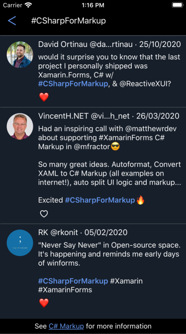
The full source of this example can be found here.
Build Top-Down with Hot Reload
C# Markup makes it easy to write markup using a top-down approach - so it reads like a story, filling in details while you progress. This short video shows the process from start to finish in 2.5 minutes (using DebugRainbows and LiveSharp):
Note that this video is unedited and realtime; it was recorded in one go by replaying git commits from the command line.
Write the Page - Like a Story
At the highest level the page contains a header, search results and a footer. So, if we structure the markup top-down - to make it read like a story - the initial markup could be:
SearchPage.cs
using Xamarin.Forms.Markup;

public partial class SearchPage
{
    void Build() => Content =
        new StackLayout { Children = {
            Header,
            SearchResults,
            Footer
        }};

    StackLayout Header => new StackLayout { };

    CollectionView SearchResults => new CollectionView { };

    Label Footer => new Label { };
}
The void Build() => Content = pattern is a convention that lets you use LiveSharp for stateful hot reload of C# Markup. If you don't plan on using LiveSharp, omit the Build() method and put the Content assignment in the page constructor.
For now C# Markup is an experimental feature. So we need to set a flag to enable the feature:
App.cs
Device.SetFlags(new string[]{ "Markup_Experimental" });
Next, let's build out the page components. It is easy as 1-2-3 (and 4 for adding animation):
1 Build the Header - Layout, Binding and Styles
Now let's create the header. We will use helpers for layout, binding and style:
StackLayout Header => new StackLayout { Children = {
    new Button { Text = "\u1438" } .Style (HeaderButton)
                .Width (50)
                .Bind (nameof(vm.BackCommand)),

    new Entry { Placeholder = "Search" }
               .FillExpandHorizontal ()
               .Bind (nameof(vm.SearchText))
}};
Bind
The Bind helper knows the default bindable property for most built-in view types; Bind's target property parameter is optional (you can register a default bindable property for your own / 3rd party view type).
Style
The Style helper refers to an instance of a Style<BindableObject> helper class, e.g.:
Styles.cs
public static class Styles
{
    static Style<Button> headerButton;

    public static Style<Button> HeaderButton => headerButton ??= new Style<Button>(
        (Button.TextColorProperty, Color.CornflowerBlue),
        (Button.FontSizeProperty , 24)
    )   .BasedOn (Implicit.Buttons);
}
2 Build the Search Result - Enums for Grid Rows and Columns
A Grid would be a good choice for the layout of the tweets in the search results. We will use helpers and enums instead of numbers for the rows and columns:
enum TweetRow    { Separator, Title, Body, Actions }
enum TweetColumn { AuthorImage, Content }

CollectionView SearchResults => new CollectionView { ItemTemplate = new DataTemplate(() =>
    new Grid {
        RowDefinitions = Rows.Define (
            (TweetRow.Separator, 2   ),
            (TweetRow.Title    , Auto),
            (TweetRow.Body     , Auto),
            (TweetRow.Actions  , 32  )
        ),

        ColumnDefinitions = Columns.Define (
            (TweetColumn.AuthorImage, 70  ),
            (TweetColumn.Content    , Star)
        ),

        Children = {
            new BoxView { BackgroundColor = Color.Gray }
                         .Row (TweetRow.Separator) .ColumnSpan (All<TweetColumn>()) .Top() .Height (0.5),

            RoundImage ( 53, nameof(Tweet.AuthorImage) )
                        .Row (TweetRow.Title, TweetRow.Actions) .Column (TweetColumn.AuthorImage) .CenterHorizontal () .Top () .Margins (left: 10, top: 4),

            new Label { LineBreakMode = LineBreakMode.MiddleTruncation } .FontSize (16)
                       .Row (TweetRow.Title) .Column (TweetColumn.Content) .Margins (right: 10)
                       .Bind (nameof(Tweet.Header)),

            new Label { } .FontSize (15)
                       .Row (TweetRow.Body) .Column (TweetColumn.Content) .Margins (right: 10)
                       .Bind (Label.FormattedTextProperty, nameof(Tweet.Body),
                              convert: (List<TextFragment> fragments) => Format(fragments)),

            LikeButton ( nameof(Tweet.IsLikedByMe) )
                        .Row (TweetRow.Actions) .Column (TweetColumn.Content) .Left () .Top () .Size (24)
                        .BindCommand (nameof(vm.LikeCommand), source: vm)
        }
    })}.Background (Color.FromHex("171F2A"))
       .Bind (nameof(vm.SearchResults));
Bind Converters and Commands
Note that in the above example hw the Bind method enables you to specify inline converters:
new Label { }
           .Bind (Label.FormattedTextProperty, nameof(Tweet.Body),
                  convert: (List<TextFragment> fragments) => Format(fragments))
Also note that the BindCommand helper binds both the Command and CommandParameter properties. Here we use it to pass the list item (tweet) that contains a button with the LikeCommand parameter:
new Button { Text = "Like" }
            .BindCommand (nameof(vm.LikeCommand), source: vm)
SearchViewModel.cs
public ICommand LikeCommand => likeCommand ??= new RelayCommand<Tweet>(Like);

void Like(Tweet tweet) { ... }
Create Views with Functions
In above example, note how easy it is to mix standard views with local functions that create views (RoundImage(), Format() and LikeButton()). These functions can be implemented right below the markup that uses them, to make the page read like a story:
ImageButton LikeButton(string isLikedPath) => new ImageButton { Source =
    new FontImageSource { Color = Color.White }
                         .Bind (FontImageSource.GlyphProperty, isLikedPath,
                                convert: (bool like) => like ? "\u2764" : "\u2661")
};

FormattedString Format(List<TextFragment> fragments)
{
    var s = new FormattedString();
    fragments?.ForEach(fragment => s.Spans.Add(
        new Span { Text = fragment.Text, ... }
    ));
    return s;
}
The LikeButton() is declarative (markup containing logic - an inline convertor), while Format() is imperative (logic containing markup - more Blazor style). Although C# Markup aims to improve declarative markup, there are plenty of cases where it is fine to mix in imperative (procedural) functions to build markup.
3 Build the Footer - Make a Gesture
The footer contains a tappable hyperlink. Here we create it using the BindTapGesture gesture helper:
new Label { }
           .FormattedText (
               new Span { Text = "See " },
               new Span { Text = "C# Markup", Style = Link }
                         .BindTapGesture (nameof(vm.OpenHelpCommand)),
               new Span { Text = " for more information" }
            )
C# Markup contains helpers to conveniently add any type of gesture to any type of view, and to connect them to commands or events.
4 Animate the Header - Logic and Markup
We will need some UI logic for animation, but we don't want to mix that logic with the markup. We can separate the logic from the markup by adding a .logic.cs partial class file:
SearchPage.logic.cs
using Xamarin.Forms;

public partial class SearchPage : ContentPage
{
    readonly SearchViewModel vm;

    public SearchPage(SearchViewModel vm)
    {
        BindingContext = this.vm = vm;
        Build();
    }
}
Notice that the logic.cs file does not use the Markup namespace; this helps to maintain a clean separation of markup and logic. If a page does not need logic, you can omit the .logic.cs file and put the page constructor and the base class in the markup file.
C# Markup offers the Assign and Invoke helpers to connect markup to UI logic. Here we use them to animate the header when the entry gets focus:
SearchPage.cs
new StackLayout { Children = {
    Header .Assign (out header),
...

new Entry { Placeholder = "Search" }
           .Invoke (entry => {
                entry.Focused   += Search_FocusChanged;
                entry.Unfocused += Search_FocusChanged;
            })
SearchPage.logic.cs
View header;

void Search_FocusChanged(object sender, FocusEventArgs e)
{
    ViewExtensions.CancelAnimations(header);
    header.TranslateTo(e.IsFocused ? -56 : 0, 0, 250, Easing.CubicOut);
}
Done! Any Next Level Tips?
We have built the example page. Our story is done!
This is a good moment to introduce some next level tips for working with C# Markup:
Code Snippets
When writing C# Markup pages for Xamarin.Forms, some code patterns are often repeated with minor variations. These C# Markup snippets create some of these patterns for you, and let you specify variations with optional parameters. These snippets can save you a lot of typing.
Format Markup
You may have noticed that in the above examples the markup does not follow standard C# formatting conventions, while the logic does. Standard C# formatting conventions are historically geared towards logic - which is perfectly logical ;) when you use a different language for declarative markup, like XAML.
Declarative markup is by its nature deeply nested; standard logic-like formatting of markup leads to excessive indenting and many lines with only a single bracket on them. On the other hand, markup languages like XAML use a single line end + indent increase between a parent and a child - for good reason. The markup formatting used here aims to achieve similar readability (a C# Markup auto-format tool would really help though - working on that).
The Layout Line
The layout helpers (e.g. Width and FillExpandHorizontal) set properties that determine the location of the view content in the page. There are many layout helpers; by convention they are specified on a single line, ordered spatially outside-in. This is called the layout line. It helps to quickly scan markup to build a mental picture of the layout and to zoom in on the location of a view's content. The layout line is described in detail in the C# Markup documentation.
The order of helpers does not matter at runtime; each helper sets different properties. You can order the helpers any way you like; the layout line is just a convention to improve source readability.
Bring Your Own Helpers
It only takes a single line to add your own helper to C# Markup. For example, this helper lets you use Steven Thewissen's excellent DebugRainbows in C# Markup:
public static TBindable Rainbow<TBindable>(this TBindable bindable) where TBindable : BindableObject { DebugRainbow.SetShowColors(bindable, true); return bindable; }
So you can use it like this:
new StackLayout { Children = {
    Header .Rainbow (),
    SearchResults,
    Footer
}};
Closing Remarks
C# Markup makes Xamarin.Forms a more attractive alternative for developers who like the single language, declarative approach of modern UI frameworks like Flutter or SwiftUI. For new Xamarin.Forms developers without XAML knowledge, C# Markup shortens the learning curve.
Last but not least, C# Markup does not force you to choose. Apps with a XAML UI can mix-in C# Markup just fine, e.g. to implement parts of the UI that are too complex / dynamic for XAML.
CSharpForMarkup has been around for quite some time; e.g. developers that have been using it report:
Less obvious advantages become apparent after working this way for a longer time ... many times easier to break down larger more complicated views into smaller more manageable pieces ... much less use for Styles
C# Markup offers a lot for Xamarin.Forms developers. Try it out, see if you like it!
Note that C# Markup is also part of .NET MAUI, which supports both MVVM and MVU.
This C# Markup for MVU and MVVM MAUI Spec aims to let developers switch and mix MVVM and MVU patterns with minimal markup changes, combining - and improving on - the best of Comet markup and Forms C# Markup.
Be sure to check out the C# Markup documentation for a full overview and more guidance. More is coming in the way of helpers and tooling. If you have questions or ideas, please submit them as comments on the C# Markup PR. Thanks!