This post has been republished via RSS; it originally appeared at: Microsoft Tech Community - Latest Blogs - .
Introduction: What is a Gantt chart?
This is a chart that is mostly used in project management visually representing projection timelines for the project and the tasks. This is a tool that clearly outlines tasks and to which teams they have been assigned to. This helps you to manage the whole project in an efficient manner by taking note of the projection timeline. You get to keep everyone on the same page from product managers, program managers, business analyst, developers etc.
The main advantage of working with a Gantt Chart is that you get to plan, schedule, and execute your projects on just one chart. The other cool thing is you can track the progress by what has been completed, what is going on and upcoming tasks.
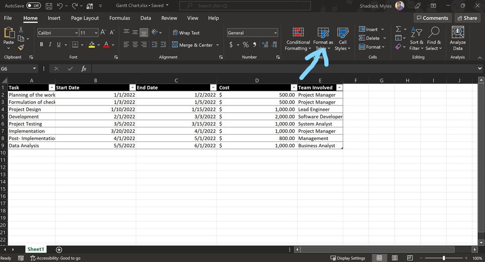
Step 1: Using your excel table Gantt chart data You first need to format your excel datasheet into a table. To format as a table select the datasheet> on the home tab click on format as table. Once you have done so save the file (You can access the excel file I used for the demo here =))
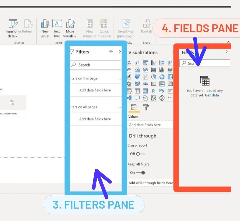
Step 2: Launch Power BI Desktop. If you already have Power BI desktop installed, open it. If not, download it from the official site. Power BI's landing page has 4 panes; Visualizations, Fields, Filters and working space where you will visualize the data.

By default, you get these visualizations, so to access more visuals you need a license to them.
Sign in with your office account (school or work account) to Power BI. If you don’t have one don’t worry about that, here is how to create a developers account
Once we are signed in let's import our Gantt chart visual.
Step 3: Import Gantt Chart visual to Power BI - On the visualizations pane click on the three dots (ellipsis) and select get more visuals.
Search Gantt chart, then click Add.
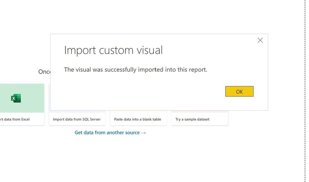
This success dialog box is displayed once the visual is successfully added. All good to go
But first let's discuss the properties of a Gantt chart since this will come handy for the next steps and will really help you match the properties you have on the excel sheet with the properties in Gantt.
- Legend- this displays which category the project is,
- Task- this basically describes the project work to be done in a specified period of time
- Parent- this takes a summary of the child tasks that you have in your project
- Start Date- this describes the starting date of the project you are working on
- End Date- this describes the end date of the project you are working on
- Duration- timeframe for working on a particular project i.e., 3 months, 6 months etc.
- % Completion- the amount of task that has been completed in terms of percentage
- Resource - This is what you use in the project. For instance, you have developer resource, program manager resource, Business analyst resource etc.
- Tooltips - Text boxes that are displayed when a timeline or data grids are hovered over
- Milestones - this refers to the important or specific pointers in your project that describe the improvements or backlogs in a project
These properties basically define the timelines, start date, etc. of the whole project,
Step 4: Lets import our data
On the Home tab and click on get data> choose Excel as your data source. Import the excel sheet you have stored locally.
Select the table you had formatted to load your data into Power BI. Once you select the table you will see a preview of the data. Select load once you have ascertained the data is in the correct format. In case you would like to alter the format of the data, click Transform Data which will open the Power BI Query Editor on a separate window for you to modify your data before loading it into the Power BI project.
We are all set!
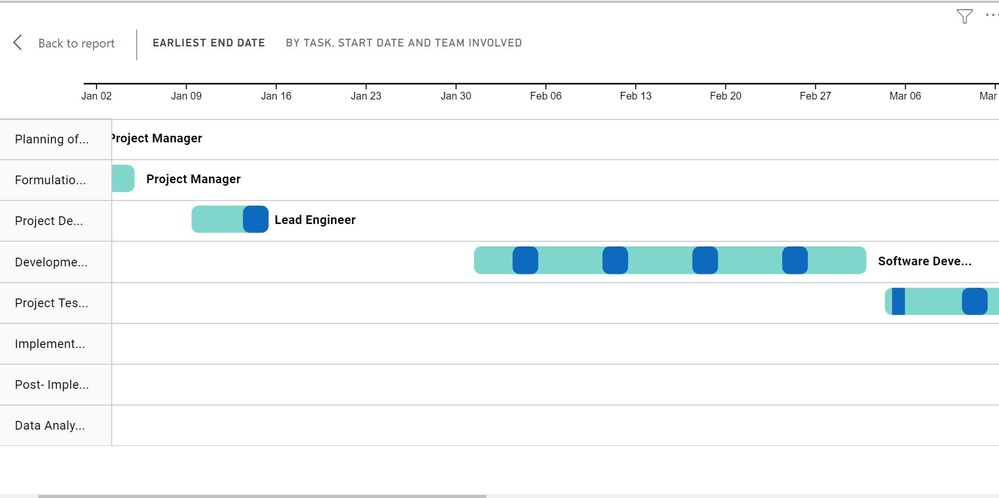
Step 5. Time to visualize! On the visualizations pane select Gantt chart to display a blank chart. Once you are done, we can now link our excel data to the properties of the Gantt chart. i.e., task (Excel) to match with task (Gantt), start date (Excel) and start date (Gantt) etc. This will depend on how you have named your excel columns
Step 6: All done - We have been able to build our Gantt chart using Power BI. This will enable us to track the tasks that we have against time and the team members playing the different roles on different tasks. You can customize your chart further on other properties such as the title of the chart, background color, date type, data labels by using the tabs below the visualizations pane.
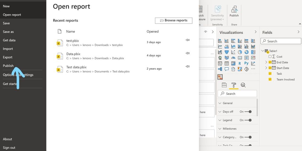
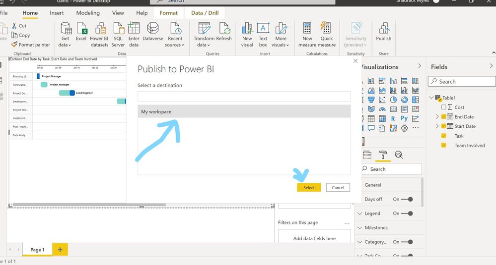
Step 7: Save, Publish and Share - We can now share the chart with our colleagues. Save the chart and publish to desired workspace on Power BI Service. This will enable your workmate's view and collaborate on the chart you have shared with them.
Next Steps
Interested in learning more about the different types of visualizations that come with Power BI here are some resources that can help you explore:
Interested in related content, register for the Power Platform Kenya Community today here.

