This post has been republished via RSS; it originally appeared at: New blog articles in Microsoft Community Hub.
My name is Rachel Irabor, I am a Microsoft Learn Student Ambassadors, Power Platform and Dynamics 365 CE developer. I love writing blog posts to document my learning.
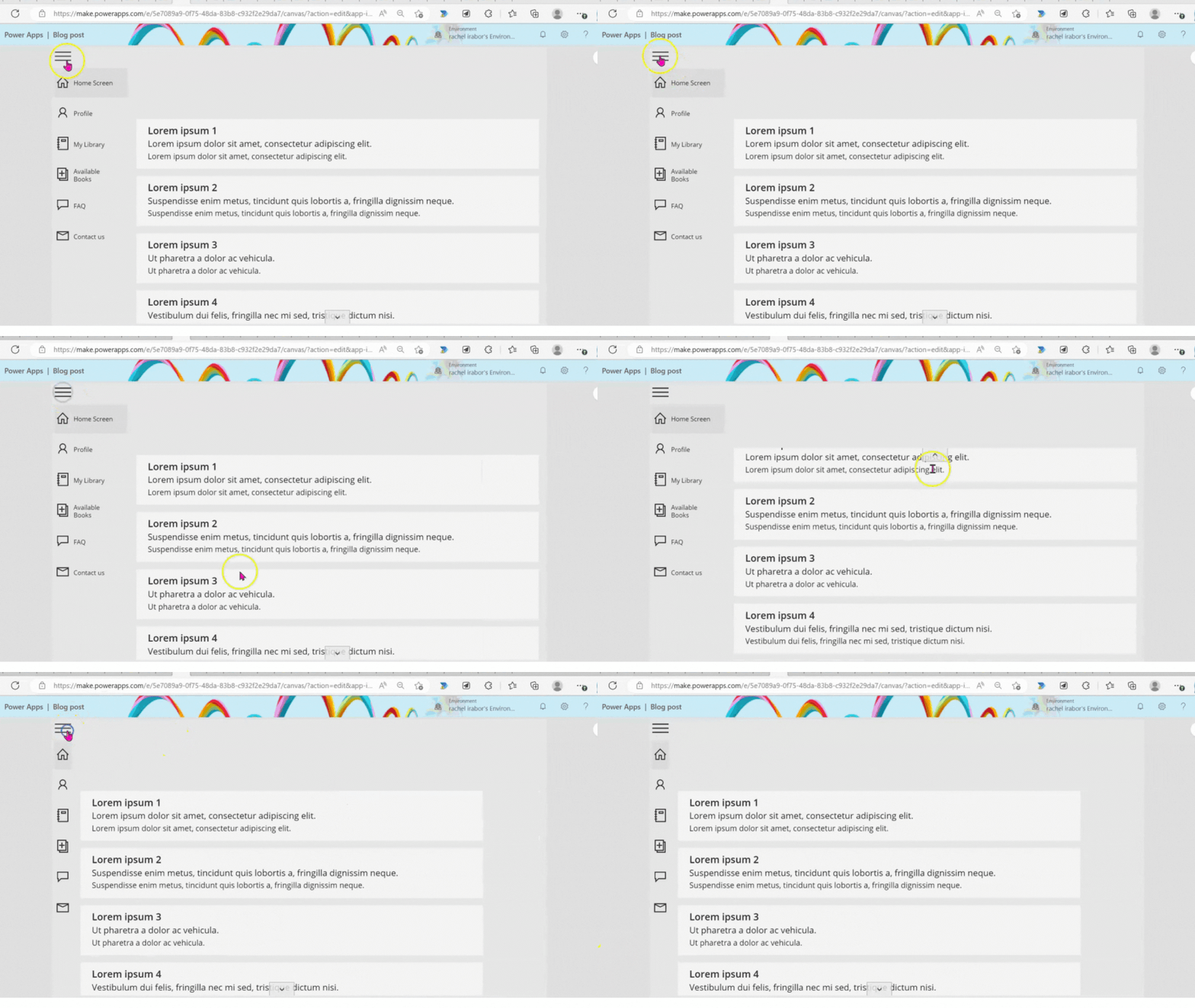
In this blog post I will show how to use two Gallery control in one screen and how to create responsive menu navigation bar in Canvas Power Apps using Gallery control and Collection, which you can use to navigate to different screens in your application.
In Power Platform, Gallery controls are used to display a collection of data in a list or grid format. A Gallery control can be used to display a set of records from a data source, such as a SharePoint list, Excel table, or Common Data Service entity.
The Gallery control provides a flexible layout and allows users to interact with the data displayed. It can be used to display images, text, and other data types.
Some common properties of a Gallery control in Power Platform include:
- Items: This property specifies the collection of data to be displayed in the Gallery control.
- Layout: This property determines the arrangement of items in the Gallery control, such as whether they are displayed in a list or a grid.
- Template: This property specifies the design and layout of each item in the Gallery control.
- OnSelect: This property specifies the action to be taken when a user selects an item in the Gallery control.
By using Gallery controls in Power Platform, users can create dynamic and interactive interfaces for displaying and interacting with data.
Steps by Step Process
Step 1:
Login into your Power Apps environment
Click on Blank app
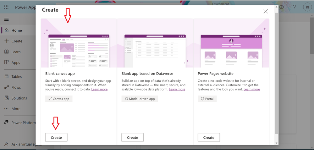
Step 2:
On Blank canvas apps, click on Create
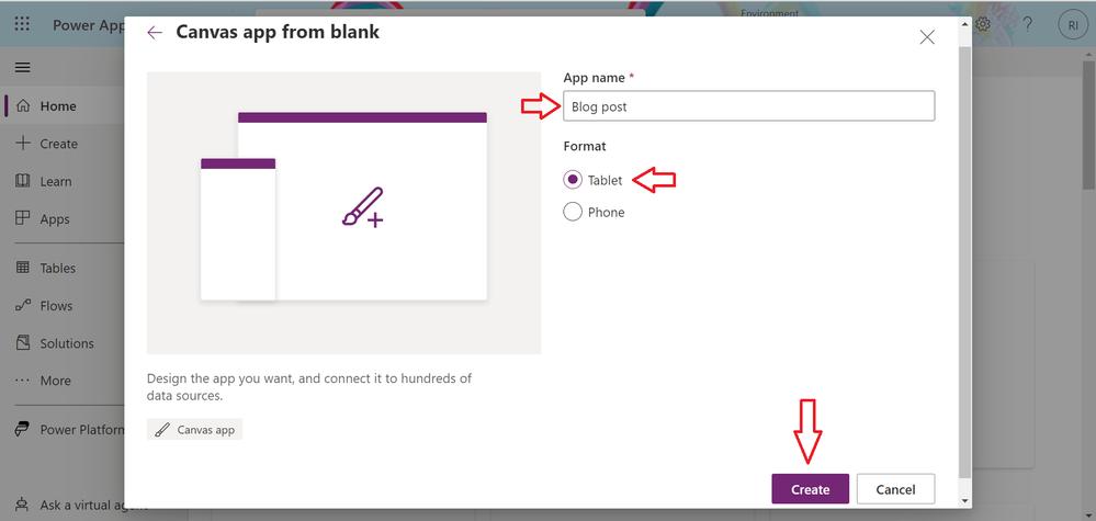
Step 3
Name your Application
Format, select Tablet
Next click on Create
Step 4:
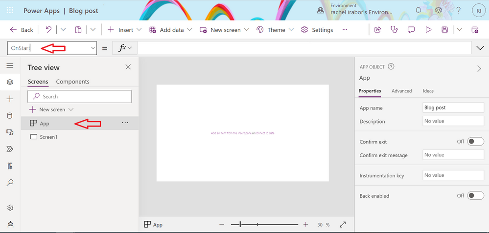
Click on App at the left side of your screen
At the left hand side of the screen, go to the properties and find OnStart
Create a local data source in your application, using collections.
If you notice from the second screen, we have errors for Screen Name which is the name of the screen we want each Icon to Navigate to but first let's add Gallery control to Screen1
Add a Gallery Control
Step 6:
Click on Screen1 at the left hand side of your screen
Step 6
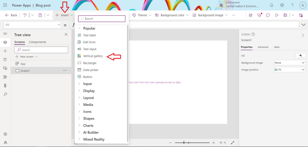
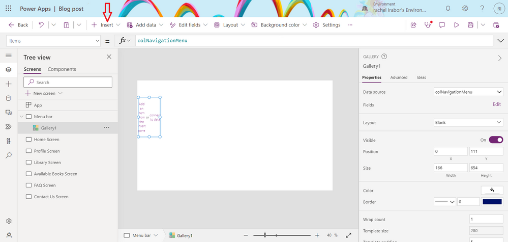
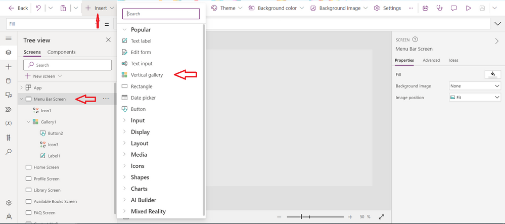
Click on Insert
Next, click on Vertical gallery
Step 7
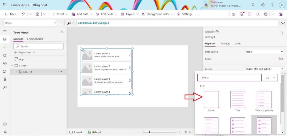
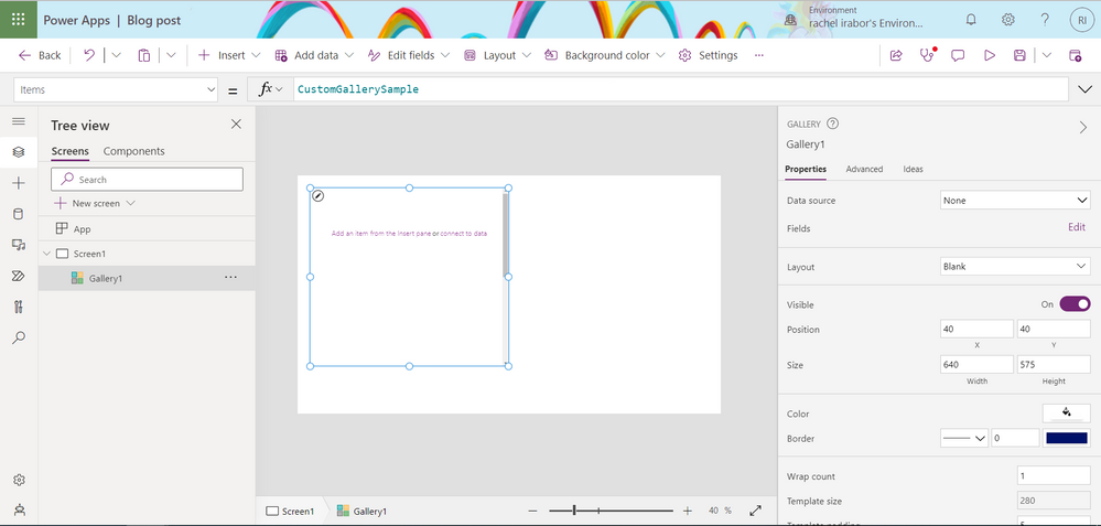
Change the layout of the Gallery control from Image,title and subtitle to Blank
- Click on the Gallery control
- Go to the left hand side of the screen, On layout click on the dropdown and change it from Image, title and subtitle to Blank
Step 8
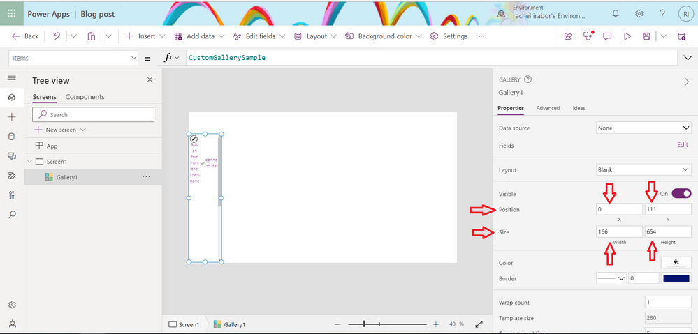
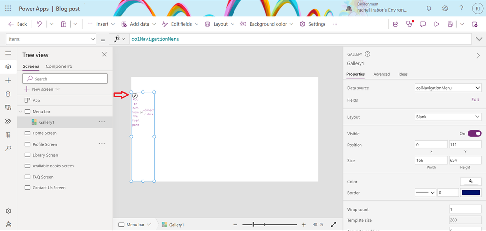
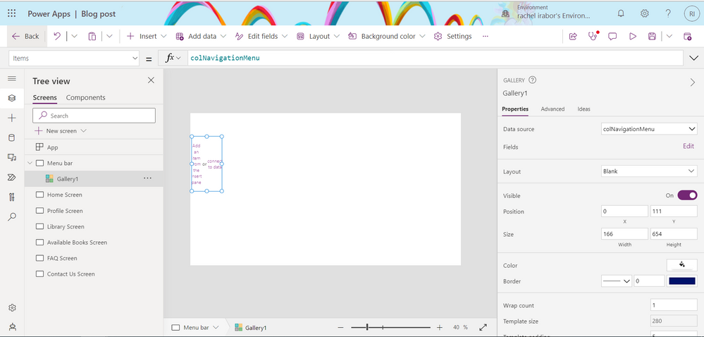
On Position, change the X and Y property of the Gallery to 0 and 111
On Size, change the Width and Height property of the Gallery to 166 by 654
If you noticed the collection we created, it has different names of screens. We need to add more screen to the Apps
Step 9
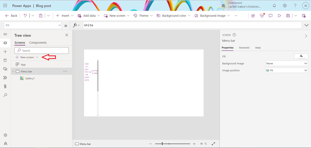
Click on New screen
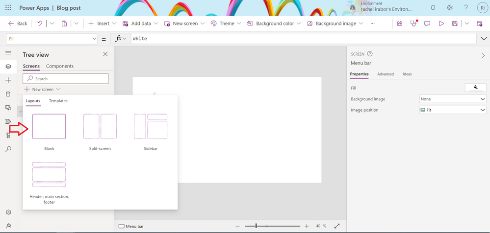
Click on Blank Screen
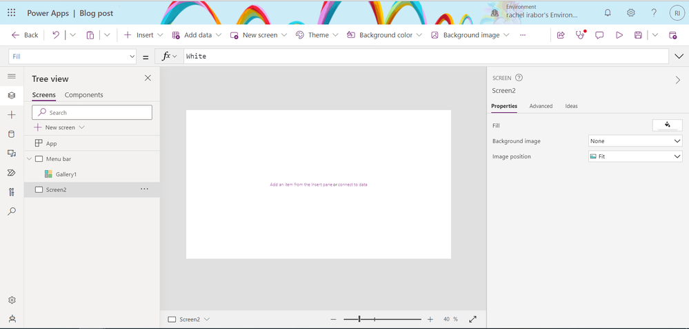
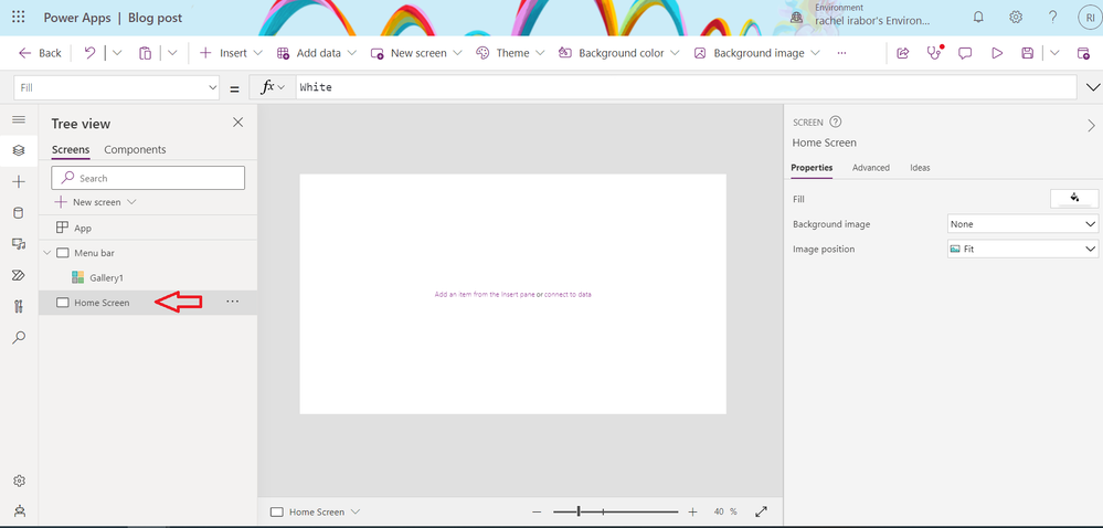
Rename the Screen from Screen 2 to Home Screen
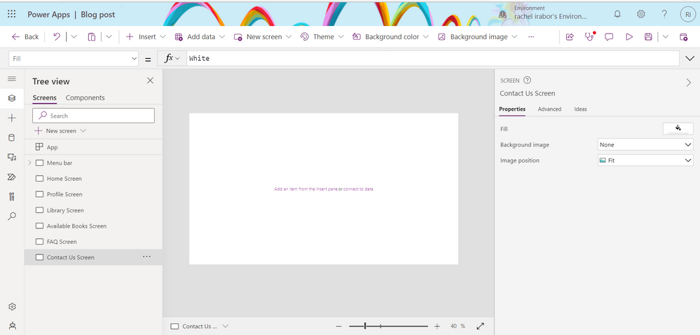
Repeat Step 9 to add Profile Screen, Library Screen, Available Screen, FAQ Screen and Contact us Screen.
You can easily edit the screen on the collection depending on how many screens you have in your Application and also the name of the screen
Step 10
On the Menu Screen or Screen 1. Click on the Gallery control
On the item property of the Gallery control change it from CustomGallerySample to
Step 11
Add a text label control to the Gallery
- Click on the edit icon in the Gallery control
- Click on Insert
- Next, select Text label control
Step 12
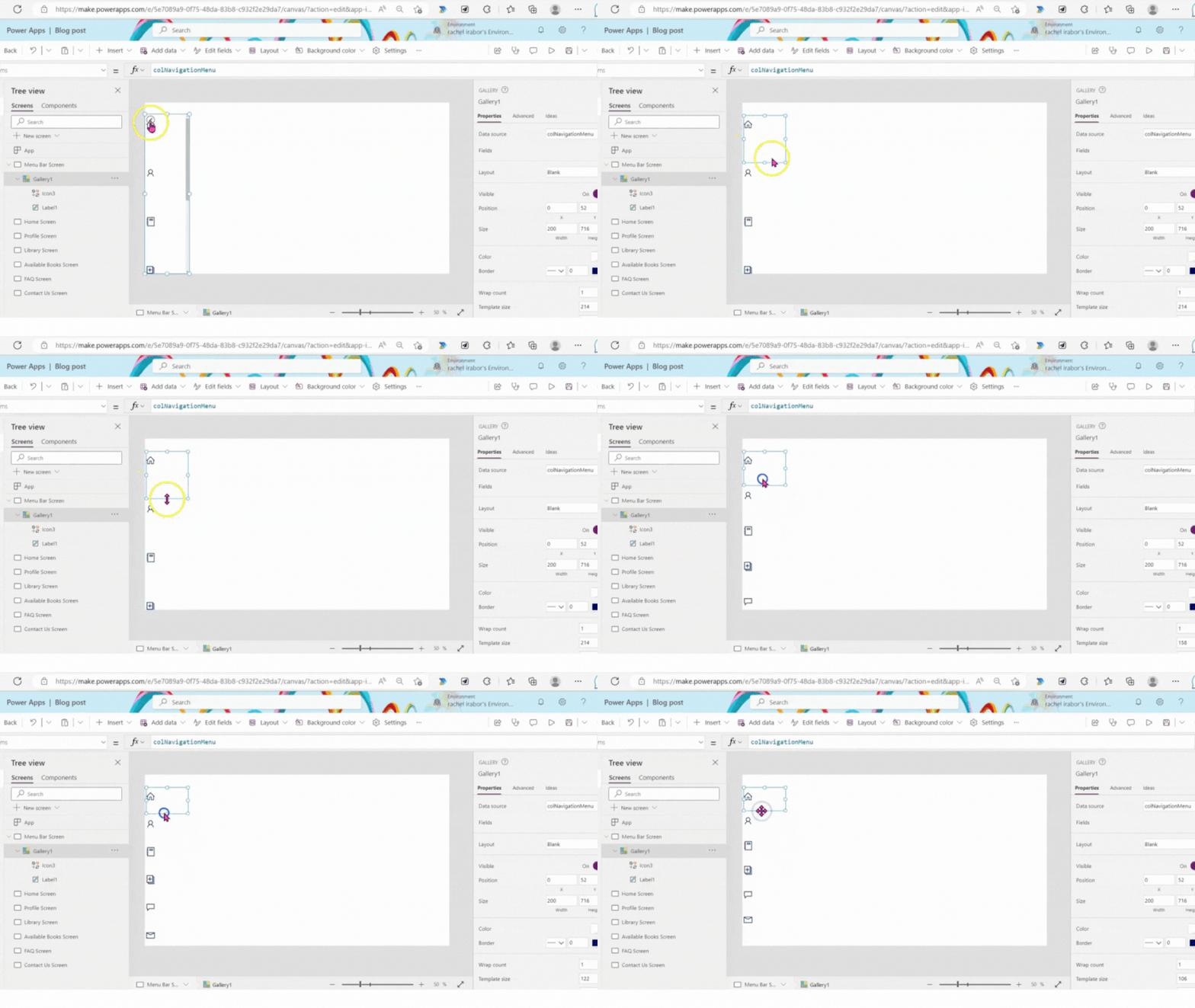
Go back and change the height and width property of the Gallery control
Step 13
Add the Home icon to the Gallery control
Click on insert
On the search bar, search for Home
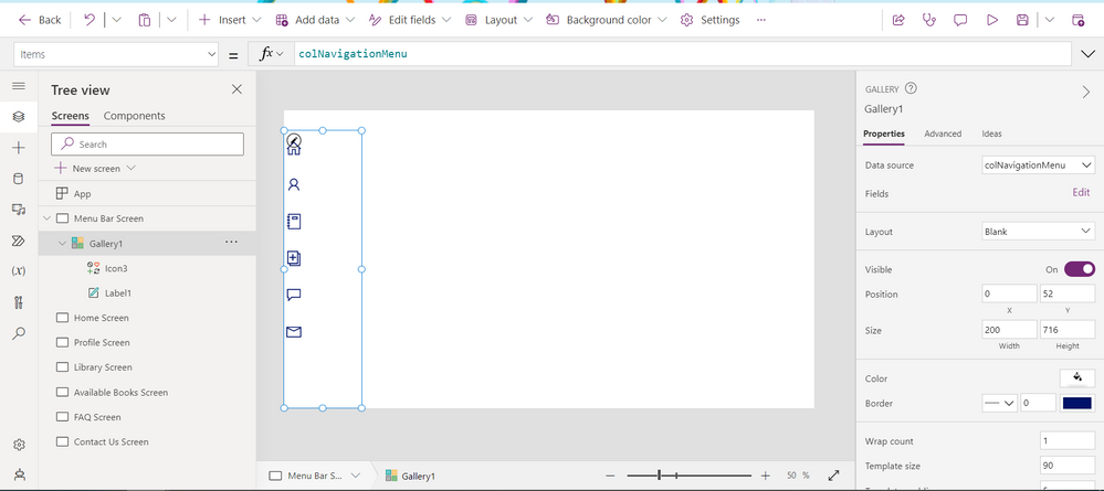
Please ensure home icon is inside the Gallery control as seen in the screenshot below
Step 14
Change icon property of the icon from Icon.Home to
Step 15
Adjust the Gallery by clicking on the edit icon in the Gallery control
Step 16
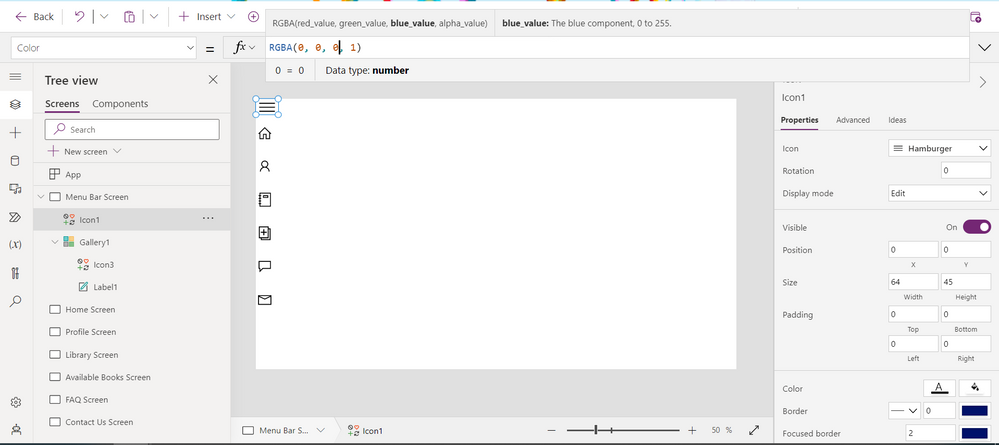
Change the font of the icon from blue to black
- Click on the icon
- Go to the color property
- Change it from RGBA(0, 18, 107, 1) to black
Step 17
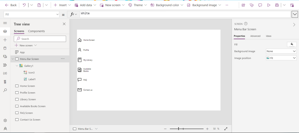
- Click on the Label control
- Change the Onselect property from false to
- Next, go the Text property of the Label control
Step 18
Adjust the Label control
Step 19
Add the Hamburger icon to the Menu Bar Screen
- Click on Insert
- Search for Hamburger on the search bar
- Click on the Hamburger icon
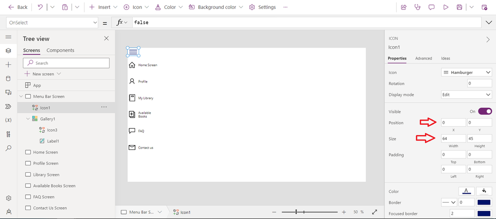
- Change the X and Y property of the Hamburger icon to 0
- Change the Width and Height property to 64 and 45 (Check the images below)
Step 20
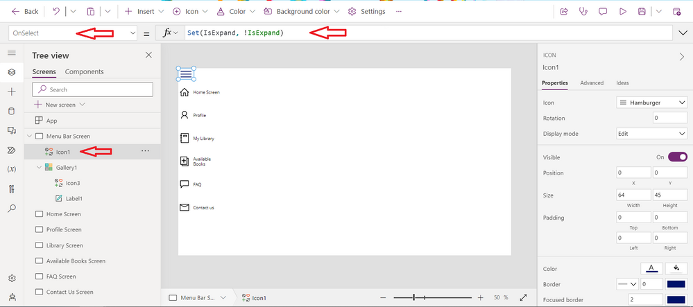
Create a variable in the onselect property of the Hamburger icon
Click on the Hamburger icon and the Onselect property of the hamburger to
- Click on the label control and change the Visibility property of the label control from true to
Step 21
Change the color property of the Hamburger icon to black see Step
Step 22
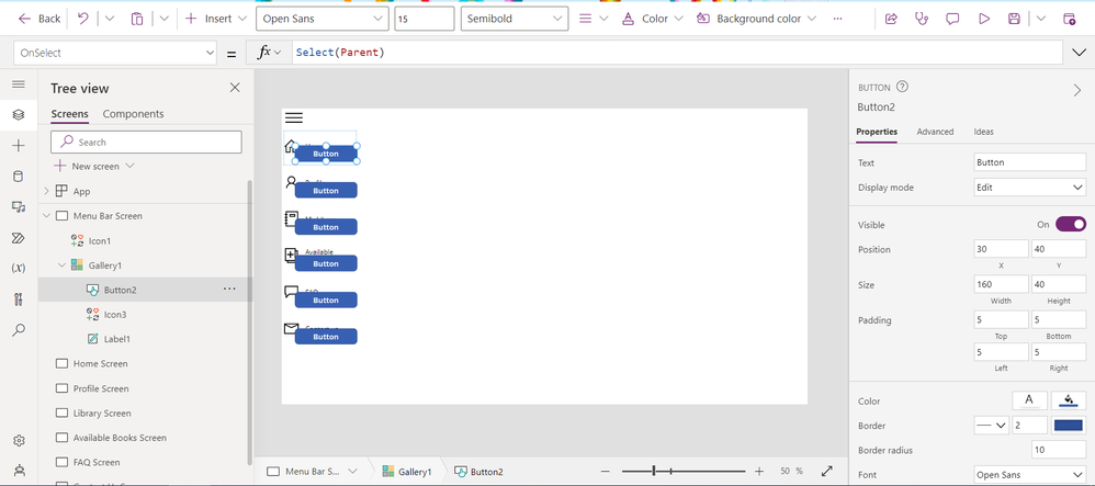
Add a button control to the Gallery
- Click on the Gallery
- Click on Insert
- Click on the button control and add it inside the gallery
- Adjust the button to cover the icon and label control in the Gallery
- Clear the text inn the Text property of the button control. Click on the button, at the left hand side search for the text property
Step 23
Hide the Button control
- Click on the button control
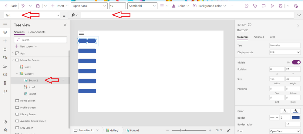
- Next, on the properties of the button control. Search for the Fill property and change to
- Next, go the HoverFill property of the button control and change to
Step 24
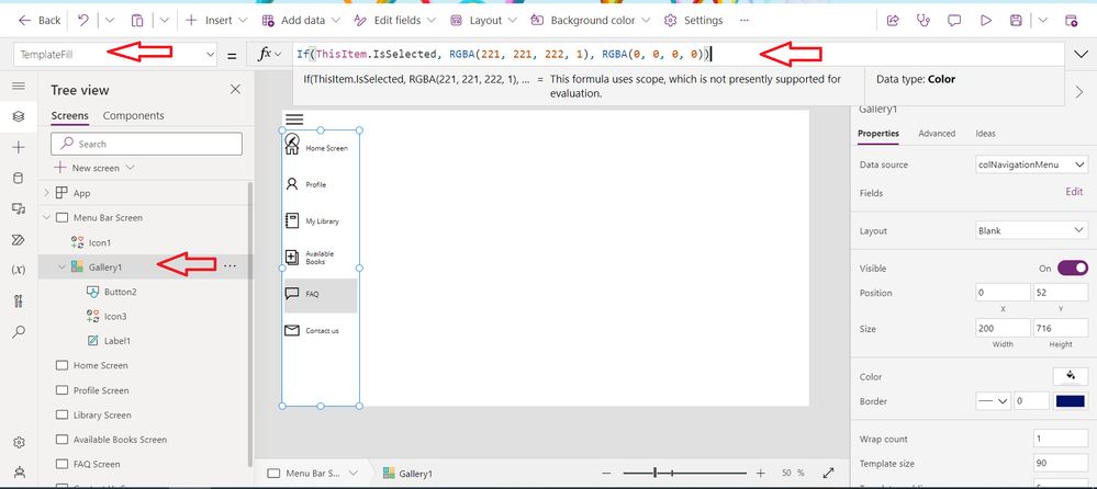
Next, click on the Gallery
Go to the Template fill property
Step 25
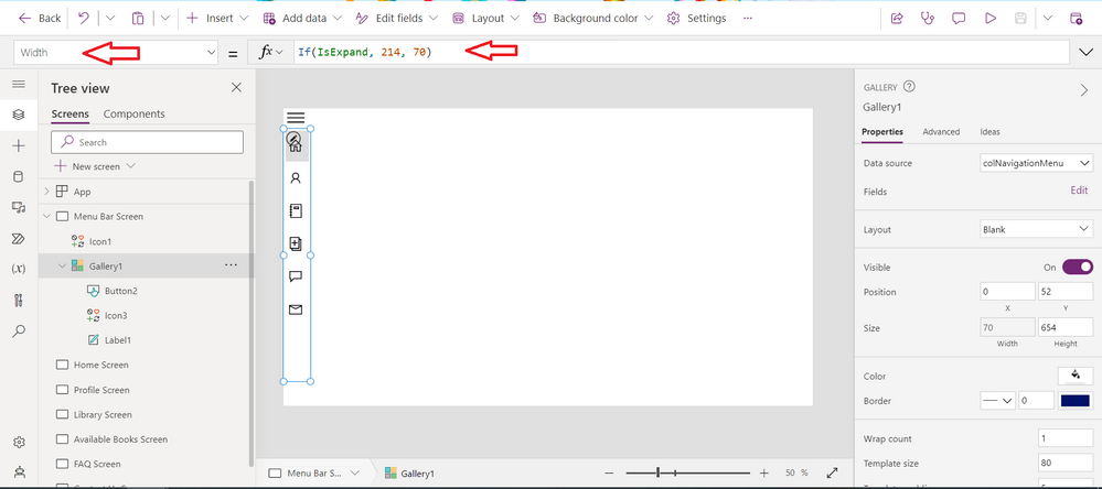
Control the User's experience of the Gallery
- Adjust the Width of the Gallery control to
Step 26
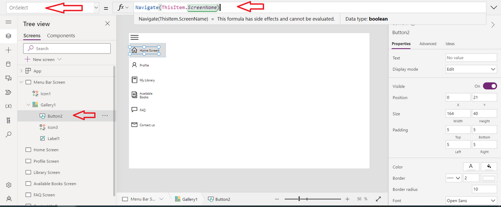
Click on the button control in the Gallery
At the left hand side, search for the Onselect property of the buttton and change to
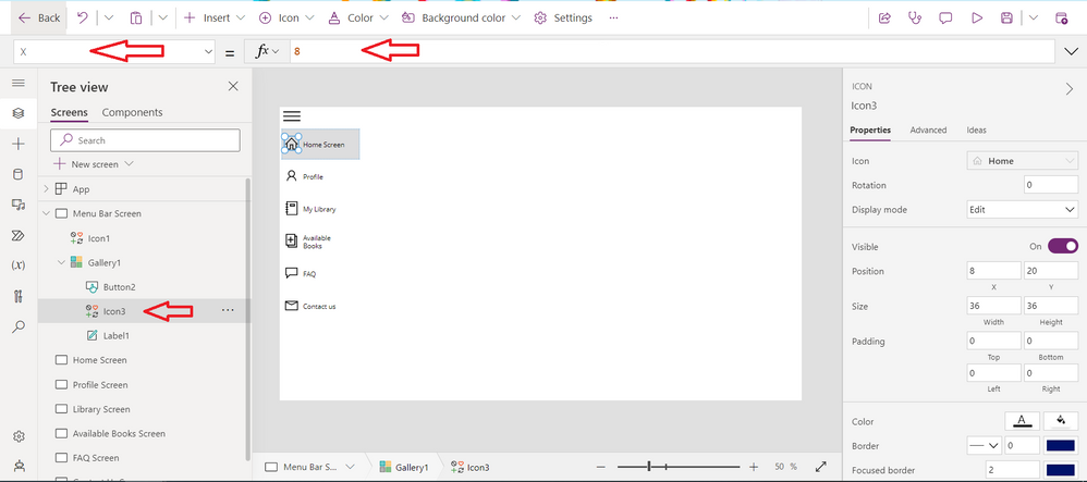
- Click on the icon in the Gallery control and change it to 8
Step 27
Adjust the Menu bar gallery
- Adjust the template size to 80
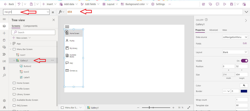
- Adjust the Height of the Gallery control to 654
Step 28
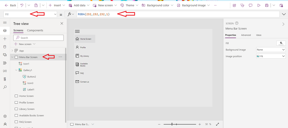
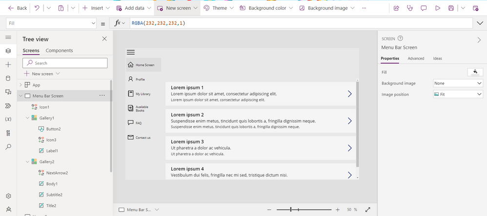
Change the background colour of the Screen
Click on the screen
Step 29
When any of the icons or screens is clicked on its shows the button to change this. Click on the button and change
Hover Fill Property of the button to
Pressed Fill property to
Step 30
Add the second Gallery to the Screen
- Click on Insert and select Vertical Gallery
- Change the Layout of the gallery control to Title, subtitle and body
Step 31
- Change the height property of the Gallery to 588
- Change the Y property to 177
- Expand the Gallery control by changing the Width to 1152
Step 32
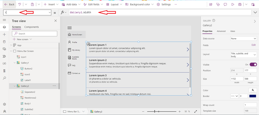
Change the X property of the Gallery control to
Step 33
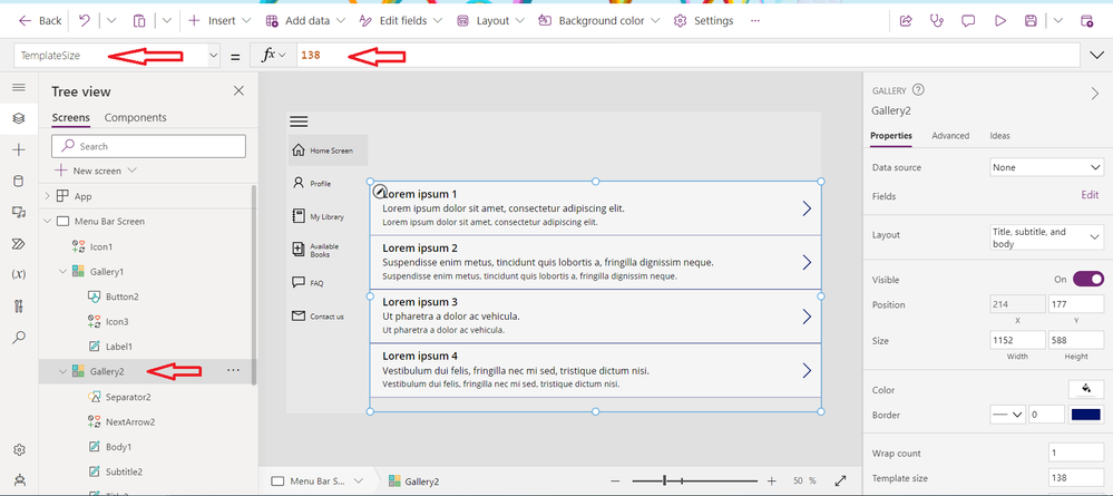
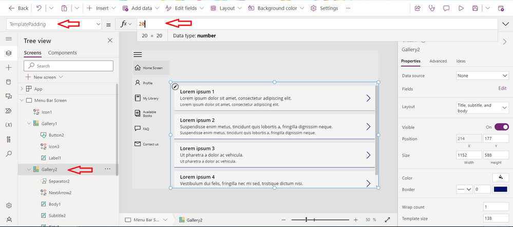
Click on the Gallery control
Search for the TemplateFill and change to
TemplateSize to 138
TemplatePadding to 20
Step 34
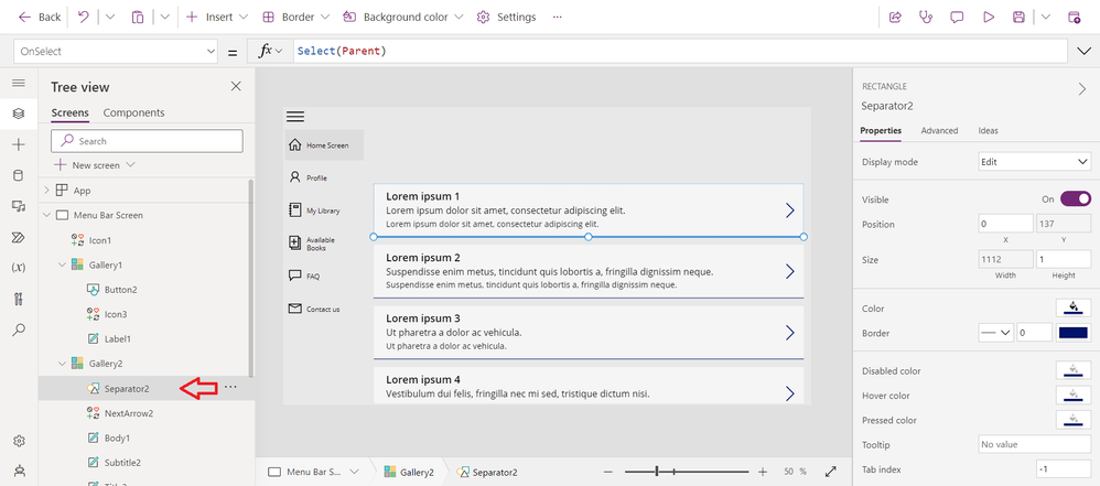
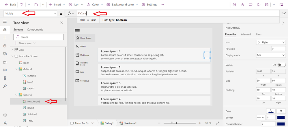
Inside the Gallery control, delete the Separator. Click on it at the left hand side of the screen.
Click on the Navigation icon and change the Visibility property from true to
Step 35
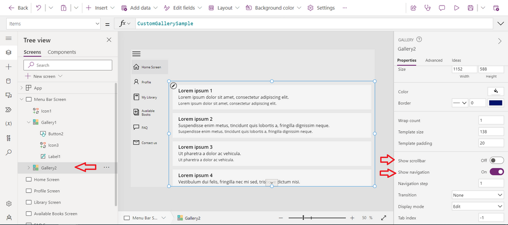
Click on the Gallery control
At the right hand side, turn off the Show scrollbar
At the right hand side, turn on Show navigation
While on the Gallery control, change the BorderColor property of the Gallery control to
Step 36
Connect your data source to the Gallery control
Thank you for reading
Learning resources
There are several learning references available for Gallery controls in Power Platform.
-
Microsoft Power Apps documentation: The official documentation for Power Apps, which is a part of Power Platform, includes a section on Gallery controls. This documentation provides an overview of Gallery controls and their properties, along with step-by-step instructions for creating and customizing Gallery controls. You can access this documentation at https://docs.microsoft.com/powerapps/maker/canvas-apps/controls/control-gallery-overview.
-
Microsoft Learn: Microsoft Learn is a free online learning platform that offers courses and tutorials on various topics related to Microsoft technologies, including Power Platform. The platform includes several courses and modules on Power Apps and Power Automate, which cover topics such as creating Gallery controls and customizing their design and functionality. You can access Microsoft Learn at https://docs.microsoft.com/learn/.
-
YouTube tutorials: There are several YouTube channels that offer tutorials on Power Platform and Gallery controls. Some popular channels include Shane Young, April Dunnam, Reza Dorrani, and Guy in a Cube. These channels offer step-by-step tutorials on creating and customizing Gallery controls, along with other Power Platform features. You can search for these channels on YouTube or visit their websites for more information.
-
Power Apps community: The Power Apps community is a community where users can ask questions, share ideas, and learn from others about Power Platform. The community includes a section on Samples and Gallery controls, where users can find tips, tricks, and best practices for using and customizing Gallery controls. You can access the Power Apps community at https://pnp.github.io
